GPAN
GPAN is a subset of lava panels that provide more flexibility in creating panels in Vulcan.
GPAN offers more controls, more automated selections, filtering, and data extraction from block models and databases.
To create a panel using GPAN, the specification and panel setup are all declared in a separate file saved in a .gpan file format. The .gpan file is then compiled into a .cgp, which can be called on through a lava scrip to display the GUI.
The following lines are required in your lava script to call the .cgp panel:
my $panel = new Lava::Gpan();
my $button = $panel->display_panel("temp.cgp","panel_name","");
if ($button eq "ok")
    {
    user defined action
    }
where
temp.cgp is the name of the .cgp file
panel_name is the name of the .gpan file
user defined action = retrieve selections from panel; perform calculations; call other functions; etc.
The panel name can be up to forty alphanumeric characters (no special characters or spaces), and can have the same name as the actual .gpan file; however, there could be multiple panels declared within the .gpan file, so a good rule is to have a descriptive name for each panel. Each panel name cannot be identical to another panel name within the same .gpan file.
GPAN panels support predefined filters and only limited event handling.
Contents
GPAN Controls
Button
The panel button will perform an action when clicked. The buttons may contain text or bitmaps and can be put into a bank of buttons.
Below are some of the most common attributes used with the button field.
The action attribute performs an action when the button is clicked. One of the following actions can be set:
-
Clear(field1,field2,...) - clears the values in the specified fields
-
SaveValues(field,title,filter) - displays a save dialog with the given title and file filter, and saves the values of the specified field
-
LoadValues(field,title,filter) - displays a load dialog with the given title and file filter, and loads the values from the file into the specified field
Example:
action = "SaveValues(my_panel,Select Equation File,*.eqs);
The assigned action will be repeated every time the button is pressed.
The align_left attribute will contain a BOOLEAN value indicating whether the button control should be aligned to the left of the enclosing block. The default is for the button to be aligned to the right.
Example:
align_left = 1;
The bank attribute groups buttons together. An INTEGER value that specifies that the button belongs to a bank of buttons. The behaviour of buttons in a bank is similar to that of radiobuttons, i.e. only one button is toggled on at any particular time. An example button bank is displayed below:
button b
    {
    label = "Button 1";
    bank = 1;
    value = 1;
    }
button b
    {
    label = "Button 2";
    bank = 1;
    value = 2;
    }
In the above GPAN example, a bank with two buttons would be created. If the user presses one of the buttons in the bank, it can be identified using the value attribute. By default, buttons in a bank are added vertically. If you want to add them horizontally, you must add a position = "same line" attribute to the button.
The default attribute is a BOOLEAN value that specifies whether or not the button is the default button on the panel.
Example:
default = 1;
The toggle attribute contains a BOOLEAN value that specifies whether the button is a toggle button. When a button is a toggle button, the internal state of the button changes when the button is pressed. Text buttons do not stay depressed when displayed on the panel but bitmap buttons do. By default text buttons are not toggle buttons. Also, setting toggle to true for a text button will have no effect unless it is also non terminal.
Example:
toggle = true;
The tooltip_sunken attribute contains a STRING value that specifies the tooltip to display when a bitmap button is depressed. This attribute can only be used with bitmap toggle buttons.
Example:
tooltip_sunken = "Corporate standards turned on";
The tooltip_raised attribute contains a STRING value that specifies the tooltip to display when a bitmap button is not pressed. This attribute can only be used with bitmap toggle buttons.
Example:
tooltip_raised = "Corporate standards turned off";
Example One

button press_me
    {
    label = "Press Me!";
    non_terminal = true;
    tooltip = "A button to press";
    }
The above example will create a simple text button which is non terminal and cannot be toggled.
Example Two
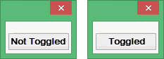
button toggle_me
    {
    toggle = true;
    label = "Not Toggled";
    toggle_label = "Toggled";
    non_terminal = true;
    }
The above example will create a toggle text button which will display "Not Toggled" when not in a toggled state and "Toggled" when it is in a toggled state.
Example Three
button bmp_btn
    {
    toggle = true;
    non_terminal = true;
    bitmap = "mtk_primitive0";
    }
The above example will create a toggle bitmap button. The bitmap image displayed will not change when the button is in a toggled state.
Example Four
button bmp_sunken_btn
    {
    toggle = true;
    non_terminal = true;
    bitmap = "mtk_primitive0";
    bitmap_sunken = "mtk_primitive1";
    tooltip = "Non toggled state";
    tooltip_sunken = "Toggled state";
    }
The above example will also create a toggle bitmap button. When in a non toggled state, the mtk_primitive0 image will be displayed and the tooltip will be "Non toggled state". When in a toggled state, the image mtk_primitive1 and the tooltip will change to the value of tooltip_sunken.
Checkbox
The checkbox control creates a checkbox field.
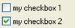
The more common attributes for the checkbox control consists of the place_in_block_order, logical_text, value, initial, and label attributes.
The place_in_block_border attribute places the checkbox in the border surrounding the control.
For example:
place_in_block_border = true;
The logical_text attribute sets the value of the control as text.
For example:
logical_text = true;
This attribute is for use with GridCalc and Rsvute utilities only.
The value a ttribute The comma delimited pair of values to set the control to when checked/unchecked.
For example:
value = "chk,unchk";
In the above example the value of the control will be set to "chk" when the user checks the control, and "unchk otherwise.
The initial attribute will contain the initial value of the control. The control is set to FALSE by default.
For example:
initial = true;
The label attribute contains the label to set the control to.
For example:
label = "My checkbox label";
Example 1:
panel mypanel
    {
    borders = 5;
    title = "checkbox";
    block
        {
        drawbox = true;
        checkbox mycheck
            {
            label   = "my checkbox";
            place_in_block_border   = true;
            }
        statictext contents
            {
            label   = "panel contents...";
            }
        }
    }
Combobox
The combobox control contains a list of items from which you can select. The user can also type in the edit region of the control if it's not readonly.
T he ignore_blanks attribute will contain a boolean value. If set to TRUE then the control will not allow empty strings in the drop down list.
Example:
ignore_blanks = 1;
The list attribute can be either a STRING or a VECTOR to populate the drop down list. If it's a STRING then the options are separated by '\n' characters. Always used with the "edit" attribute.
For example:
MVariant myFileList...    // Loaded up with your files
MVariant   var;
for (int i=0; i< myFileList.Size(); ++i)
    {
    var["myCombobox"]["list"][i]   = myFileList[i];
    }
The edit attribute contains a string to initialise the text region of the editbox. Used in conjunction with the " list " attribute.
For example:
MVariant var;
var["myComboxbox"]["edit"]   = "Pink Elephant";
The filter attribute determines how to construct OR limit the drop-down list from other fields.
For example:
filter = "__filelist("",*.dmp)";
filter = "__filelist($(corp_btn_value) ? $(__corp_dir)   :,*.res,$(corp_btn_value))";
filter = "db_name(ALL,$(__environment),$(__project),$(datasheet_name))";
filter = "$(__resources symbols,symbols.dgd,.*)";
filter = "$(loadedlayer_list)";
filter = "fontlist(FIXED|SCALED|VECTOR,true)";
filter = {
    eval   = "$(use_database)";
    "Y" = "$(mapfile2 groups,$(__environment),$(__project)$(database_file_id).$(datasheet_name))";
    default   = "$(mapfile2 groups,$(__environment),$(__project)$(mapfile_name).map,2)";
    };
The length attribute contains the maximum number of characters allowed in the combobox. This is an INTEGER value.
For example:
length = 10;
The width attribute contains the physical size of the combobox that you see on the panel (in spacing characters). This is an INTEGER value.
For example:
width = 5;
The show_one_item attribute will contain a boolean value. If the drop-down list has only one value and this attribute is TRUE then it will automatically display the value in the Combobox edit region. The user will not have to select it from the drop-down list.
For example:
show_one_item = true;
The never_show_one_item attribute will contain a boolean value. If the drop-down list has only "one" value and this attribute is TRUE then it will stop it automatically displaying that value in the Combobox edit region. The user is forced to select it from the list.
Not to be used in conjunction with “show_one_item” attribute
For example:
never_show_one_item = true;
The read_only attribute will hold a boolean value. If the value is TRUE, the user can only select values from the pulldown list and can not type in the edit region of the combobox.
For example:
read_only = true;
The mandatory attribute will contain a boolean value. If the value is TRUE, then the combobox must have a value before the user can OK the panel.
For example:
mandatory = true;
dirselector
The dirselector control is a directory selection control that contains an editbox and a browse button.
The only attribute for the dirselector is the browse_title which will contain the title of the common dialog for browsing.
For example:
browse_title = "browse for file";
Example:
panel mypanel
    {
    title = "My directory selector";
    borders = 10;
    block
        {
	 dirselector   datafiles_directory
	     {
	     browse_title = "Locate file directory";
	     label   = "Directory containing files";
	     width   = 30;
	     }
        }
    }
editbox
The editbox control allows the user to enter text into the edit region. It is a typical control for receiving input from the user.
The uppercase attribute will contain a boolean value. When set to TRUE all alpha-characters entered in the edit region will be in uppercase.
For example:
uppercase = true;
The lowercase attribute will contain a boolean value. When set to TRUE all alpha-characters entered in the edit region will be in lowercase.
For example:
lowercase = true;
The nospaces attribute will contain a boolean value. If set to TRUE then the user is prevented from entering spaces in the edit region.
For example:
nospaces = true;
The length attribute will hold a value representing the maximum number of characters allowed in the editbox. This is an INTEGER value.
For example:
length = 10;
The width attribute represents the physical size of the editbox that you see on the panel (in spacing characters). This is an INTEGER value.
For example:
width = 5;
The initial attribute will contain the initial value of the editbox on panel creation and is a STRING data type.
Some examples include:
initial = "Jumping Jack Flash";
initial = "$(initial_value)";
The readonly attribute will contain a boolean value. The user can not enter text in the edit region while readonly is set to TRUE. The background of the edit control is also greyed out to indicate to the user that the contents cannot be modified.
For example:
readonly = true;
The mandatory attribute will contain a boolean value. The editbox must have text in the edit region before the user can OK the panel.
For example:
mandatory = true;
fileselector
The fileselector is a control that makes it easier selecting files by using the browse button and the Standard Open dialog Box provided in windows.
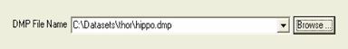
The browse_title attribute will contain the title for the Open dialog Box.
For example:
browse_title = "DMP Filename";
The button attribute will contain the label on the button next to the fileselector. The default is " Browse... "
Some examples:
button = "Search...";
button = "DMP Files...";
The default_file attribute contains the default filename for the Open dialog Box.
For example:
default_file = "test.00t";
The directory attribute will hold the initial directory to begin browsing in for the Open dialog Box.
Some examples:
directory = "c:/Datasets/thor";
directory = "$(initial_directory)";
The existing attribute will contain either yes or no value. Checks for file existence when the user clicks the OK button on the panel. If the attribute value is "yes" then we check if the file exists, and "no" we check the file doesn't exist. If the existence does not match this attribute the user is asked if this is ok. If the value is "yes_mandatory"/"no_mandatory" then the file must/must not exist and the user is not given a choice how to proceed.
For example:
exist = "yes";
The filter attribute determines how to construct OR limit the drop-down list from other fields.
For example:
filter = "__filelist("",*.dmp)";
filter = "__filelist($(corp_btn_value)   ? $(__corp_dir) :,*.res,$(corp_btn_value))";
filter = "db_name(ALL,$(__environment),$(__project),$(datasheet_name))";
filter = "$(__resources   symbols,symbols.dgd,.*)";
filter = "$(loadedlayer_list)";
filter = "fontlist(FIXED|SCALED|VECTOR,true)";
If the force_extension attribute is set to true, it will automatically append the current filter's extension if the file has none. Note that the wx browse dialog always does this, so this option caters for the case where the user types the file into the editbox part of the control. Also, in line with the current (2.4.2) wx behaviour, if the current filter has multiple patterns then the extension of the last one will be used. If the last one contains a wildcard (e.g. *.??t) then no extension is added.
force_extension = true;
If the ignore_history attribute is set to TRUE then the fileselector will prevent the drop-down list keeping a history of the file(s) chosen from the Open dialog Box and instead will use a filter. If set to FALSE then the drop-down list will be replaced with a history of files selected.
For example:
ignore_history = true;
If the ignore_path attribute is set to TRUE then the edit region of the fileselector will trim the string passed into it and display only the filename. Hence the path will be removed.
For example:
ignore_path = true;
The initial attribute is the initial value for the fileselector once the panel is displayed. It is a STRING data type.
Some examples include:
initial = "test.00t";
initial = "$(filename)";
The readonly attribute will contain a boolean value. If set to TRUE then this attribute will remove the browse button, the drop-down list and prevent the user from typing in the edit region of the control.
For example:
readonly = true;
The width will represent the width of the box (including the browse button) that you see on the panel. This is an INTEGER value.
For example:
width = 5;
The wildcard attribute is used to restrict files in the Open dialog Box. Descriptions are allowed with the wildcard as well.
Some examples:
wildcard = "All Files|*.*|GIF Files|*.gif"
wildcard = "Image files (*.jpg,*.pexel,*.gif,*.tif,*.ecw,*.rgb)| *.jpg;*.pexel;*.tif;*.gif;*tiff;*.ecw;*.rgb|All files (*.*)|*.*";
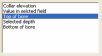
listbox
The listbox control is a control for displaying a list of items which cannot be edited by the user.
Example:
blank = "-BLANK-";
The initial attribute will contain either a STRING or INTEGER value. As an integer (zero-base) it represents the index of the string to select from the list of choices. As a string it must be one of the items in the list or in the translation list. If it is not in the list, no item will be selected.
Example:
initial = 1;
initial = "DEPTH";
The length attribute contains an INTEGER that specifies the maximum number of characters allowed in the list box.
Example:
length = 40;
The list attribute contains a STRING value to initialize the list. The items in the list are separated by the '\n' character.
Example:
list = "One\nTwo\nThree\nFour";
The lowercase attribute contains a BOOLEAN value that specifies whether or not to display the list items in lowercase.
Example:
lowercase = true;
The readonly attribute contains a BOOLEAN value that specifies that the listbox is read only.
Example:
readonly = true;
The sort attribute will contain a BOOLEAN value that specifies whether or not to sort a list. By default, lists are unsorted.
Example:
sort = true;
The uppercase attribute contains a BOOLEAN value that specifies whether or not to display the list items in uppercase.
Example:
uppercase = true;
width
The width attribute will contain an INTEGER value that specifies the width (in spacing characters) to make the list box.
Example:
width = 20;
multifileselector
The multifileselector is a multiple file selection control. It contains a directory selection control, a standard file browsing list box, a list box of chosen files, and a set of buttons to transfer between the two (Add, Remove, Add All, Remove All).
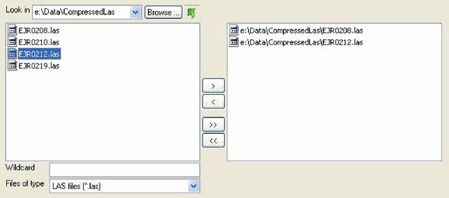
T he list box on the left displays files in the current directory that match the type or wildcard (if entered). Like any standard file dialog, a wildcard can be entered to narrow the list of displayed files (e.g. thor*.las). To do this type in the wildcard and press Enter.
The list box on the right displays the currently selected files. These can be chosen in three ways:
By double-clicking on a file in the left list box.
By highlighting one or more filed in the left list box and clicking the > button.
By clicking the >> button to select all files from the left list box.
Files can be deselected in three analogous ways:
By double-clicking on a file in the right list box.
By highlighting one or more files in the right list box and clicking the < button.
By clicking the << button to remove all filed from the right list box.
The directory can be changed by clicking on the Browse button, by typing a new directory into the editbox and pressing Enter, by double-clicking a directory that appears in the left list box or by clicking the up icon. The list of selected files is not affected by changing the directory, so it is possible to select files from multiple directories.
The browse attribute allows browsing to other directories. The default is true. If false the browse control is not shown and directories do not appear in the left listbox.
browse = false;
The directory attribute will contain the initial directory in which to start browsing. The default is the current working directory. This can be dynamically updated using references to other controls on a panel, which is especially useful for corporate standards (see Appendix A ).
directory = "c:/Data/pit_design.vc";
directory = "$(starting_dir)";
directory = "$(my_check_box)?$(dir1):$(dir2)";
The height attribute contains the overall height of the control.
height = 240;
The ignore_history attribute will contain a boolean value. If set to true, the attribute will not set the history in the directory drop down. The default is false.
ignore_history = true;
The l eft_width attribute contains the width of the left list control (the browsed files).
left_width = 180;
The right_width attribute contains the width of the right list control (the selected files).
right_width = 220;
The width attribute is the overall width of the control.
width = 700;
The wildcard attribute will filter string for the file type drop down filter.
wildcard = "Code Files|*.c;*.cpp;*.h|All Files (*.*)|*.*";
Example One
multifileselector files
    {
    mandatory = true;
    wildcard = "LAS files (*.las)|*.las";
    ignore_history = true;
    on_change = ["files", "$(files)"];
    forward_callback = "gph_Import_Las";
    expand_x = true;
    }
numberbox
The numberbox control is a "special" editbox control in which the user can only input numbers. This does not restrict the user to input only digits as it does accept some characters for relative and up/down values.
For example: r-400, u800 or *2.3
The initial attribute will contain the initial value of the numberbox on panel creation and is a STRING data type.
Some examples include:
initial = "123";
initial = "10.5";
initial = "r+100";
initial = "u720";
The max_length attribute will contain the maximum length (including the decimal point) that can be typed in the edit region. NOTE: -1 is used for arbitrary length
For example:
max_length = 10;
The decimal attribute is the number of decimal places to display. If this is not defined the number is assumed to be an INTEGER value.
For example:
decimal = 2;
The width attribute represents the width of the edit box displayed in characters.
For example:
width = 10;
The min attribute contains the minimum value this field can receive. This is a DOUBLE data type.
For example:
min = 100.0;
The max attribute contains the maximum value this field can receive. This is a DOUBLE data type.
For example:
max = 10000.5;
The allow attribute contains a settable style that allows relative or up-down values. This is a STRING data type.
The two options are:
relative - True if we are going to allow relative numbers eg) r+100
updown - True if we are going to allow up/down numbers eg) u300
For example :
allow = "relative";
allow = "updown";
The readonly attribute contains a boolean value. The user can not enter text in the edit region while readonly is set to TRUE. The background of the edit control is also greyed out to indicate to the user that the contents cannot be modified.
For example:
readonly = true;
The mandatory attribute contains a boolean value. The editbox must have text in the edit region before the user can OK the panel.
For example:
mandatory = true;
The value_as_double attribute will contain a boolean value. If true then the value is returned as a DOUBLE VARIANT rather than a string.
For example:
value_as_double = true;
Example One
numberbox size("Size of text on plot")
    {
    width = 10;
    length = 7;
    decimal = 2;
    mandatory = true;
    initial = 0.14;
    trail = "cm ";
    }
Example Two
numberbox x_field
    {
    label = "X field (Easting)";
    width = 5;
    min = 1;
    max = 120;
    decimal = 0;
    value_as_double = 1;
    invalid_message = "Field number must be between 1 and 120";
    }
radiobutton
A radiobutton control field allows mutually exclusive items on a panel.
The initial attribute contains the initial value of the radiobutton (boolean) on entry.
For example:
initial = true;
initial = "$(init_value)"1.
In the second example "init_value" is a variable that is substituted at runtime with a value.
In your C++ code the programmer would define "init_value" and pass it in the variant to the panel.
C++ example :
MVariant var;
var["global"]["init_value"] = true;
DisplayPanel("mypanel.cgp","mypanel",var,0);
The bank attribute groups the bank of buttons to which this button belongs
For example:
bank = 1;
The logical_text attribute sets the value of the control as text.
For example:
logical_text = true;
The place_in_block_border attribute will contain a boolean value. Set to TRUE to place the radiobutton in the border surrounding the control.
For example:
place_in_block_border = true;
The label attribute sets the text to be displayed adjacent to the radiobutton.
For example:
label = "my label";
example one:
panel mypanel
    {
    borders = 5;
    title = "Radiobuttons";
    block
        {
        drawbox = true;
        radiobutton rad1
            {
            initial = true;
            bank = 1;
            label = "my first radiobutton";
            }
        radiobutton rad2
            {
            bank = 1;
            label = "my second radiobutton";
            }
        }
    }
statictext
The statictext control will display a field containing text which cannot be modified by the user. The text may optionally be displayed in bold, underlined, or italic.
The height attribute will contain an INTEGER value that specifies the height of the static text field in pixels.
Example:
height = 100;
The highlight attribute will contain a boolean value that specifies whether or not to display the text as highlighted (bold). By default highlight is false.
Example:
statictext st1("SOME STATIC TEXT") { highlight = 1; } statictext st2("SOME STATIC TEXT") { underline = 1; } statictext st3("SOME STATIC TEXT") { italic = 1; }justify
The justify attribute contains a STRING value that specifies the justification of the text. Valid values are: centre, left, and right.
Example:
justify = "left";
The label attribute contains a STRING expression that provides a prefix label for the static text control.
Example:
label = "Block model:";
label = "$(file_type)";
The value attribute is a STRING expression that specifies the text to display. This is different to the label and will be displayed to the right of the label.
Example:
statictext st
    {
    label = "Label";
    value = "Value";
    }
The width attribute contains an INTEGER value that specifies the width of the static text field in pixels.
Example:
width = 100;
The wrap attribute contains a BOOLEAN value that specifies whether or not the text should wrap. By default wrap is false.
Example:
wrap = true;
Example one:
statictext st1
    {
    label = "Label";
    value = "Value";
    highlight_label = true;
    }
statictext st2
    {
    label = "Label";
    value = "Value";
    highlight = true;
    }
statictext st3
    {
    value = "A dog goes into a hardware store and says: 'I'd like a job please'.   The hardware store owner says: 'We don't hire dogs, why don't you go join   the circus?' The dog replies: 'What would the circus want with a plumber'?";
    wrap = true;
    width = 200;
    height = 100;
    }
GPAN Field Base
GPAN field base deals with the base class for all GPAN controls and has a set of attributes common to derived classes.
There are times or conditions when a control wants to be turned on or off or available or not available. The enable attribute can control this. Th e enable is assigned a BOOLEAN expression that specifies whether or not a control is enabled. When enable is set to false or 0, the control will still remain visible but greyed out so the user cannot access the control.
Example:
enable = false;
enable = 1;
enable = "$(field_1)!2";
enable = "$(field_2)=blah";
<image>
A control can only be enabled if its parent container is enabled.
The enable_when_hidden field is assigned a BOOLEAN value that specifies whether or not the control is enabled when it is hidden. By default, enabled_when_hidden is false.
Example:
enabled_when_hidden = true;
Depending on where a control is placed and how it is organized, there may exist excess spacing that may make to look awkward or desolated. There are the expand fields and fill fields that can assign the controls to take up the empty spaces.
The expand_row field is assigned a BOOLEAN value that specifies whether or not to expand the row in the y direction while not expanding the control (use expand_y for that). This effectively allows the control to be centred vertically in a block.
Example:
block l
    {
    statictext st
        {
        value = "Some random text to expand the parent block enough in the Y direction   to demonstrate how to use the expand_row attribute.";
        wrap = true;
        width = 200;
        }
    }
block r
    {
    position = "same line";
    editbox eb
        {
        expand_row = true;
        label = "Edit Box";
        width = 20;
        }
    }
The expand_x field is assigned a BOOLEAN value that specifies whether or not to expand the control horizontally when the panel is resized. By default, expand_x is false.
Example:
expand_x = true;
The expand_y field is assign a BOOLEAN value that specifies whether or not to expand the control vertically when the panel is resized. By default, expand_y is false.
Example:
expand_y = true;
The fill_x field is assigned a BOOLEAN value that specifies whether or not to make the control horizontally as large as space will allow on creation of the panel. Unlike the expand_x attribute, the control is not resized as the panel is resized. By default, fill_x is false.
Example:
fill_x = true;
The fill_y field is assign a BOOLEAN value that specifies whether or not to make the control vertically as large as space will allow on creation of the panel. Unlike the expand_y attribute, the control is not resized as the panel is resized. By default, fill_y is false.
Example:
fill_y = true;
At times there could be conditions where instead of just enabling or disabling a control, making the control completely not visible to the user is more appropriate, the hide field can be used to perform this. The hide field is assign a BOOLEAN expression that specifies whether or not to display the control. By default, hide is set to false.
Example:
hide = true;
hide = "($field_x)=1";
<image>
One common instance for using this field is for consolidating spaces where a large number of controls need to be displayed or enabled for certain conditions.
Emphasis can be placed on the text of a control by highlighting the text through the use of the highlight field. The highlight field is assigned a BOOLEAN value that specifies whether or not to display the controls label and trailing text as highlighted (bold). By default highlight is false.
Example:
editbox e1("This is editbox 1")
    {
    trail = "Trailing Text";
    }
editbox e2("This is editbox 2")
    {
    trail = "Trailing Text";
    highlight = 1;
    }
<image>
The highlight_label field is assigned a BOOLEAN value that specifies whether or not to display the controls label as highlighted (bold). By default highlight_label is false.
Example:
highlight_label = true;
The highlight_trail field is assigned a BOOLEAN value that specifies whether or not to display the controls trailing text as highlighted (bold). By default highlight_trail is false.
Example:
highlight_trail = 1;
A good way to group controls together is to use the indent field. Indenting a control or a number of controls under a main control or text expresses a sense of sub-grouping or sub-categorization. The indent field is assigned an INTEGER value that specifies how many characters to indent the control. The indent attribute may be used for blocks as well as individual controls.
Example:
editbox e1("This is editbox 1");
editbox e2("This is editbox 2")   { indent = -2; }
editbox e2("This   is editbox 3") { indent =  2; }
<image>
At times there may be controls requiring user input that may contain a default value at the start. Setting an initial value for the control can be done with the initial field. The initial field contains the initial value of the control. The type of the value depends on the control but may include BOOLEAN, INTEGER, STRING and VARIANT.
Example:
initial = true;
initial = "$(expression)=2";
initial = "Hello world";
initial = 3;
initial = { "key" = { "value" = 1; }; };
The key field is assigned a STRING value that specifies a unique way to identify the control. By default, the name of the control in the GPAN code is used, but this may be overridden using the key attribute.
Example:
editbox some_really_long_name
    {
    key = "my_editbox";
    }
In the above example, the editbox may be referred to as "my_editbox" in callbacks as well as by other GPAN controls.
The label field is assigned a STRING expression that specifies the label for the control.
Example:
label = "Angle";
label = "$(some_global_var)";
Some controls may require user input where others may be optional. Making the control not optional can be set with the mandatory attribute. The mandatory field is assigned a BOOLEAN value that specifies that the control must have a non-empty value. The default value for the mandatory field is 0, which leaves the control optional can be left blank.
Example:
mandatory = true;
Positioning the control is another way to either perform space consolidation, grouping, or control layout. The position field is assigned a STRING value that specifies where to display the control. Valid values for position are: "skip line" and "same line". "skip line" inserts vertical spacing between the current row of controls and the previous row. "same line" puts the control on the same row as the previous control. By default, controls are placed vertically below one another with no spacing between them.
Example:
editbox e1("Editbox 1");
editbox e2("Editbox 2");
editbox e3("Editbox 3") { position = "same line"; }
editbox e4("Editbox 3") { position = "skip line"; }
<image>
The title field is assigned a STRING expression that specifies the title of a control or panel.
Example:
title = "Block Addition";
title = "$(tab_title)";
Where labels are text that are placed to the left of the control to be descriptive, there may be times where text placed at the end of the control can be used to express a suffix, the input type, or act as further description of the control (i.e. ft.,.isis, csv, etc). The trail field contains a STRING expression that specifies the trailing text for a control.
Example:
trail = "Trailing text";
trail = "$(some_var)";
<image>
Another way of emphasizing a text in addition to making the text bold is to underline the text. Underlining text places more importance on the text as well as makes it more noticeable than those that are not underlined. This is performed using the underline field. The underline field contains a BOOLEAN value that specifies whether or not to display the controls label and trailing text as underlined. By default underline is false.
Example:
editbox e1("Editbox 1")
    {
    trail = "Trailing Text";
    }
editbox e2("Editbox 2")
    {
    trail = "Trailing Text";
    underline = 1;
    }
<image>
The underline_label field contains a BOOLEAN value that specifies whether or not to display the controls label as underlined. By default underline_label is false.
Example:
underline_label = 1;
The underline_trail field contains a BOOLEAN value that specifies whether or not to display the controls trailing text as underlined. By default underline_trail is false.
Example:
underline_trail = true;
GPAN Filters
Filters are available to a number of GPAN controls enabling them to do such things as list files, layers, objects and block model variables. In it's most basic form, a filter can simply be a list of items.
For example:
filter = [ "one", "two", "three" ];
filter = "$(some_list)" ;
There are a number of predefined filters which do many common tasks. These are described in more detail below. These filters deals with files.
Where the filter can contain just a list of strings as the selections, the __filelist attribute can filter a list of files according to certain criteria. The __filelist attribute returns a list of files matching a particular pattern in a specified directory. The syntax is:
__filelist < directory >,< pattern >,< full_path >
The directory is the directory to search. If left blank, the current directory is used. The pattern is an optional pattern that the files must match. If left blank, all files are returned. The full_path is an optional Boolean that returns the files with their full path. The default value for full_path is set to false.
Example:
filter = "__filelist(,)";
filter = "__filelist(,*.00t)";
filter = "__filelist(,*.txt,1)";
filter = "__filelist($(corp_btn_value)?$(__corp_dir):,*.ftd,$(corp_btn_value))";
These next few attributes will filter information from a DGD. In a DGD, there are layers and within the layers, objects. To access the layers within the DGD, use the __layers attribute. The _layers attribute returns a list of layers in a DGD. The syntax is:
__layers <database>,<pattern>,<search>,<replace>,<flags >
The database is the name of the design database. The pattern is an optional pattern the layers must match. If left blank, all the layers are returned. This parameter is case sensitive. The search is an optional parameter that specified a pattern to do a search and replace on. The replace is an optional text to replace the layer name in the search parameter with. The flags are optional flags for the callback. The optional flags are: (1) i – case insensitive match for the search and replace, with the default value set to case sensitive, (2) g – do a global search and replace, (3) u – only return unique object names, which is applied after substitution, and (4) v – revert match, select the non-matching strings only.
Example:
filter = "$(__layers $(design))";
filter = "$(__layers $(design),A*)";
filter = "$(__layers $(design),^DIG\$COLOUR$,,,v)";
After selecting the layer to examine in the DGD, the objects existing in the layer can be examined with the __objects attribute. The __objects attribute returns the list of objects in a particular layer of a DGD. The syntax is:
__layers <database>,<layer>,<pattern>,<search>,<replace>,<flags >
The database is the name of the design database. The layer is the name of the layer to list the objects in. The pattern is an optional pattern that objects must match. If left blank, all the objects in the layer are returned. This parameter is case sensitive. The search is an optional parameter that specifies a pattern to do a search and replace on. The replace is an optional text to replace the object name in the search parameter with. The flags parameter are optional flags for the callback. The optional flags consists of : (1) i – case insensitive match for search and replace, with the default being case sensitive, (2) g – do a global search and replace, (3) u – only return unique object name, which is applied after substitution, and (4) revert-match, select non-matching strings only.
Example:
filter = "$(__objects $(in_dgd),$(in_layer),^LIN, +(.*,,iu)";
Within block models, the filter has attributes to access the block model variables and its values. TO access the variables within a block model, use the bm_variables attribute. The bm_variables attribute returns the set of variables for a particular block model. The syntax is:
bm_variables <model>,<type>,<first>
The model is the name of the block model. The type is optionally the type of variable wanted. This can be set to user, numeric, or class. If left blank, all block model variables are returned. The first is an optional modifier to return only the first element in the list.
Example:
filter = "$(bm_variables $(block_model_name))";
filter = "$(bm_variables $(block_model_name),class)";
filter = "$(bm_variables $(block_model_name),class,first)";
The bm_variable_values returns a list of block model variable values for a translation variable. If the variable is numeric, the string "Numeric Value" is returned. The syntax is:
bm_variable_values <model>,<variable>
The model is the name of the block model. The variable is the variable.
Example:
filter = "$(bm_variable_values $(model),geol)";
The next set of attributes for the filter deal with extracting information from databases. To access the database name, use the db_name attribute. The db_name attribute returns the list of optional database identifiers for a certain environment. The syntax is:
db_name <type>,<env>,<project>,<design>
The type is the database type. The valid values for type are: ALL, ODBC, ISIS, ISISHEAD, and ISISLIB. The env is the env name. The project is the project name. The design is the design name.
Example:
filter = "$(db_name ALL,$(__environment),$(__project),$(dsr_assoc_dsht))";
filter = "db_name(ISIS,$(__environment),$(__project),$(datasheet))";
In a database, accessing the keys is performed with the use of the database_keys attribute. The database_keys attribute returns the list of keys in a given database and environment. The syntax is:
database_keys <database>,<env>
The database is the name of the database. The env parameter is the environment.
Example:
filter = "database_keys($(dbname),$(__environment))";
The db_design attribute returns the list of database designs for a certain environment. The syntax is:
db_design <type>,<env>
The type is the type of database design. The values are: ALL, ODBC, ISIS, ISISHEAD, ISISDB, ISISLIB, ISISDSF, and DSF. The env is the optional environment name.
Example:
filter = "$(db_design ALL,$(__environment))";
filter = "db_design(ODBC,)";
The design_tables attributes returns a list of tables in a specified design.
This does not handle designs from headered databases, use db_tables for that.
The syntax is:
design_tables <type>,<design>,<env>
The type is the design type. The valid values for the type are: DEFAULT, LIBRARY, and HEADERED. The design is the design name. The env is the environment.
Example:
filter = "$(db_tables DEFAULT,$(__project)$(database_file_id).$(file_datasheet),$(file_datasheet),$(__environment))";
To check is a database exists use the db_exists attribute. The db_exists attribute returns a boolean values indicating the existence of a database. The syntax is:
db_exists <type>,<database>,<design>
The type is the database type. Valid values are: DEFAULT, ODBC, ISISHEAD, and ISISLIB. The database is the database name. The design is the design name.
Example:
initial = "$(db_exists ODBC,$(database_name),$(design_name))";
The tables list that exists within each database object can be retrieved using the db_tables. The db_ tables attribute returns the list of tables in the design of a database. The syntax is:
db_tables <type>,<database>,<design>,<env>
The type is the type of database. The valid values are: DEFAULT, ODBC, ISISHEAD, and ISISLIB. The database is the database name. The design is the design name. The env is the environment.
Example:
filter = "$( db_tables DEFAULT,$(__project)$(database_file_id).$(file_datasheet),$(file_datasheet),$(__environment))";
Within each table in the database, exists fields which can be accessed with the db_fields attribute. The db_fields attribute returns the list of fields in a table in the design of a database. The syntax is:
db_fields <db_type>,<database>,<design>,<env>,<table>,<type>
The db_type is the type of database. Valid values are: DEFAULT, ODBC, ISISHEAD, and ISISLIB. The database is the database name. The design is the design name. The env is the environment. The table is the name of the table. The type is the field type. The valid values for the field types include: ALL, TEXT, INT, SINGLE, DOUBLE, and NUMBER. The values may also be combined use the “|” operator, e.g. TEXT|INT.
Example:
filter = "$( db_fields DEFAULT,$(__project)$(database_file_id).$(file_datasheet),$(file_datasheet),$(__environment),$(record_name),ALL)";
The design_fields attribute returns the list of fields in a table in a specified design.
Note: this does not handle designs from headered databases, use db_fields for that
The syntax is:
design_fields <design_type>,<design>,<env>,<table>,<type>
The design_type is the design type. The valid values for design_type are: DEFAULT, LIBRARY, and HEADERED. The design is the design name. The env is the environment. The table is the table name. The type is the type field. The valid values for the type are: ALL, TEXT, INT, SINGLE, DOUBLE, and NUMBER. The type values may also be combined using the “|” operator, e.g. TEXT|INT.
Example:
filter = "$( design_fields DEFAULT,$(database_file_id),$(file_datasheet),$(__environment),$(record_name),SINGLE|DOUBLE)";
The environment attribute returns a list of the environments (found via *dd.ilb files). The syntax is:
environment
Example:
filter = "environment()";
The remaining attributes deals with files. To retrieve the files in a directory, use the file attribute. The file attribute returns a list of files in the current directory. The syntax is:
file <pattern>,<search>,<replace>,<options>
The pattern is the pattern match. If blank, * is used. The search is an optional parameter that specifies a pattern to do a search and replace on. The replace is an optional text to replace the text in the search parameter with. The options is the options for the substitution. The available options are: (1) I – case insensitive match for the search and replace, with the default being case sensitive and (2) g – do a global search and replace.
Example:
filter = "file($(__project)*.map)";
filter = "file($(__project)*.anim_seq,\($(__project)\)?\(.*\)\.anim_seq,\2,i)";
The filelist attribute returns a list of files in a specified directory. If no directory is specified, the current directory is used. The syntax is:
filelist<dir>,<pattern>,<search>,<replace>,<options>
The dir is the directory to list files in. The pattern is the pattern to match. If blank, * is used. The search is an optional parameter that specifies a pattern to do a search and replace on. The replace is an optional text to replace the text in the search parameter with. The options is the options for the substitution. The list of options available are: (1) i – case insensitive match for search and replace with the default being case sensitive and (2) g – do a global search and replace.
Example:
filter = "filelist(,*.dxf)";
filter = "filelist(,*.jpg;*.gif;*.pexel)";
filter = "filelist(,*.mapfile_spec,\(.*\).mapfile_spec,\1)";
filter = "$(filelist.,$(__project)*.map,$(__project)\(.*\).map,\1,i)";
To access the information within a mapfile, use the mapfile2 attribute. The mapfile2 attribute returns a list of groups or variables within a mapfile. The syntax is:
mapfile2 <type>,<env>,<filename>,<var_type>
The type is either variable or groups. The env is the environment. The filename is the mapfile name. The var_type is the variable type to list, with 0 for numeric, 1 for char, and 2 for both. This parameter only applies to variables and is ignored for groups.
Example:
filter = "$(mapfile2 groups,$(__environment),$(map_file),1)";
filter = "$( mapfile2 variables,$(__environment),$(__project)$(database_file_id).$ (datasheet_name),2)";
GPAN Layout Field
The layout field corresponds to the layout and display of a block, and is used to house and format child controls.
The block attribute is used to group or house GPAN controls together. It can be used for display purposes, for enabling/disabling purposes, and most importantly layout purposes. You will find that as you write more and more GPAN code you will rely heavily on using blocks.
For example:
block
    {
    drawbox = true;
    borders = 5;
    editbox myEditbox
        {
        label = "Name";
        initial = "Darth Vader";
        }
    combobox myCombobox
        {
        label = "Planet";
        list = "Endor\nEarth\nAlderaan\n";
        }
    }
The drawbox will contain a boolean value. If set to TRUE then the block or panel will have a border around it.
For example:
drawbox = true;
The border_x field will contain a numeric value representing the gap in pixels between the panel or block boundary and its controls in the X direction (from the left side).
For example:
border_x = 50;
The border_y field will contain a numeric value representing the gap in pixels between the panel or block boundary and its controls in the Y direction (from the top side).
For example:
border_y = 50;
The border_width field will contain a numeric value representing the gap in pixels between the panel or block boundary and its controls in the X direction (from the right side).
For example:
border_width = 50;
The border_height field will contain a numeric value representing the gap in pixels between the panel or block boundary and its controls in the Y direction (from the bottom side)..
For example:
border_height = 50;
The borders field will contain a numeric value that puts an even gap in pixels around the "panel or block" on all sides.
For example:
borders = 50;
The title field puts a STRING caption on the " drawbox " border in the top left corner.
For example:
title = "My Border";
The col_gap field contains a numeric value that represents the gap in pixels between blocks and controls. This only works left to right (columns) on the panel and NOT rows.
For example:
panel blah
    {
    borders = 5;
    title = "Test";
    block
        {
        drawbox = true;
        borders = 5;
        col_gap = 50;
        editbox myEditbox
            {
            borders = 30;
            label = "Name";
            width = 14;
            }
        combobox myCombobox
            {
            position = "same line";
            label = "Planet";
            width = 10;
            }
        }
    col_gap = 50;
    block
        {
        drawbox = 1;
        borders = 5;
        position = "same line";
        numberbox myEditbox
            {
            borders = 30;
            label = "Age";
            width = 14;
            decimal = 0;
            }
        combobox myCombobox
            {
            label = "Species";
            width = 10;
            }
        }
    }
The button_gap field contains a numeric value that represents the gap in pixels between a block (or controls) and a button in the Y direction.
For example:
panel Test
    {
    borders = 5;
    title = "Test";
    button_gap = 30;
    editbox Name
        {
        label = "Please enter your name";
        }
    button ok
        {
        label = "OK";
        }
    }
The load_save field will contain a string value. If defined then two small icons will appear in the bottom left corner of the panel. These are specially used for loading and saving " Variant Spec Files " from the panel. Basically if you load a spec file the panel will perform a SetValue to populate fields and a GetValue (SaveASCII) when saving a spec file. This is a STRING type and sets the file extension to look for (no need to include the '.')
For example:
panel test
    {
    borders = 10;
    title = "Test";
    help_tag = "$(env_help_tag)";
    button_gap = 30;
    load_save = "tbe";
    editbox Name
        {
        label = "Please   enter your name";
        }
    button ok
        {
        label = "OK";
        }
    }
The store_as_list field will contain a boolean value. If set to TRUE then the contents are stored using a list syntax, rather than by hash value.
For example:
block Window
    {
    key = "WINDOW";
    store_as_list = 1;
    numberbox X
        {
        label = "X";
        initial = 1.0;
        }
    numberbox Y
        {
        label = "Y";
        initial = 2.0;
        }
    }
Result :
"WINDOW" =
[
"1.0",
"2.0"
]
Instead of :
"WINDOW" =
{
"X" = "1.0",
"Y" = "2.0"
}
The layout field will contain either string off or old. If set to "off" or "old" then it will stop the auto-column spacing happening for our panel layout. Basically, controls won't conform to our column layout and will be placed right after each other. Useful in getting panel blocks looking just right.
For example:
layout = "off"; OR
layout = "old";
The bank_controller field allows radiobuttons in separate blocks to be a part of the same bank. Previously in GPAN this wasn't available and all radiobuttons had to be in the same block.
For example:
block bank_cont
    {
    drawbox = true;
    title = "Radio button banks across blocks";
    radiobutton rb1
        {
        label = "Radio Button1 bank 1";
        initial = true;
        bank = 1 ;
        }
    radiobutton rb2
        {
        label = "Radio Button2 bank 1";
        initial = true;
        bank = 1 ;
        }
    block dummy
        {
        drawbox = true;
        bank_controller = " bank_cont ";
        radiobutton rb3
            {
            label = "Radio Button4 bank 1";
            initial = true;
            bank = 1 ;
            }
        }
    }
The place_in_block_border field will contain a boolean value. Is used to place controls in the block border. At this stage it's ONLY recommended that you use this on radiobutton and checkbox controls.
For example:
panel custom
    {
    borders = 10;
    title = "Database Input”;
    block
        {
        borders = 10;
        drawbox = true;
        checkbox Allocate
            {
            label = "Add new customer";
            place_in_block_border = 1;
            }
        editbox Name
            {
            label = "Name";
            indent = 1;
            enable = "$(Allocate)";
            }
        }
    button ok
        {
        label = "OK";
        }
    }
The inplace_buttons field will contain a boolean value. If set to TRUE then the buttons are displayed in place (displayed where they appeared in the definition) -OR- are placed at the bottom of the layout. By default all buttons are placed at the bottom right of the layout like an OK button.
For example:
panel blah
    {
    borders = 10;
    title = "Database Input";
    block
        {
        inplace_buttons = true ;
        borders = 10;
        drawbox = 1;
        title = "New customer";
        editbox name
            {
            label = "Name";
            }
        editbox address
            {
            label = "Address";
            }
        button btn_add
            {
            position = "same line";
            label = "Add...";
            collapse = "Add customer...";
            user_button = ["btn_add","$(ADD)"];
            }
        }
    button ok
        {
        label = "OK";
        }
    }
Examples
note.gpan
panel noteone
    {
    notebook stuff
        {
        tab var_page
            {
            title = "Variable";
            editbox the_value
                {
                label = "Enter variable value";
                width = 8;
                }
            }
        tab file_page
            {
            title = "File";
            fileselector file
                {
                label = "Select output file";
                width = 30;
                }
            }
        }
    button ok
        {
        label = "OK";
        }
    button cancel
        {
        label = "Cancel";
        }
    }
note.lava
panel noteone
    {
    notebook stuff
        {
        tab var_page
            {
            title = "Variable";
            editbox the_value
                {
                label = "Enter variable value";
                width = 8;
                }
            }
        tab file_page
            {
            title = "File";
            fileselector file
                {
                label = "Select output file";
                width = 30;
                }
            }
        }
    button ok
        {
        label = "OK";
        }
    button cancel
        {
        label = "Cancel";
        }
    }
sam.gpan
panel basic
    {
    title = "Test";
    borders = 10;
    resizable = true;
    invisible file_const
        {
        value = "frank.goo";
        }
    block
        {
        title = "Block blah";
        drawbox = true;
        expand_x = true;
        borders = 5;
        combobox combo_one
            {
            label = "Combo one";
            filter = "filelist(,*.dhd.isis)";
            mandatory = true;
            expand_x = true;
            }
        }
    block
        {
        drawbox = true;
        title = "Block yak";
        position = "skip line";
        borders = 5;
        fileselector file_one
            {
            label = "File one";
            browse_title = "Select Limit File";
            wildcard = "Triangulation files (*.00t)|*.00t|All Files|*.*";
            filter = "filelist(,*.00t)";
            allow_edit = false;
            expand_x = true;
            initial = "";
            invalid_message   = "You must selection a triangulation";
            width = 40;
            }
        numberbox   number_one
            {
            label = "Number one";
            min = 0;
            max = 10;
            initial = 5;
            width = 10;
            }
        editbox edit_one
            {
            label = "Edit one t";
            initial = "$(sam_const)";
            width = 10;
            }
        }
    block
        {
        position = "skip line";
        grid grid_one
            {
            expand_x = true;
            label = "Grid one";
            visible_rows = 5;
            combo_col grid_combo
                {
                title = "Combo";
                width = 120;
                }
            col grid_edit
                {
                title = "edit";
                width = 120;
                }
            number_col grid_number
                {
                title = "Combo";
                width = 120;
                }
            }
        }
    button ok
        {
        label = "OK";
        }
    button cancel
        {
        label = "Cancel";
        }
		}
tree.gpan
panel mytree
    {
    title = "My Test Tree";
    borders = 5;
    lines_at_root = true;
    block
        {
        borders = 5;
        treelist category
            {
            pre_expand = true;
            sz_x = 150;
            sz_y = 150;
            items = [
                {
                label = "Root";
                value = "root_node";
                items = [
                    {
                    label = "First Node";
                    value = "first_node";
                    }
                    {
                    label = "Second Node";
                    value = "second_node";
                    }];
                }];
            }
        }
    block
        {
        position = "same line";
        borders = 5;
        notebook ategories
            {
            auto_page = "$(category)";
            expand_x = true;
            expand_y = true;
            tab root_node
                {
                block
                    {
                    expand_x = true;
                    expand_y = true;
                    border_width = 5;
                    drawbox = true;
                    statictext bla {value = "Root node of the tree";}
                    }
                }
            tab first_node
                {
                block
                    {
                    expand_x = true;
                    expand_y = true;
                    border_width = 5;
                    drawbox = true;
                    statictext bla {value = "First child node in the tree";}
                    }
                }
            tab second_node
                {
                block
                    {
                    expand_x = true;
                    expand_y = true;
                    border_width = 5;
                    drawbox = true;
                    statictext bla {value = "Second child node in the tree";}
                    }
                }
            }
        }
    button ok
        {
        label = "OK";
        }
    button cancel
        {
        label = "Cancel";
        }
    }
tree.lava
###############################################################################
#
# File        :
# Description : Create uncertainty curves for drillholes   at specified levels.
#             :
# Revision    : 0
#             :
# Modified    : ---
# Creation    : 10-Jul-2008
#
###############################################################################
#
#          Maptek   Pty Ltd (C) 2005 All rights reserved
#
###############################################################################
use MIME::Base64;
use vulcan;
use Lava;
use strict;
# ===========================================================
#                     Global   variables...
# ===========================================================
my $spec_name = "";
#===========================================
#                 main
#===========================================
# Build temporary cgp panel...
BuildTempCgpPanel();
# Display panel...
my $panel = new Lava::Gpan();
my $button = $panel->display_panel("temp.cgp","mytree","");
if ($button eq "ok")
    {
    }
# Clean temporary cgp file
unlink "temp.cgp";
# ===========================================================
# Do not touch below this
# ===========================================================
#////////////////////////////////////////////////////////////////////////////
#
# Name        :   BuildTempCgpPanel
# Description : Build temporary cgp file...
# Parameters  :
# Returns     :
#
#///////////////////////////////////////////////////////////////////////////
sub BuildTempCgpPanel()
    {
     my $cgp_encoded_data =
    "TUFQVEVLMDAxAFBBTkVMAAQAAAAATVZBUgAAQAAAAAAA+SMAAAAAAAAAAAAAAAAAsPgjAAAAAADIVdF2AAAAAAEAAAAAAAAAAAAAAAEAAABUAAAABJkJAAAFlAkAAAsAAABib3JkZXJzAwkAAAAFAAAACAAAAG5hbWUCCwAAAG15dHJlZQkAAAB0aXRsZQIRAAAATXkgVGVzdCBUcmVlEQAAAGxpbmVzX2F0X3Jvb3QDCQAAAAEAAAAIAAAAdHlwZQIKAAAAcGFuZWwKAAAAZmllbGRzBBgJAAAFzgEAAAsAAABib3JkZXJzAwkAAAAFAAAACAAAAG5hbWUCCgAAAGJsb2NrCAAAAHR5cGUCCgAAAGJsb2NrDAAAAF9fcGFyYW1zBCYAAAACCgAAAGxhYmVsAg0AAABwb3NpdGlvbgIKAAAAd2lkdGgKAAAAZmllbGRzBFUBAAAFUAEAAAgAAABuYW1lAg0AAABjYXRlZ29yeQkAAABpdGVtcwStAAAABagAAAAJAAAAbGFiZWwCCQAAAFJvb3QJAAAAaXRlbXMEcQAAAAU1AAAACQAAAGxhYmVsAg8AAABGaXJzdCBOb2RlCQAAAHZhbHVlAg8AAABmaXJzdF9ub2RlBTcAAAAJAAAAbGFiZWwCEAAAAFNlY29uZCBOb2RlCQAAAHZhbHVlAhAAAABzZWNvbmRfbm9kZQkAAAB2YWx1ZQIOAAAAcm9vdF9ub2RlCAAAAHR5cGUCDQAAAHRyZWVsaXN0DAAAAF9fcGFyYW1zBCYAAAACCgAAAGxhYmVsAg0AAABwb3NpdGlvbgIKAAAAd2lkdGgIAAAAc3pfeAMJAAAAlgAAAAgAAABzel95AwkAAACWAAAADgAAAHByZV9leHBhbmQDCQAAAAEAAAAFawYAAAsAAABib3JkZXJzAwkAAAAFAAAACAAAAG5hbWUCCgAAAGJsb2NrCAAAAHR5cGUCCgAAAGJsb2NrDAAAAF9fcGFyYW1zBCYAAAACCgAAAGxhYmVsAg0AAABwb3NpdGlvbgIKAAAAd2lkdGgMAAAAcG9zaXRpb24CDgAAAHNhbWUgbGluZQoAAABmaWVsZHME2AUAAAXTBQAADAAAAGV4cGFuZF95AwkAAAABAAAACAAAAG5hbWUCDwAAAGNhdGVnb3JpZXMIAAAAdGFicwQhBQAABa4BAAAIAAAAbmFtZQIOAAAAcm9vdF9ub2RlCAAAAHR5cGUCCAAAAHRhYgwAAABfX3BhcmFtcwQmAAAAAgoAAABsYWJlbAINAAAAcG9zaXRpb24CCgAAAHdpZHRoCgAAAGZpZWxkcwRHAQAABUIBAAAMAAAAZXhwYW5kX3kDCQAAAAEAAAAIAAAAbmFtZQIKAAAAYmxvY2sIAAAAdHlwZQIKAAAAYmxvY2sMAAAAX19wYXJhbXMEJgAAAAIKAAAAbGFiZWwCDQAAAHBvc2l0aW9uAgoAAAB3aWR0aBAAAABib3JkZXJfd2lkdGgDCQAAAAUAAAAMAAAAZXhwYW5kX3gDCQAAAAEAAAALAAAAZHJhd2JveAMJAAAAAQAAAAoAAABmaWVsZHMEhgAAAAWBAAAACAAAAG5hbWUCCAAAAGJsYQgAAAB0eXBlAg8AAABzdGF0aWN0ZXh0DAAAAF9fcGFyYW1zBCYAAAACCgAAAGxhYmVsAg0AAABwb3NpdGlvbgIKAAAAd2lkdGgJAAAAdmFsdWUCGgAAAFJvb3Qgbm9kZSBvZiB0aGUgdHJlZQW2AQAACAAAAG5hbWUCDwAAAGZpcnN0X25vZGUIAAAAdHlwZQIIAAAAdGFiDAAAAF9fcGFyYW1zBCYAAAACCgAAAGxhYmVsAg0AAABwb3NpdGlvbgIKAAAAd2lkdGgKAAAAZmllbGRzBE4BAAAFSQEAAAwAAABleHBhbmRfeQMJAAAAAQAAAAgAAABuYW1lAgoAAABibG9jawgAAAB0eXBlAgoAAABibG9jawwAAABfX3BhcmFtcwQmAAAAAgoAAABsYWJlbAINAAAAcG9zaXRpb24CCgAAAHdpZHRoEAAAAGJvcmRlcl93aWR0aAMJAAAABQAAAAwAAABleHBhbmRfeAMJAAAAAQAAAAsAAABkcmF3Ym94AwkAAAABAAAACgAAAGZpZWxkcwSNAAAABYgAAAAIAAAAbmFtZQIIAAAAYmxhCAAAAHR5cGUCDwAAAHN0YXRpY3RleHQMAAAAX19wYXJhbXMEJgAAAAIKAAAAbGFiZWwCDQAAAHBvc2l0aW9uAgoAAAB3aWR0aAkAAAB2YWx1ZQIhAAAARmlyc3QgY2hpbGQgbm9kZSBpbiB0aGUgdHJlZQW4AQAACAAAAG5hbWUCEAAAAHNlY29uZF9ub2RlCAAAAHR5cGUCCAAAAHRhYgwAAABfX3BhcmFtcwQmAAAAAgoAAABsYWJlbAINAAAAcG9zaXRpb24CCgAAAHdpZHRoCgAAAGZpZWxkcwRPAQAABUoBAAAMAAAAZXhwYW5kX3kDCQAAAAEAAAAIAAAAbmFtZQIKAAAAYmxvY2sIAAAAdHlwZQIKAAAAYmxvY2sMAAAAX19wYXJhbXMEJgAAAAIKAAAAbGFiZWwCDQAAAHBvc2l0aW9uAgoAAAB3aWR0aBAAAABib3JkZXJfd2lkdGgDCQAAAAUAAAAMAAAAZXhwYW5kX3gDCQAAAAEAAAALAAAAZHJhd2JveAMJAAAAAQAAAAoAAABmaWVsZHMEjgAAAAWJAAAACAAAAG5hbWUCCAAAAGJsYQgAAAB0eXBlAg8AAABzdGF0aWN0ZXh0DAAAAF9fcGFyYW1zBCYAAAACCgAAAGxhYmVsAg0AAABwb3NpdGlvbgIKAAAAd2lkdGgJAAAAdmFsdWUCIgAAAFNlY29uZCBjaGlsZCBub2RlIGluIHRoZSB0cmVlCAAAAHR5cGUCDQAAAG5vdGVib29rDAAAAF9fcGFyYW1zBCYAAAACCgAAAGxhYmVsAg0AAABwb3NpdGlvbgIKAAAAd2lkdGgNAAAAYXV0b19wYWdlAhAAAAAkKGNhdGVnb3J5KQwAAABleHBhbmRfeAMJAAAAAQAAAAVpAAAACQAAAGxhYmVsAgcAAABPSwgAAABuYW1lAgcAAABvawgAAAB0eXBlAgsAAABidXR0b24MAAAAX19wYXJhbXMEJgAAAAIKAAAAbGFiZWwCDQAAAHBvc2l0aW9uAgoAAAB3aWR0aAVxAAAACQAAAGxhYmVsAgsAAABDYW5jZWwIAAAAbmFtZQILAAAAY2FuY2VsCAAAAHR5cGUCCwAAAGJ1dHRvbgwAAABfX3BhcmFtcwQmAAAAAgoAAABsYWJlbAINAAAAcG9zaXRpb24CCgAAAHdpZHRo";
    open(OF,">temp.cgp");
    binmode (OF);
    print OF decode_base64($cgp_encoded_data);
    close(OF);
    }

