Visualization
Use the visualization features to customise the window size of your charts and the fonts styles used for the axes labels, legends, and annotations.
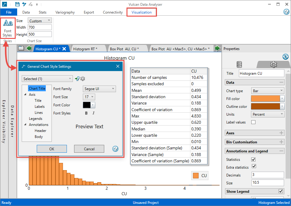
Customising the font style
On the Visualization tab, in the Styles group, click Font Styles to open the General Chart Style Settings panel.
-
Use the drop-down list to select which chart you want to customise.
Tip: You can apply the settings to all open charts
 , or set your customisations as the default setting for any future charts in the same project
  by clicking on the two small icons to the right of the drop-down list.
 -
Highlight the area of the chart you want to customise.
-
Use the controls on the right side of the panel to set the font family, size, colour, and style.
-
Click OK when you are finished.
Setting the display size of the chart
On the Visualization tab, in the Chart Size group, use the drop-down list labelled Size to select from the following options. Use these settings to customise the size of your charts when exporting.
| Window | Sets chart to the size of the chart window as it currently is. |
| Document | Sets the charts to a standard size for use in documents. |
| Small Document | Sets the charts to a smaller size for use in documents. |
| Custom | Allows you to adjust the size of the chart by using the Width and Height controls. |
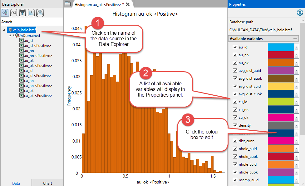
Assign colours to predefined variables
In the Data Explorer, click the Data source name.
You can assign colours to all predefined variables, including default and domain variables by clicking the data source name in the Data Explorer. This provides a consistent look across all your charts.
All the charts could be setup to represent Au as orange and Cu as blue whether the data is viewed in a histogram, scatterplot, etc.