Histogram
Create a histogram chart.
Click for tutorial: Chart Viewing and Exporting
Instructions
Follow these steps:
-
On the ribbon, go to the Data tab, then click Open Data Source, then select the block model or database you want to analyse to load it into the Explorer Visibility column.
-
Select the variable you want to use from the Data Explorer column.
Note: You can select more than one variable if you want to see multiple histograms on the same chart.
-
On the ribbon, go to the Stats tab, then click Histogram. After the histogram has been created, the Properties column will display the options available to customise your chart.
To refresh the chart, click the
 icon in the upper right corner.
Tip: To add additional data to the chart, you can drag and drop one or more variables from the Data Explorer column. The chart will be updated automatically.
-
The Properties column lets you edit the title, colours, and type of information that is displayed.
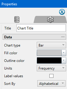
Option Result Title You can replace the default title with a customized title by entering the text here. If you do not want a title on the chart, delete the text from the textbox. Chart type Select the option for either a bar chart of a line chart.
You can set different display options for charts showing more than one dataset, as shown in the example chart above.
Fill colour To change the colour of the histogram bars, select a colour from the colour chart. Outline colour To change the colour of the bar outlines, select a colour from the colour chart. Units Count - Shows the number of values that fall within a range (bin).
Frequency - Shows the ratio of a number of values between 0 and 1.
Percent - Shows the ratio of a number of values between 0 and 100.
Label values Selecting this option will label each bar with its numeric value. Sort By If the dataset is categorised by an alphabetic scheme, you will be given the option to sort the bins by using the drop-down list.
-
Use the Axes tab lets up adjust the way information is displayed on the X and Y axes.
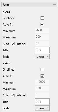
Option Result Gridlines Click this option to display major gridlines along either the X axis, the Y axis, or both. Auto fit Select this option for the axes to be automatically set up based on the values found in the data.
Minimum / Maximum
Deselect Auto fit, then enter the minimum and maximum axes values.
Auto Interval
With this option checked, the interval will be automatically determined. Unchecked this option to enter a new interval.
Title
Enter a title for the axis.
Scale
Select the type of scale in which you want to view the data.
-
Use the Bin Customization tab to adjust the size and number of bins.
-
Customise numerical histograms by editing the following options.
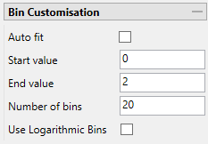
Option Result Auto fit Using Auto fit will distribute the values of the entire dataset over the number of bins. If you want to limit the range of values, clear the Auto fit checkbox and enter a Start and End value to use instead. Start / End value
Enter the starting and ending values that you want the bins to capture. The number of samples that are excluded because of this adjustment will be shown in the Statistics Chart under Excluded Samples.
Number of bins
Enter the number of bins.
Use Logarithmic Bins Select this option to change the X axis to display a logarithmic scale.
-
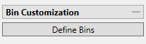
Customise a character histogram by clicking the Define Bins button.
It is possible to customize a character histogram by renaming, adding, deleting, or combining bins.
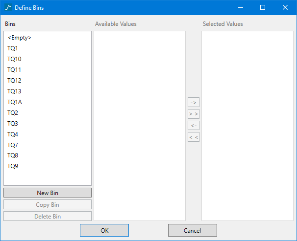
The Bins column shows a list of all the values found for the variable you are creating a histogram for. By default, all unique values found for the variable you are analysing will be shown in your histogram as separate bins.
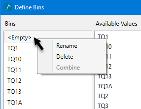
You can Rename, Delete, or Combine bins by right-clicking on a name in the list, then making a selection from the context menu.
Deleting a bin by this method does not delete the data from the database, nor does it remove the histogram's access to that data. It only removes the current bin from the chart window. The data can still be added back onto the chart.
Tip: If there are blank entries in the database, they will be represented by the word
<Empty>. This value will be added to the histogram like all other values, however, that bin will not have a label associated with it. The word '<Empty>' will not be displayed. If you want a label for that bin, right-click on the name, then select Rename from the context menu. If you do not want to include the blank values in your histogram, you can delete it from the list.To combine bins, select two or more bins by holding down the Ctrl key and making your selection.
Separating bins
To separate bins that have been combined follow these steps:
-
Open the Define Bins panel if it is not open already.
-
Highlight the bin that you want to separate.
-
In the Selected Values column, select the bin values that you do not want to be included and use the << or <- arrows to move them into the Available Values column, leaving only the value or values that you want to use remaining in the Selected Values column.
-
Click the New Bin button.
-
Rick-click on <NewBin> in the Bins column and rename the bin.
-
Click OK to apply changes.
The Available Values column shows a list of all available values that can used in the bin selected from the Bins list. It is activated by selecting one or more names from the Bins column.
The Selected Values column shows a list of values that are currently being used for the bin that is selected from the Bins list. By default, the value that is selected from the Bins list will automatically be used. However, you can add more values to that bin by highlighting an item in the Available Values list, then using the arrows to move it over to the Selected Values list.
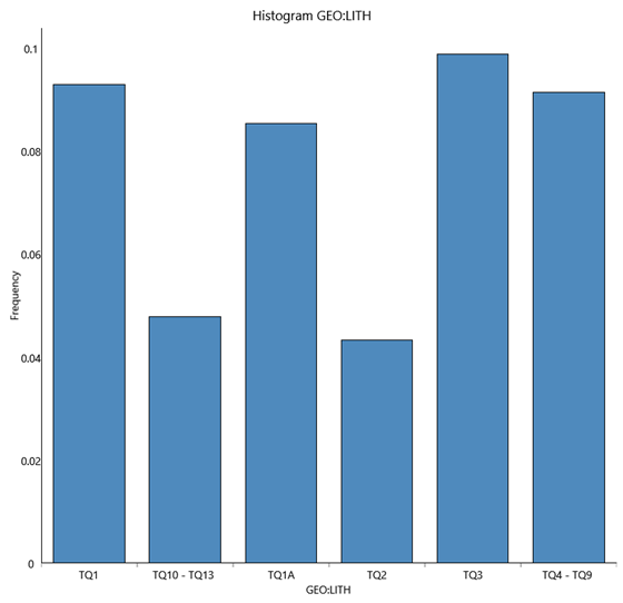
ExampleIn this example, the values for TQ10, TQ11, TQ12, and TQ13 were all combined into one bin. Then the bin was renamed to TQ10 - TQ13, and the values were chosen from the Available Values list and moved to the Selected Values list.

The resulting histogram is shown here.
-
-
-
Select the Show Statistics and Show Legend checkboxes to display annotations and legends. Enabling the Dock Statistics option will position the table below the chart.
Set the number of decimals to display in the legend.
Note: This will effect the display only. It has no effect on the precision of the numbers used in calculations.
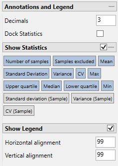
Enable the Show Statistics checkbox to display the statistics in the chart. You can select the specific statistics you want displayed by clicking on the various options.
Click Show Legend to toggle the legend display on and off.
Click and drag the legend with your mouse, or use the Horizontal and Vertical Alignment adjustments to customise the look of the chart.

