QQ Plot
Create a Quantile - Quantile plot.
Click for tutorial: Chart Viewing and Exporting
Instructions
Follow these steps:
-
On the ribbon, go to the Data tab, then click Open Data Source, then select the block model or database you want to analyse to load it into the Explorer Visibility column.
-
Select the variables you want to use from the Data Explorer column.
Note: You must have at least two datasets to create a QQ plot.
-
On the ribbon, go to the Stats tab, then click QQ Plot. After the QQ Plot has been created, the Properties column will display the options available to customise your chart.
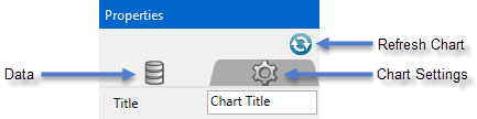
To refresh the chart, click the
 icon in the upper right corner.
Tip: To add additional data to the chart, you can drag and drop one or more variables from the Data Explorer column. The chart will be updated automatically.
-
The Properties column lets you edit the title, colours, and type of information that is displayed.
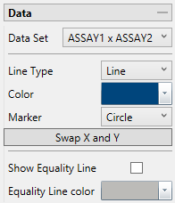
Data
Refresh Chart
To refresh the chart, click the
icon in the upper right corner.Data Set
Displays the datasets that are currently active and can be edited by adjustments made in the Properties pane.
Hint: More than one pair of datasets can be displayed on the same chart. Begin by highlighting all the pairs you want to display in the Data Explorer. Then on the Stats tab, the Settings group, select the icon labelled All variables on the same chart. When you click the button to generate the chart, all of the results will be shown on the same chart.
Line Type
Select between a scatter (points) or a line plot.
Color
Use the color chart to select the color of the data points on the chart. Multiple groups of datasets will automatically be assigned different colors.
Marker
Select from various shapes to customise the data points.
Swap X and Y
Click this button to reverse the X and Y axes.
Show Equality Line
Select this option to display the Equality line.
Equality Line Color
Use the color chart to select the color of the Equality line if the default color is not desired.
Axes
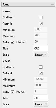
Auto fit
Select this option for the axes to be automatically set up based on the values found in the data.
Minimum / Maximum
Deselect Auto fit, then enter the minimum and maximum axes values.
Auto Interval
With this option checked, the interval will be automatically determined. Unchecked this option to enter a new interval.
Title
Enter a title for the axis.
Scale
Select the type of scale in which you want to view the data.
Show Legend
Toggle on and off the legend display.
Horizontal / Vertical Alignment
Click and drag the legend with your mouse, or use the Horizontal and Vertical Alignment adjustments to customise the look of the chart.

