Scatter / Line Plot
Create a scatterplot or line plot.
Click for tutorial: Chart Viewing and Exporting
Instructions
Follow these steps:
-
On the ribbon, go to the Data tab, then click Open Data Source, then select the block model or database you want to analyse to load it into the Explorer Visibility column.
-
Select the variable you want to use from the Data Explorer column.
Note: Select two datasets from the Data Explorer. The datasets do not have to be from the same data source. However, they must contain the same number of data entries.
 How the plot is created
In order to create the scatter, Vulcan Data Analyser first creates a spatial intersection between both sources. The points in the same location are merged and then used to compute the chart.

When a block model is involved, the calculations work a little different. The scatter plot uses the points inside each block and looks for the closest point to the centroid to create the match.
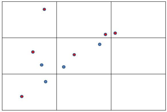
Figure 1: In this example, the red points are the closest to each centroid and therefore are a match.
-
On the ribbon, go to the Stats tab, then click Scatter / Line. After the chart has been created, the Properties column will display the options available to customise your chart.
To refresh the chart, click the
 icon in the upper right corner.
Tip: To add additional data to the chart, you can drag and drop one or more variables from the Data Explorer column. The chart will be updated automatically.
-
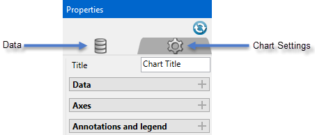
The Properties column lets you edit the title, colours, and type of information that is displayed.
Customising the Properties
Refresh Chart
To refresh the chart, click the
icon in the upper right corner.Data
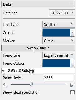
Data Set
Displays the datasets that are currently active and can be edited by adjustments made in the Properties pane.
Tip: More than one pair of datasets can be displayed on the same chart. Begin by highlighting all the pairs you want to display in the Data Explorer. Then on the Stats tab, the Settings group, select the icon labelled All variables on the same chart. When you click the button to generate the chart, all of the results will be shown on the same chart.
Line Type
Select between a scatter (points) or a line plot.
Colour
Use the colour chart to select the colour of the data points on the chart. Multiple groups of datasets will automatically be assigned different colours.
Marker
Select from various shapes to customise the data points.
Swap X and Y
Click this button to reverse the X and Y axes.
Trend Line
Select a trend line to be superimposed onto the chart. When a trend line is selected, the equation for the line will be displayed in the box below the Trend Colour selector.
Trend Colour
Select a colour for the trend line.
Point Limit
Use the slider to limit the number of data points that are displayed on the chart. This setting is not used in the calculation of the trend line, but only affects the display.
Show ideal correlation
Select this option to display the ideal correlation line (45°).
Axes
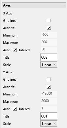
Gridlines
Select this option to display the major gridlines on the graph.
Auto fit
Select this option for the axes to be automatically set up based on the values found in the data.
Minimum / Maximum
Deselect Auto fit, then enter the minimum and maximum axes values.
Auto Interval
With this option checked, the interval will be automatically determined. Unchecked this option to enter a new interval.
Title
Enter a title for the axis.
Scale
Select the type of scale in which you want to view the data.
Simulation validation

Cutoff
Indicates a cutoff value for the estimation, generating 4 subareas for the scatter, the percentage of each area is displayed in the bivariate statistics.
-
Correct Positive: Both the real and estimated values are above the cutoff.
-
Correct Negative: Both the real and estimated values are below the cutoff.
-
False Positive: Only the estimated value is above the cutoff.
-
False Negative: Only the real value is above the cutoff.
Highlight outliers
Enter the number of outliers to be displayed.
Accuracy Tolerance (%)
Enter the tolerance to be used for the accuracy percentage.
Annotations and legend

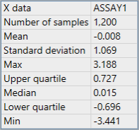
X & Y statistics
Click this option to display a list of statistics for each axis, such as the example below.
Bivariate statistics
Click this option to show a list of bivariate statistics, such as the example below.
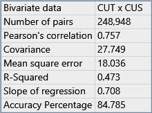
Pearson's correlation
Indicates the linear correlation between two variables.
Covariance
A measure of how much two variables vary together.
Mean square error
Indicates the error between the original and estimated data.
R-Squared
Indicates how close the data are to the fitted regression line.
Slope of regression
Indicates the slope of the lineal regression equation.
Accuracy Percentage
Indicates how many points have similar real and estimated value (with a default tolerance of 1%.
Decimals
Enter the number of decimals you wish to use in the statistical displays.
Size
Enter the font size that is to be used in the statistical displays. The default is 10.5.
Show Legend
Toggle on and off the legend display.
Horizontal / Vertical Alignment
Click and drag the legend with your mouse, or use the Horizontal and Vertical Alignment adjustments to customise the look of the chart.
-

