Property Editor
Editing object attributes
Click the Property Editor Panel icon to display the Property Editor Panel.
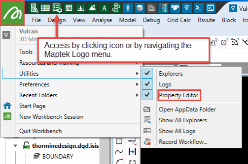
Another way to display the Property Editor Panel is to navigate to Workbench > Show/Hide Property Editor.
The panel will populate when an object is selected in the Vulcan window.
To edit a specific attribute, click in a field and enter the appropriate information. In the case of the colour, pattern and line type attributes, clicking in a field will require you to select items from a panel, such as the new colour, fill pattern etc. Read only attributes, that is unavailable fields, cannot be edited.
The following objects can be edited through the Properties Window:
Edit multiple objects at once
The Property Editor Panel can be used to edit multiple objects at the same time, i.e. it can be used when multiple objects have been highlighted. It can also be used to edit triangulations or block models.
Expand Collection Icon
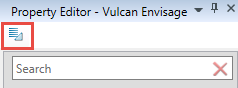
Click this icon to expand or collapse the groups (or collections) of properties.
2D Text
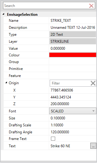
Name
Enter a new name for the selected object. Object names can contain up to 40 alphanumeric characters (spaces are not allowed).
Description
Enter a new description for the object. Object descriptions can contain up to 80 alphanumeric characters (spaces are allowed).
Type
This 'read only' field displays the object type.
Layer
This 'read only' field displays the layer in which the selected design object is stored.
Value
Enter a new object value.
Colour
Select a new colour for the highlighted object. The Colours panel will be displayed once you click within the available field.
Group
Assign/remove group codes from the selected object. Group codes allow you to group objects for editing purposes. Once grouped, they can be edited as a single entity rather than each object being edited individually.
Feature
Assign/remove features from the selected object. A feature is a set of pre-determined attributes, such as colour, line type or pattern.
Origin
This field allows you to alter the text object's position within the Primary Window. To view and alter the X, Y and Z coordinates, double-click on the Origin label.
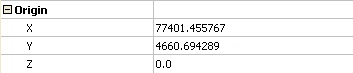
Click within the applicable field and enter a new coordinate value.
Font
Select a new font type for the highlighted text object. The drop-down list contains all fonts found within yourENVIS_RESO area. Refer to Fonts for information on the differences between fixed and transformable fonts.
Size
Enter the size, in plotter units, of the text on the plot. The specified value will also be used to define the size of the point markers on the plot.
Drafting Scale
Enter, as a ratio, the drafting scale, which is used in conjunction with the text size entered above.
For example, if the text size is set to '0.10 (10cm), and the drafting scale to '1:1250, then the text will appear on the screen the same size as an object that is 125 units long. Changing the scale, through either this option or the File > Plot > Plot All option to '1:1000 will result in the text appearing the same size as an object that is 100 units long. Changing the scale to '1:10 000 results in a text size of 1000 and so forth.
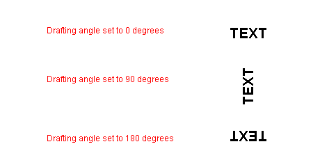
Drafting Angle
Enter the angle at which the text block will appear. Fixed fonts will always be displayed horizontally when viewed onscreen. The resulting text, however, will appear at the correct angle when plotted.
Frame Text
Select this check box to place a frame or box around the displayed text. This check box can only be used when using the Fixed font style.
Text
This field allows you to add and delete lines from the highlighted text objected. Click within the field to display the Text Lines panel.
The Text Lines panel displays each line of text within the highlighted text object. To edit an existing line of text, click within the appropriate field before entering the new text. A single text object can contain up to 60 lines of text with each line consisting of a maximum of 132 alphanumeric characters. Lines containing more than 132 alphanumeric characters will be truncated to the maximum.
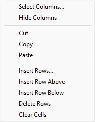
The panel utilises grid controls to manage the grid information, i.e. right-click context menus, that allow you to perform options such as hiding columns, cutting, copying, and pasting cells, and inserting and deleting rows. Right-click in the grid area to display the context menu. Descriptions of the available options are listed below.
 Grid Control Options
-
Use the Select Columns option to choose which grid columns to display in the panel, and optionally save the selection to a template for future use. Alternatively, select cells and click Hide Columns to hide the respective columns directly.
-
Select cells and use the Cut, Copy, and Paste options to duplicate or move cell entries.
-
Select a cell in a row of interest and use the various insert and delete row options to manage the records in the grid.
-
Click Clear Cells to clear the contents of a selection.
3D Text
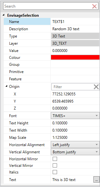
Name
Enter a new name for the selected object. Object names can contain up to 40 alphanumeric characters (spaces are not allowed).
Description
Enter a new description for the object. Object descriptions can contain up to 80 alphanumeric characters (spaces are allowed).
Type
This 'read only' field displays the object type.
Layer
This 'read only' field displays the layer in which the selected design object is stored.
Value
Enter a new object value.
Colour
Select a new colour for the highlighted object. The Colours panel will be displayed once you click within the available field.
Group
Assign/remove group codes from the selected object. Group codes allow you to group objects for editing purposes. Once grouped, they can be edited as a single entity rather than each object being edited individually.
Feature
Assign/remove features from the selected object. A feature is a set of pre-determined attributes, such as colour, line type or pattern.
Origin
This field allows you to alter the text object's position within the Primary Window. To view and alter the X, Y and Z coordinates, double-click on the Origin label.
Click within the applicable field and enter a new coordinate value.
Font
Select a new font type for the highlighted text object. The drop-down list contains all fonts found within your ENVIS_RESO area. Refer to Fonts for information on the differences between fixed and transformable fonts.
Text Height
Enter the height, in plotter units, for the text.
Text Width
Enter the width, in plotter units, for the text. Unlike 2D text, 3D text can be stretched horizontally and vertically by varying the ratio of the height to the width.
Map Scale
Enter the scale, as a ratio, used by the text height.
For example : If the text height is '0.1' (10cm) and the map scale is '1:1250', then the text will appear on the screen the same size as an object that is 125 units tall.
Horizontal Alignment
Select the horizontal positioning of the text, which can be left, centre or right justified.
Vertical Alignment
Select the vertical positioning of the text, which can be bottom, centre or top justified.
Horizontal Mirror
Select this check box to mirror the text horizontally.
Vertical Mirror
Select this check box to mirror the text vertically.
Use Italics
Select this check box if you want the text to be in italics.
Text
This field allows you to add and delete lines from the highlighted text objected. Click within the field to display the Text Lines panel.
The Text Lines panel displays each line of text within the highlighted text object. To edit an existing line of text, click within the appropriate field before entering the new text. A single text object can contain up to 60 lines of text with each line consisting of a maximum of 132 alphanumeric characters. Lines containing more than 132 alphanumeric characters will be truncated to the maximum.
The panel utilises grid controls to manage the grid information, i.e. right-click context menus, that allow you to perform options such as hiding columns, cutting, copying, and pasting cells, and inserting and deleting rows. Right-click in the grid area to display the context menu. Descriptions of the available options are listed below.
Grid Control Options
-
Use the Select Columns option to choose which grid columns to display in the panel, and optionally save the selection to a template for future use. Alternatively, select cells and click Hide Columns to hide the respective columns directly.
-
Select cells and use the Cut, Copy, and Paste options to duplicate or move cell entries.
-
Select a cell in a row of interest and use the various insert and delete row options to manage the records in the grid.
-
Click Clear Cells to clear the contents of a selection.
Arrows
Name
Enter a new name for the selected object. Object names can contain up to 40 alphanumeric characters (spaces are not allowed).
Description
Enter a new description for the object. Object descriptions can contain up to 80 alphanumeric characters (spaces are allowed).
Type
This 'read only' field displays the object type.
Layer
This 'read only' field displays the layer in which the selected design object is stored.
Value
Enter a new object value.
Colour
Select a new colour for the highlighted object. The Colours panel will be displayed once you click within the available field.
Group
Assign/remove group codes from the selected object. Group codes allow you to group objects for editing purposes. Once grouped, they can be edited as a single entity rather than each object being edited individually.
Feature
Assign/remove features from the selected object. A feature is a set of pre-determined attributes, such as colour, line type or pattern.
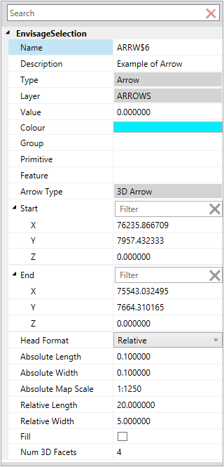
Arrow Type
This 'read only' field displays the arrow type, for example 2D Arrow or 3D Arrow.
Start
This field allows you to alter the arrow's star point in the Primary Window. To view and alter the X, Y and Z coordinates, double-click on the Start label.
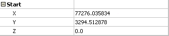
Click in the applicable field and enter a new coordinate value.
End
This field allows you to alter the arrow's last point in the Primary Window. To view and alter the X, Y and Z coordinates, double-click on the End label.

Click in the applicable field and enter a new coordinate value.
Head Format
This field controls the arrow head size. Select 'Absolute' if you want the arrow's head to have a fixed size. You can then specify the Absolute Length and Absolute Width (both in plotter units), as well as the Absolute Map Scale. The map scale value refers to the scale used when drawing the arrow head onto the screen).
Select 'Relative' if you want the arrow's head to have a size relative to the length of the arrow instead of an absolute size. The longer the arrow, the bigger the arrow's head. The Relative Length and Relative Width values need to entered as a percentage of the arrow length.
Fill
Select this check box to fill the arrow head with a solid pattern.
Num 3D Facets
Enter the number of facets in the arrow head's cone (a minimum of 3 and a maximum of 100). The higher the number of facets, the more the arrow head approximates a cone. This attribute only applies to 3D arrows.
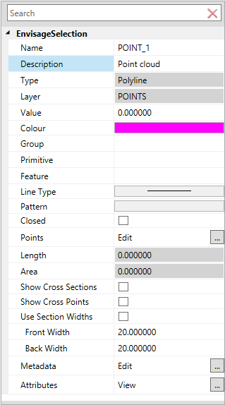
Points
Name
Enter a new name for the selected object. Object names can contain up to 40 alphanumeric characters (spaces are not allowed).
Description
Enter a new description for the object. Object descriptions can contain up to 80 alphanumeric characters (spaces are allowed).
Type
This 'read only' field displays the object type.
Layer
This 'read only' field displays the layer in which the selected design object is stored.
Value
Enter a new object value.
Colour
Select a new colour for the highlighted object. The Colours panel will be displayed once you click within the available field.
Group
Assign/remove group codes from the selected object. Group codes allow you to group objects for editing purposes. Once grouped, they can be edited as a single entity rather than each object being edited individually.
Feature
Assign/remove features from the selected object. A feature is a set of pre-determined attributes, such as colour, line type or pattern.
Line Type
Select a new line style for the highlighted object. The Line Style panel will be displayed once you click within the available field.
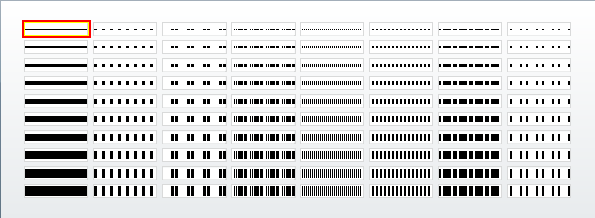
From the displayed panel, select the new line style.
Pattern
Select a new fill pattern for the highlighted object. The Patterns panel will be displayed once you click within the available field.
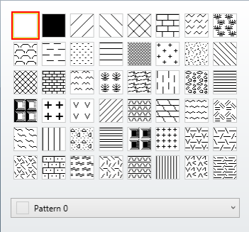
From the displayed panel, select the new fill pattern.
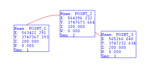
Points
This field allows you to alter the attributes for the individual points within the highlighted object. Click within the field to display the Object Points panel.
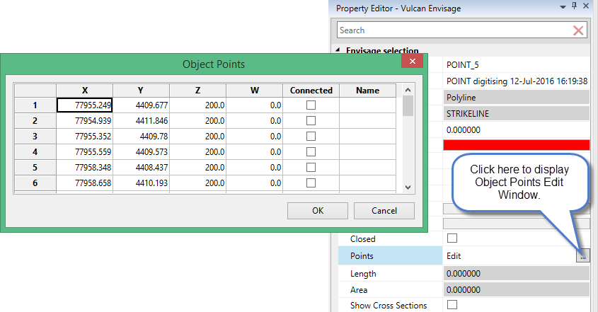
The Object Points panel allows you to edit the X, Y and Z coordinates for each point within the highlighted object. You also have the ability to connect/disconnect the available points and, if applicable, assign new point names. Closed connects the first and last points in the highlighted object while Closed and Connected informs whether or not all the points in the object are connected.
The panel utilises grid controls to manage the grid information, i.e. right-click context menus, that allow you to perform options such as hiding columns, cutting, copying, and pasting cells, and inserting and deleting rows. Right-click in the grid area to display the context menu. Descriptions of the available options are listed below.
Grid Control Options
-
Use the Select Columns option to choose which grid columns to display in the panel, and optionally save the selection to a template for future use. Alternatively, select cells and click Hide Columns to hide the respective columns directly.
-
Select cells and use the Cut, Copy, and Paste options to duplicate or move cell entries.
-
Select a cell in a row of interest and use the various insert and delete row options to manage the records in the grid.
-
Click Clear Cells to clear the contents of a selection.
Polylines
The following attributes are applicable to lines, polygons, splines, arcs and circles.
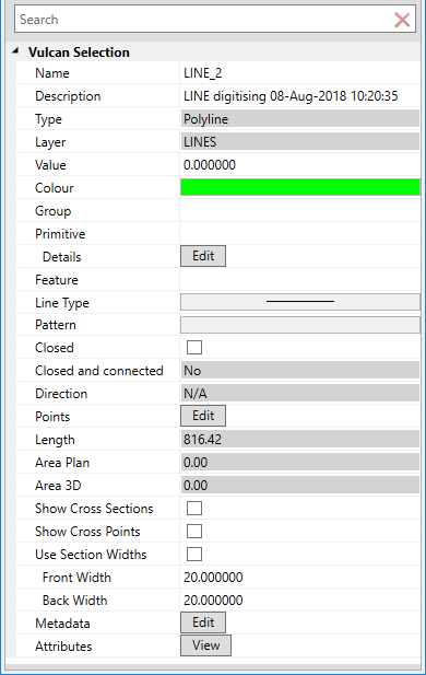
Name
Enter a new name for the selected object. Object names can contain up to 40 alphanumeric characters (spaces are not allowed).
Description
Enter a new description for the object. Object descriptions can contain up to 80 alphanumeric characters (spaces are allowed).
Type
This 'read only' field displays the object type.
Layer
This 'read only' field displays the layer in which the selected design object is stored.
Value
Enter a new object value.
Colour
Select a new colour for the highlighted object. The Colours panel will be displayed once you click within the available field.
Group
Assign/remove group codes from the selected object. Group codes allow you to group objects for editing purposes. Once grouped, they can be edited as a single entity rather than each object being edited individually.
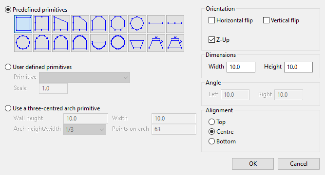
Primitive
Customise primitive design by clicking the Details button to display the panel.
Click here for detailed instructions.
Feature
Assign/remove features from the selected object. A feature is a set of pre-determined attributes, such as colour, line type or pattern.
Line Type
Select a new line style for the highlighted object. The Line Style panel will be displayed once you click within the available field.
From the displayed panel, select the new line style.
Pattern
Select a new fill pattern for the highlighted object. The Patterns panel will be displayed once you click within the available field.
From the displayed panel, select the new fill pattern.
Points
This field allows you to alter the attributes for the individual points within the highlighted object. Click within the field to display the Object Points panel.
The Object Points panel allows you to edit the X, Y and Z coordinates for each point within the highlighted object. You also have the ability to connect/disconnect the available points and, if applicable, assign new point names. Closed connects the first and last points in the highlighted object while Closed and Connected informs whether or not all the points in the object are connected.
The panel utilises grid controls to manage the grid information, i.e. right-click context menus, that allow you to perform options such as hiding columns, cutting, copying, and pasting cells, and inserting and deleting rows. Right-click in the grid area to display the context menu. Descriptions of the available options are listed below.
Grid Control Options
-
Use the Select Columns option to choose which grid columns to display in the panel, and optionally save the selection to a template for future use. Alternatively, select cells and click Hide Columns to hide the respective columns directly.
-
Select cells and use the Cut, Copy, and Paste options to duplicate or move cell entries.
-
Select a cell in a row of interest and use the various insert and delete row options to manage the records in the grid.
-
Click Clear Cells to clear the contents of a selection.

