Contact Profile
Use this option to create a contact matrix to determine hard verses soft boundaries. This is similar to the correlation matrix, but is graded by colour to show how hard or soft the boundaries are based on the differences between their average grades.
Instructions
Follow these steps:
-
On the Data ribbon, click Source Data to import your data into VDA. Any data source can be used as long as it contains the domain information, an assay value, and the X, Y, and Z coordinates.
-
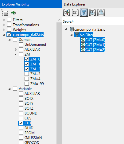
In the Explorer Visibility pane, select the domain(s) and variable(s) to use.
-
In the Data Explorer pane, select the data.
-
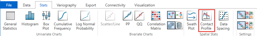
On the Stats ribbon, select Contact Profile.
Note: The icon will be disabled if the data selected is invalid for some reason.
-
In the Properties pane, set the Max Distance and Step Size, then click the green arrow to generate the charts.

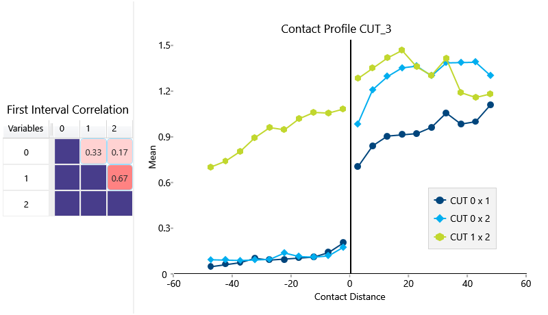
The results will be shown with the correlation matrix displaying the relationship between the first intervals.
Click on any of the matrix cells to isolate a correlation on the graph. Click any empty cell to display all correlations at the same time.
You can select more than one cell by holding down the control key and making your selection.
The small icons at the bottom of the chart window allow you to customise the contents of the chart.

