Editing & Modelling a Semivariogram
After an experimental variogram has been made, these parameters can be used to generate the model variogram.
Properties tabs
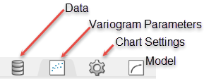
Data Tab
Data Sets
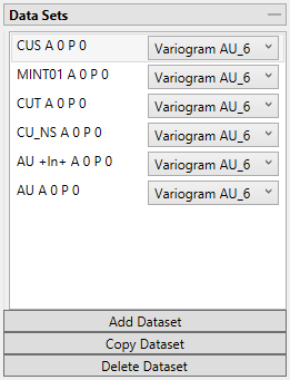
Add Dataset
Select the chart to which you wish to add data. Then select the data group from the Data Explorer that you wish to add. Last, click on the  button. The data will be added to the chart using the same parameters as the existing dataset already on the chart.
Copy Dataset
Select a dataset from the list to highlight it, then click the  button to create a copy of the dataset on the chart.
Delete Dataset
Select a dataset from the list to highlight it, then click the 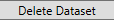 button to delete the dataset from the list and the chart.
Variogram Parameters Tab
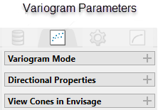
Variogram Mode
Refresh Chart
To refresh the chart, click the ![]() icon in the upper right corner.
icon in the upper right corner.
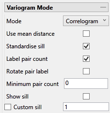
Mode
Note: The list of modes available for use depends on the type of variogram you are modelling. Depending on what type of variogram you are modelling, some of these modes might not be available.
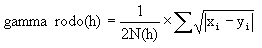
This is the standard semi variogram.
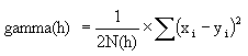
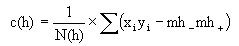
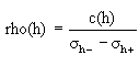
This is like the standard semi variogram, but divided by the mean of the data values.
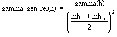
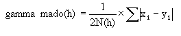
This is like the standard semi variogram, but each difference is divided by the mean of the sample values.
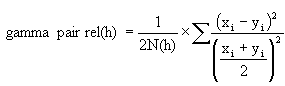
sqrt(Semivariogram) / Madogram
Transform data as  and compute the semivariogram
where:
Use mean distance
Use the mean distance for the x coordinate of the variogram points.
Standardise sill
Select this check box if you want to standardise the variogram sill by dividing the results by the sample variance. This is useful when calculating a semivariogram because instead of reaching the sill at the sample variance it will reach it at 1.
Label pair count
Select this option to display the number of pairs used for each point on the graph.
Rotate pair count
This option displays when Label pair count is selected. Select this option to rotate the number labels of the pairs so that they are oriented 90 degrees upward.
Minimum pair count
Enter the lowest number of pairs that you want to be used to influence the variogram model.
Show sill
Select this option to show the sill.
Custom Sill
Select this option to enter your own value for the sill.
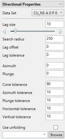
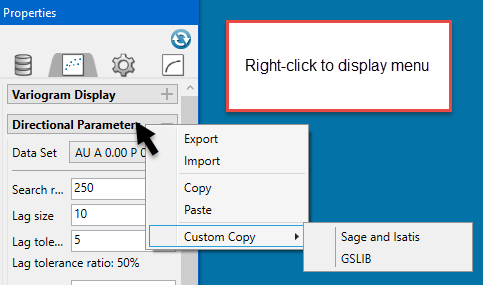
Directional Properties
Right-click on Directional Properties bar to display a context menu. From there, you can select options to copy the parameters of the variogram and paste them into a Microsoft Word or Microsoft Excel document as a table.
Selecting Custom Copy will copy the rotation information into a format usable with Sage, Isatis, and GSLIB
Tip: A red border will warn you when an entry is not a number or has an incorrect format.
Data Set
The current data set that is being display on the chart is listed, showing the azimuth and plunge angle.
Lag size
Set a lag size that coincides with your data spacing. If you have to err, do so on the side of too small.
Search radius
The search radius should correspond to approximately half of your data field. Past the halfway point the search will over-extend the edge of the data.
Lag tolerance
Set the distance within which to use samples. If this is set to 0, then the tolerance is not used.
Azimuth
Enter the azimuth. This parameter controls the azimuth direction in which variography is evaluated.
Plunge
Enter the plunge. This parameter controls the plunge direction in which variography is evaluated.
Azimuth tolerance
Enter the limit on the angle between two samples as measured in the plane of the plunge of the variogram.
Plunge tolerance
Enter the limit on the angle between two samples as measured in a vertical plane in the direction of the azimuth.
Note: A combination of cone, azimuth and plunge tolerances is used if the azimuth angle tolerance and plunge angle tolerance are set to less than the cone angle tolerance.
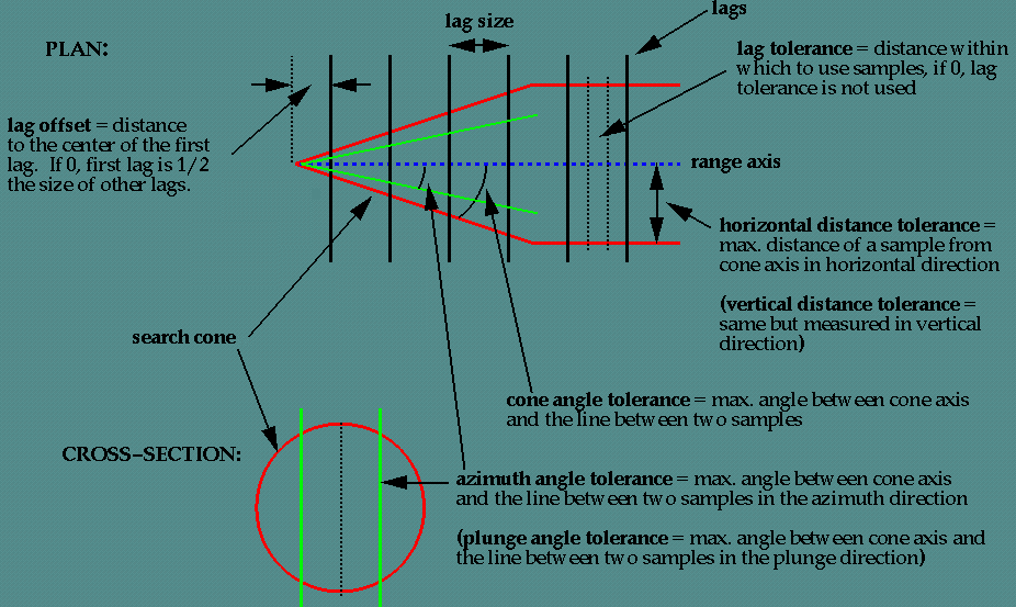
Figure 1 : Cones of tolerance.
Horizontal tolerance
Enter the horizontal distance limit on sample pairs. Any acceptable sample must be within this horizontal distance of the centre of the variogram cone.
Tip: Set this value to a typical spacing (or larger) between your data, for example, if your data is on a 100 × 100 × 10 grid, set a horizontal distance of 100 and a vertical tolerance of 10. If you receive too few sample pairs, try increasing the tolerances to capture more data otherwise artifacts such as "hole effects" may occur.
Vertical tolerance
Enter the vertical distance limit on sample pairs. Any acceptable sample must be within this vertical distance from the centre of the variogram cone. The vertical distance is measured from the plane of the plunge of the variogram cone.
Using too large a "cone" can result in excessive mixing of samples from different directions. This can cause the apparent anisotropy to appear smaller than the true anisotropy. Using too small a cone can result in rough variograms that are hard to interpret. The sample cone may be too small if the number of sample pairs for most lags is small compared to the number of sample points.
For an omnidirectional variogram, use 90 for the azimuth tolerance and 90 for the cone angle tolerance.
Note: At a great enough distance, the horizontal distance tolerance and vertical distance tolerance will clip the sides of the search cone.
Unfolding
The unfolding option is used in the case of deformed strata bound deposits. This can be applied to deposits where mineralisation is controlled by a structural surface that can be modelled. The specification file from a Grid Model is used.
Backtransform Normal Score
This option simulates the back transformation of the current variogram into the real variable, which is usually easier to model.
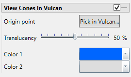
View Cones in Vulcan
You can visualise the search ellipses by enabling the option to View Cones in Vulcan, or by clicking Display Cones from the Connectivity tab in the ribbon. The cones are interactive, therefore, any changes made in the variogram parameters will be automatically reflected in the cones seen in Vulcan.
Steps
-
Begin by clicking the button labelled Pick in Vulcan.
-
In the Envisage workspace, click where you want the origin of the cones to be displayed.
-
Use the slider to adjust the Translucency of the cones.
-
Set the colours for the cone by clicking on Colour 1 and Colour 2, then selecting a colour from the palette.
-
To remove a the cone from the screen, disable the View Cones in Vulcan checkbox.
After you have set the parameters for a cone, it can be displayed using the icons found on the Connectivity tab on the ribbon.
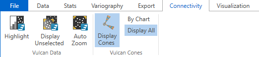
Click Display Cones, then select either By Chart or Display All.
By Chart - Only the charts that have the View Cones in Vulcan option enabled will be displayed.
Display All - All cones will be displayed regardless of whether or not the View Cones in Vulcan option has been enabled.
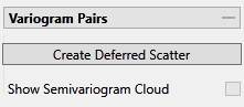
Create Deferred Scattered
Each variogram point is the average of a collection of points that have a distance (h) from the origin point. Therefore, each variogram point can generate a correlation between the origin point and the others inside the indicated neighbourhood.
First, select a point from the variogram.
Tip: To select multiple points and create more than one chart at once, hold down the CTRL key while selecting the points.
Next, click the Create Deferred Scatter button to create the chart.
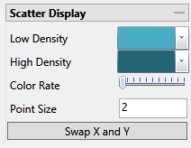
Low Density
Select a colour for scatter points that are located in low density areas of the chart.
High Density
Select a colour for scatter points that are located in high density areas of the chart.
Colour Rate
This controls the density threshold that is needed to pass from high density colour to the low density colour. If the slider is all the way to the left, then the sensitivity will be high, meaning that most of the data points will be displayed as high density points. As the slider is moved to the right, the sensitivity will be lowered and more and more points will be displayed as low density points.
Point Size
This controls the size of the points.
Show Semivariogram Cloud
A variogram cloud is another way of looking at the data. It is useful for finding outliers.
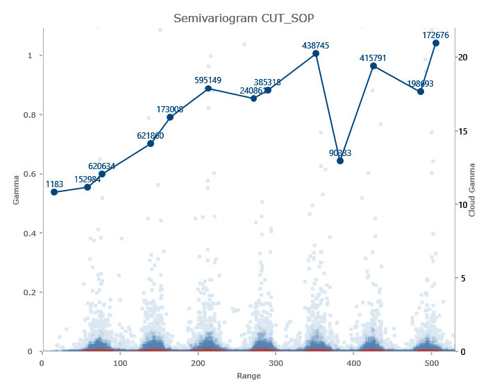
The same type of colour options that control the deferred scatter plot also control the point cloud in this chart.
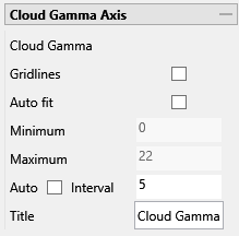
You can adjust the axis on the right side of the chart by editing the Auto Interval setting, then clicking the ![]() button at the top of the Properties panel.
button at the top of the Properties panel.
Chart Settings Tab
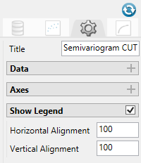
Title (optional)
By default, the title is filled in with the <mode> + <dataset name>. The mode can be selected by using the dropdown list found under the Variogram Parameters tab. However, you may enter your own title by replacing the default entry, or remove the title by deleting the text.
Data
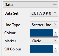
Data Set
The current data set that is being display on the chart is listed, showing the azimuth and plunge angle.
Line Type, Colours and Markers
Use the drop-down menus to select the line type, colours, and markers to customise the charts.
Axes
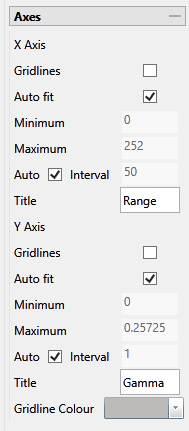
Gridlines
Select this option to display the gridlines at major intervals on the chart. You can elect to display gridlines for both axes or just one, depending on your needs.
Auto fit
By default, Vulcan Data Analyser will auto fit the axes based on the values calculated from the dataset. However, you can customise the axes to highlight your particular study and needs. This can be done in two ways:
Method One
-
Deselect Auto fit.
-
Set a Minimum and Maximum range.
-
Let Vulcan Data Analyser adjust the intervals automatically by leaving the Auto Interval option selected.
Method Two
-
Deselect Auto fit.
-
Set a Minimum and Maximum range.
-
Deselect Auto Interval, then enter an interval of your choice.
Axes Titles
By default, the axes are provided with the traditional titles of Gamma and Range. However, if you wish to change these you may do so by replacing the text in each of the textboxes.
Gridline Colour
Click the arrow to display the colour palette, then select a colour for the gridlines.
Clicking the Advanced button will bring up a dialog which will allow you to customise the colour to you exact specifications.
Show Legend
By default, the legend is automatically displayed. If you do not want to see the legend simply uncheck the checkbox in the upper right corner.
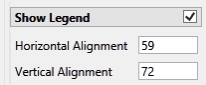
Horizontal and Vertical Alignment
Position the chart legend by left-clicking on it with your mouse and dragging it to the desired location. It is also possible to position the legends by typing in a number between 0 and 100 into the textbox. If you do not want to see the legend simply uncheck the checkbox in the upper right corner.
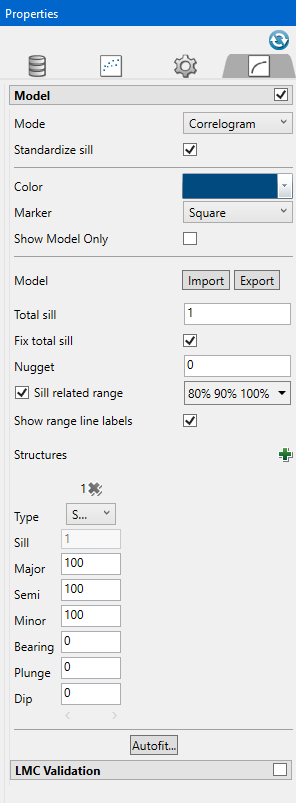
Model Tab
Model
Mode (To refresh the chart, click the icon in the upper right corner..)
Standardize sill
Select this check box if you want to standardise the variogram sill by dividing the results by the sample variance. This is useful when calculating a semivariogram because instead of reaching the sill at the sample variance it will reach it at 1.
Colour and Marker
Use the drop-down menus to select the colours and markers to customise the charts.
Show Model Only
Select this option to show only the model and hide the experimental variogram data.
Model Import / Export
A model can be imported in or exported out. The files are stored as <filename>.vrg. The models that are exported out can be used in block model estimations .
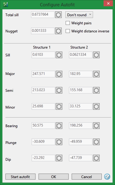
Total Sill
Click the Fix total sill checkbox to enable this option. If you do not know the exact sill, enter a number that is close. Start with a whole number or a number rounded to 0.5 and work from there. The sill you choose will not affect the model calculations. It will only affect how you are able to see it on the chart.
The total sill is equal to the nugget plus all the structures such that
Total Sill = Nugget + Structure 1 + Structure 2 +... + Structure n
Nugget
You can enter the nugget obtained from the down hole variogram or enter another nugget. The default nugget is 0.
The nugget is the variance at an infinitely small separation distance.
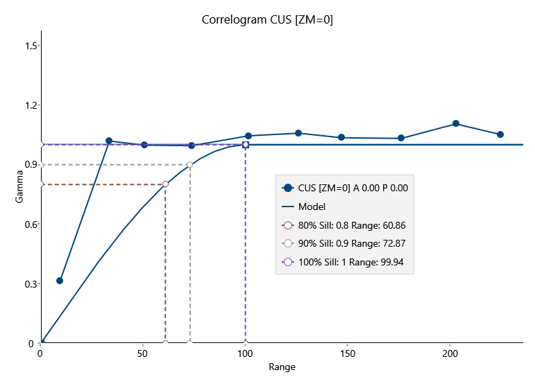
Sill related range
Use this option to add up to three vertical lines showing where the range would intersect the sill.
Show range line labels
Use this to display the legend for the range lines.
Structures
Additional structures can be added by clicking the green ![]() icon.
icon.
Use the red ![]() icon to delete a structure.
icon to delete a structure.
Type
|
General |
This option will be used most of the time. Use this if the experimental variogram has a standard look. |
|
Zonal Anisotropic |
Use the Zonal option when the range of the experimental variogram is extremely long. Typically, the variogram may never reach the sill. With this option, the search distance of at least one direction must be set. |
|
Cyclic Anisotropic |
User the Cyclic option when the experimental variogram looks like a sine wave as it approaches the sill. Only two types of structures are available when this option is selected: Periodic and Hole Effect. With this option, the search distances for two of the three directions must be set to a maximum distance of 999999. |
|
Isotropic |
This option is similar to the General option. However, all search distances will be the same for each direction. |
Define the type of structure by choosing from the drop-down list.
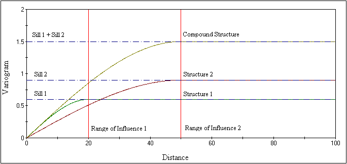
In some instances, a variogram cannot be characterised by one of the model variograms described previously. However, a combination of models may adequately represent such behaviour. The final variogram structure is therefore termed a nested structure. Spherical models are often nested, with each component model reflecting a particular scale of variability in the deposit. Modelling of nested structures is generally by trial-and-error.
Search Distances & Orientation
Enter the search distances into the Major, Semi-major and minor textboxes. Then enter the orientations into the Bearing, Plunge and Dip. You can see the affect altering the orientation of the search parameters will have on the model by adjusting the sliders.
Autofit
Click Autofit to display the Configure Autofit panel.
Limiting the region
To the left of the textboxes are small icon like those shown below. Each icon has three states. Click on an icon to change its state. These icons allow you to control how tightly the values are locked during the iterations.
From top to bottom the three states are:
![]() Freeze value - the value is not allowed to change.
Freeze value - the value is not allowed to change.
![]() Freeze region - the value is allowed to change only within 15%.
Freeze region - the value is allowed to change only within 15%.
![]() No Freeze - there is no limit.
No Freeze - there is no limit.
Total sill
This is the sum of the nugget plus the each of the sills of the nested structures. With the range icon set to Unfreeze or In range, you can enter the desired sill. If you do not know the exact sill, enter a number that is close. Start with a whole number or a number rounded to 0.5 and work from there. The sill you choose will not affect the model calculations. It will only affect how you are able to see it on the chart.
The total sill is equal to the nugget plus all the structures such that
Total Sill = Nugget + Structure 1 + Structure 2 +... + Structure n
Nugget
You can enter the nugget obtained from the down hole variogram or enter another nugget. The default nugget is 0.
The nugget is the variance at an infinitely small separation distance.
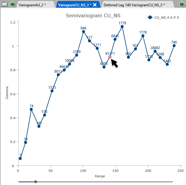
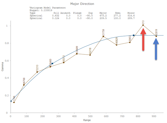
Weighted Pairs
Weighting is a way of preventing points made up of a low number of pairs from having too much influence on the modelled variogram. In the image below, the red arrow is pointing to a point that is made up of 213 pairs and the blue arrow is pointing to a point made up of 82,819 pairs. Notice how the model almost ignores the point made up of 213 pairs. That is because weighting has been applied. If no weighting had been applied then the model would have treated both points equally and would have shown less correlation than what actually exists.
Weight Distance Inverse
With Weight Distance Inverse, the greater the distance, the less influence a point will have. Select this option if you have points at the extreme ends of the experimental variogram that are made up of a large number of pairs. By weighting them this way their influence will be reduced.
Sill
This shows the sill for each structure.
Direction, Plunge and Dip
These show the results from each structure. In most cases, consideration should be given to what the geological orientation of the deposit is like verses what may result from an experimental variogram. Sampling errors or bias can effect the results of a variogram.
Start autofit
Click this to begin fitting your model. A progress bar will show you the progress. You can also hover your mouse over the Stop Autofit button to see how many iterations have been calculated and the error between one iteration and the next. You do not need to wait until the autofit function completes. You can stop it at any time. The model will be drawn in realtime on the chart and you will be able to see the changes as the autofit function calculates through the iterations.
OK
Click to save the edits and exit the panel.
Cancel
Click to exit the panel without saving.

