Create a Swath Plot
Use this option to create a sectional graph through a block model in a specific direction. The plot will show the average grade for the blocks in the swath. You can also display a histogram on the same chart showing the number of samples used within each distance interval.
Instructions
Follow these steps:
-
On the ribbon, go to the Data tab, then click Open Data Source, then select the block model or database you want to analyse to load it into the Explorer Visibility column.
-
Select the variable you want to use from the Data Explorer column.
-
On the ribbon, go to the Stats tab, then click Swath Plot. The Properties column will display the options available to customise your chart.
-
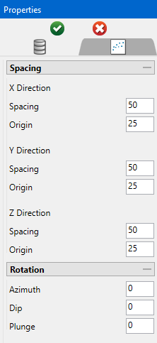
Set the Spacing interval for the X, Y, and Z directions. This is related to how wide the swath bands will be. The lower the spacing number, the more swath bands that will be used.
Tip: After the charts have been created, the spacing can be adjusted by using the sliders under each chart.
-
Set the Origin for the X, Y, and Z directions. This will control where the swath bands start in relation to the extents of your data.
If you are evaluating a block model with 50 meter blocks, you might set the spacing of 50m to cover a one-block width, with an origin offset of 25 meters so that the swath transects the middle of the blocks. If the swath transect was right on the border of the block, it could produce erroneous results.
-
Enter any customised rotations for Azimuth, Dip, and Plunge.
-
Click the green check icon
 at the top of the Properties column to create the swath plot.
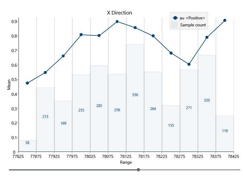
-
After the swath plot has been created, you can customise the chart.
-
You can change the size of the slice with a slider found at the bottom of the chart.
-
Display options on the Parameters tab.
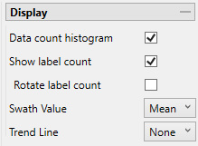
Option Result Data count histogram Display a histogram on the swath plot reflecting the values. Show label count Label each bin of the histogram. Rotate label count Rotate the labels vertically. Swath Value Select the type of evaluation. Trend Line Select the type of trend line.
-
Settings found on the Chart Settings tab.
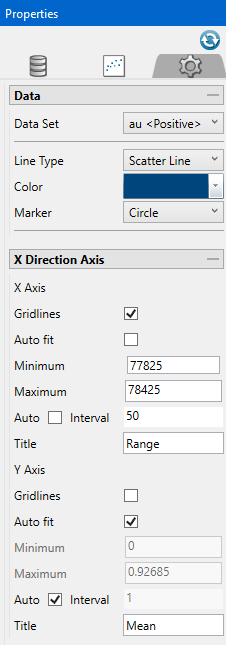
Option Result Data Set Select the dataset that the chart will reference. Line Type Select a line style. Colour Select the colour scheme. Marker Select the shape of the points displayed in the chart. Gridlines Display gridlines for either the X or Y direction. Auto fit Select this option for the axes to be automatically set up based on the values found in the data.
Minimum/Maximum Deselect Auto fit, then enter the minimum and maximum axes values.
Auto Interval With this option checked, the interval will be automatically determined. Unchecked this option to enter a new interval.
Title Enter a title for the axis.
NoteYou can also adjust the settings found on the ribbon on the Visualisation tab, in the Styles and Chart Size groups.
For information on setting font styles and chart sizes see Visualisation.
-

