Boxplot
Create a boxplot.
Instructions
Follow these steps:
-
On the ribbon, go to the Data tab, then click Open Data Source, then select the block model or database you want to analyse to load it into the Explorer Visibility column.
-
Select the variable you want to use from the Data Explorer column.
Note: You can select more than one variable if you want to see multiple box plots on the same chart.
-
On the ribbon, go to the Stats tab, then click Box Plot. After the chart has been created, the Properties column will display the options available to customise it.
To refresh the chart, click the
 button in the upper right corner.
Tip: To add additional data to the chart, you can drag and drop one or more variables from the Data Explorer column. The chart will be updated automatically.
-
Use the Properties column to edit the title, colours, and type of information that is displayed.
Customise the chart colours
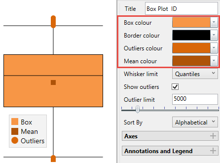
Whiskers have the following options:
-
Quantile: uses 2.5% and 97.5% of the data for the whisker limits.
-
All Data: uses all the data for the whiskers, no outliers exist in this case.
-
2x Standard deviation: uses the Mean ±1 Standard Deviation.
-
3x Standard deviation: uses the Mean ±1.5 Standard Deviation.
-
1.5 x Interquantile: 1.5 times the Interquantile Range below and above the first and third quantiles respectively.
Outliers
You can set an option to display the outliers or not. If you decide to display the outliers, you can adjust the threshold by entering the value into the textbox or by using the slider control.
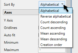
Sort By
Sort the data by selecting from the drop-down list.
Axes
Use these options to customise the amount of information displayed in the axes of the chart.
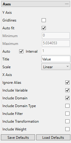
Option Result Gridlines Select this to include gridlines in the chart at each interval. Auto fit Select this option for the axes to be automatically set up based on the values found in the data. Minimum / Maximum Deselect Auto fit, then enter the minimum and maximum axes values. Auto Interval With this option checked, the interval will be automatically determined. Unchecked this option to enter a new interval. Title Enter a title for the axis. Scale Select the type of scale in which you want to view the data by using the drop-down list. Ignore Alias Enabling this option will allow the chart to display the actual variable name(s) instead of the alternate name that may have been provided as an alias. Include Variable Set the variable that is currently being analysed as the default that will be used the next time the defaults are restored. Include Domain Set the domain that is currently being applied as the default that will be used the next time the defaults are restored. Include Domain Type Set the domain type that is currently being applied as the default that will be used the next time the defaults are restored. Include Filter Set the filter that is currently being applied as the default that will be applied the next time the defaults are restored. Include Transformation Set the transformation that is being applied as the default that will be applied the next time the defaults are restored. Include Weight Set the weight that is currently being applied as the default that will be used the next time the defaults are restored. Save Defaults Click this button to save the current settings as the default settings. Load Defaults Click this button to load and apply the previously saved default settings to the current chart. Annotations and legend
You can display annotations and legends (which are turned off by default) by enabling the Statistics and Show Legend checkboxes. Enabling the Dock Statistics option will position the table below the chart.
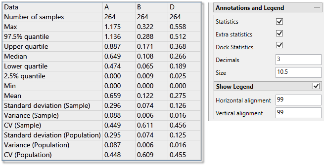
Decimals
Set the number of decimals places.
Size
Set the font size.
Horizontal / Vertical Alignment
Click and drag the legend with your mouse, or use the Horizontal and Vertical Alignment adjustments to customise the look of the chart.
-
