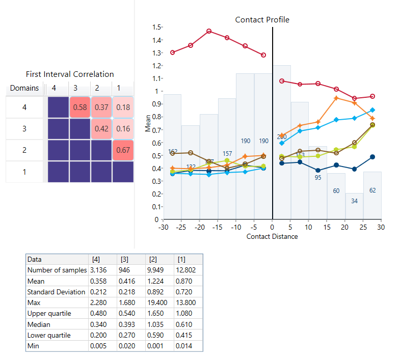
Contact Profile
Use this option to create a contact matrix to determine hard verses soft boundaries. This is similar to the correlation matrix, but is graded by colour to show how hard or soft the boundaries are based on the differences between their average grades.
Instructions
Follow these steps:
-
On the Data ribbon, click Source Data to import your data into VDA. Any data source can be used as long as it contains the domain information, an assay value, and the X, Y, and Z coordinates.
-
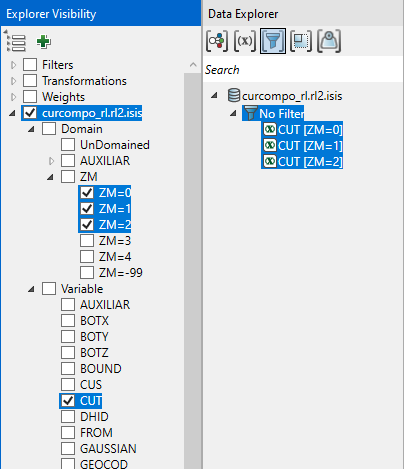
In the Explorer Visibility pane, select the domain(s) and variable(s) to use.
-
In the Data Explorer pane, select the data.
-
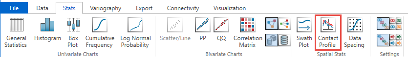
On the Stats ribbon, select Contact Profile.
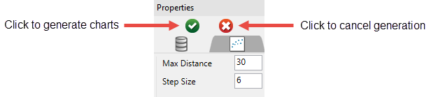
Note: The icon will be disabled if the data selected is invalid for some reason.
-
Click the green arrow in the Properties pane to generate the charts.
The result:
-
You can make adjustments to the way information about your chart is displayed by editing the settings in the Properties pane.
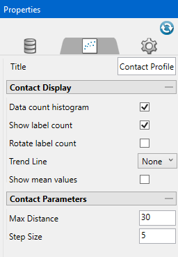
Title Replace the default title with a title of your choice. Data count histogram Display a superimposed histogram. Show label count Display the number of samples per histogram bin. Rotate label count Rotate the labels to a vertical orientation. Trend Line Display a trend line by selecting the type from the drop-down list. Show mean values Display lines on the graph showing the mean value of each variable. Max Distance Enter the maximum distance away from the contact line that samples will be included. Any sample located beyond this distance will not be used in the analysis. Step Size Enter the number of increments the max distance into which the max distance will be divided. 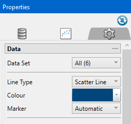
Data Set Use the drop-down list to select which data set is currently being customised. Line Type Select a line type from the drop-down list. Colour Select a colour from the colour palette. Note that this option can only be edited when a single data set has been selected from the Data Set drop-down list. Marker Select the shape of point marker from the drop-down list. 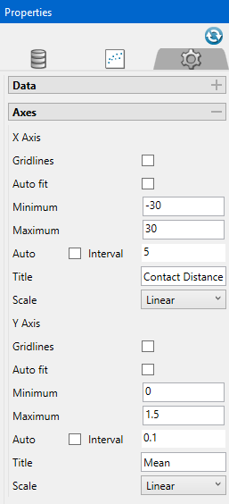
Gridlines Display gridlines on the chart. Auto fit Allows Vulcan Data Analyser to automatically set the minimum and maximum values. Minimum Sets the minimum value displayed in the chart. Maximum Sets the maximum value displayed in the chart. Auto Allows Vulcan Data Analyser to automatically set the axis interval. To customise the interval, disable this option and enter a new interval in the space provided. Title Enter a title for the X and Y axes. Scale Select the type of scale to use for each axis by using the drop-down list. 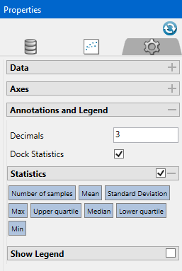
Decimals Dock Statistics Dock the statistics panel below the chart. Statistics Once enabled, you can select or deselect any of the statistical measurements to display on the statistics panel. Move the location of the statistics panel by clicking and dragging it to the desired location. Show Legend Enable this option to display the chart legend. Once displayed, you can click and drag it with your mouse, or edit the horizontal and vertical alignment settings to position it where you want. TipAdjust the font style and size by clicking the Visualisation tab at the top of the Vulcan Data Analyser panel, then clicking Font Styles.

