Advanced Statistics
Graph Type
Use the Advanced Statistics option to generate statistics and graphs. The graphs can be displayed in Vulcan as well as generated directly in Microsoft Excel.
Instructions
On the Analyse menu, point to Statistics, and then click Advanced Statistics to display the following panel.
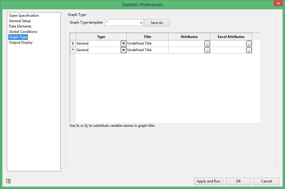
The current state of the Graph Type section, that is, graph titles and attributes, can be saved in a nominated template. The template name can be manually entered or selected from the drop-down list. Use the Save As button when you are ready to save the template. If the chosen template already exists, then you will need to confirm whether or not you want to overwrite it.
Type
Select a graph type from the drop-down list.
Use the Entry listing to export the data that was used in the statistical analysis to a nominated file.
The Joint and Multivariate listings generate statistics rather than graphs. Refer to the Terminology section for more information.
Title
Enter a title for the graph.
Attributes
Configure the data attributes for the resulting graph in this column. Click ![]() to display the Attributes panel and configure the attributes for the associated graph.
to display the Attributes panel and configure the attributes for the associated graph.
The options contained in the displayed panel are dependant upon the chosen graph type. Click on the listings below to display information on the displayed panels.
This column is not applicable to the Joint, Multivariate and Ternary listings.
This option generates univariate statistics but does not produce a graph. Univariate statistics include:
-
Average
-
Standard deviation
-
Median
-
Skewness
-
Geometric mean
-
Harmonic mean
-
Mean of logs
-
Variance of logs
-
Kurtosis
-
Sichel T
-
Quartiles
-
Percentage distribution listing
Select as many variables as you want to analyse. Each variable is analysed separately. For example, if you have a composite database with an AU field and a AG field and also a block model with an AU field and an AG field, when you select these 4 variables, you will get 4 statistics, one for each variable.

Apply a weighting
Select this check this box to apply a weighting. The weighting variable is specified once the data has been selected. The weighting variable must have the same length as the data variable to which it is applied, i.e. the same number of data values.
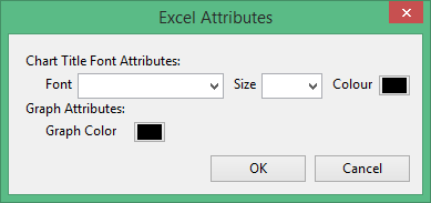
Excel Attributes
Use this panel to configure the font settings, including the font type, size, and colour, for the text elements within the graph.
Click OK to return to the Graph Type section of the Statistics Preferences interface.
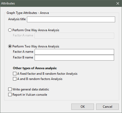
Analysis title
Enter a title for the analysis (a maximum of 40 alphanumeric characters).
Specify whether you want to perform One-Way ANOVA analysis or Two-Way ANOVA analysis. You will need to identify the factors used. When performing Two-Way ANOVA analysis, you will have the ability to nominate whether the factors are to be fixed or random.
Write general data statistics
Select this check this box if you want to display the general statistics with the graph.
Report in Vulcan console
Select this check this box if you want to display the resulting analysis within the Report Window as well as through the Graph window. If the check box is not selected, the analysis will only display through the Graph window.
This plot type produces a simple graphical summary of a set of data, allowing you to display a measure of central location (the median), two measures of dispersion (the range and inter- quartile range), the skewness (from the orientation of the median relative to the quartiles) and potential outliers.
The Attributes panel consists of the following tabbed sections;
General tab
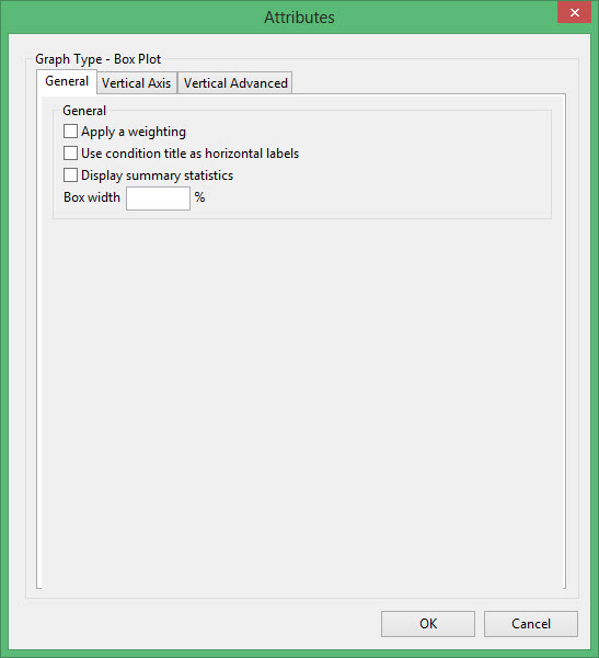
Apply a weighting
Select this check this box to apply a weighting. The weighting variable is specified once the data has been selected. The weighting variable must have the same length as the data variable to which it is applied, i.e. the same number of data values.
Use condition title as horizontal labels
Select this check box to use the condition title instead of a numeric ID. If this check box is not checked, then D<n> (where <n> refers to the distribution number, for example D1, D2, D3 etc.) will be used for each horizontal label.
Display summary statistics
Select this check box to display a summary of the statistics that were used to construct each box. The summary statistics we also contain the standard deviation and the number of samples.
Box width
Enter the width of each box in the resulting graph. The width value is entered as a percentage.
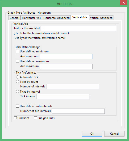
Vertical Axis tab

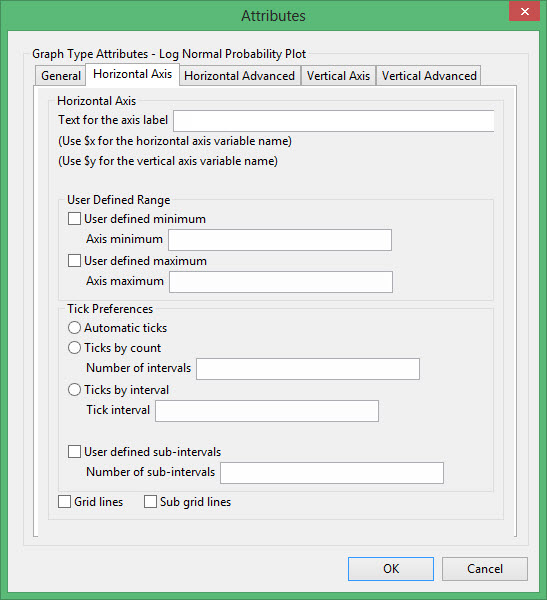
Text for axis label
Enter the axis title (a maximum size of 40 alphanumeric characters). $x can be used for the horizontal axis variable name, while $y can be used for the vertical axis variable name.
User Defined Range
User defined minimum/maximum
Select these check boxes if you want to manually define the range of the axis. The minimum and maximum values can contain up to 6 decimal places. If these boxes are not selected, the system will find the minimum and maximum from the data.
Check marks can be controlled or generated automatically.
Automatic ticks
Select this option to let the system decide where to place the ticks.
Checks by count
Select this option to specify the number of ticks. The interval between ticks is the quotient of the horizontal range and this value.
If the horizontal range is 20, and the number of ticks is '5', then ticks will be placed at 4, 8, 12, 16 and 20.
Checks by interval
Select this option to specify the distance between ticks.
For example If the horizontal range is 20, and the check interval is '5', then the ticks will be placed at 5, 10, 15 and 20.
User defined subintervals
Select this check this box if you want to use subintervals, which are smaller check marks placed between the major check marks. You will need to specify the distance between these smaller check marks.
If the interval between major check marks is 10, and the interval between minor check marks is '2', then the minor check marks will be placed at 2, 4, 6 and 8.
Grid lines
Select this check this box if you want to replace check marks with grid lines.
Sub grid lines
Select this check this box if you want to replace subinterval check marks with sub grid lines.
User defined minimum/maximum
Select these check boxes if you want to manually define the range of the axis. The minimum and maximum values can contain up to 6 decimal places. If these check boxes are not selected, the system will find the minimum and maximum from the data.
User defined subintervals
Select this check box if you want to use subintervals, which are smaller check marks placed between the major check marks. You will need to specify the distance between these smaller check marks.
Grid lines
Select this check box if you want to replace check marks with grid lines.
Sub grid lines
Select this check box if you want to replace subinterval check marks with sub grid lines.
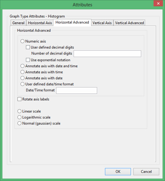
Vertical Advanced tab
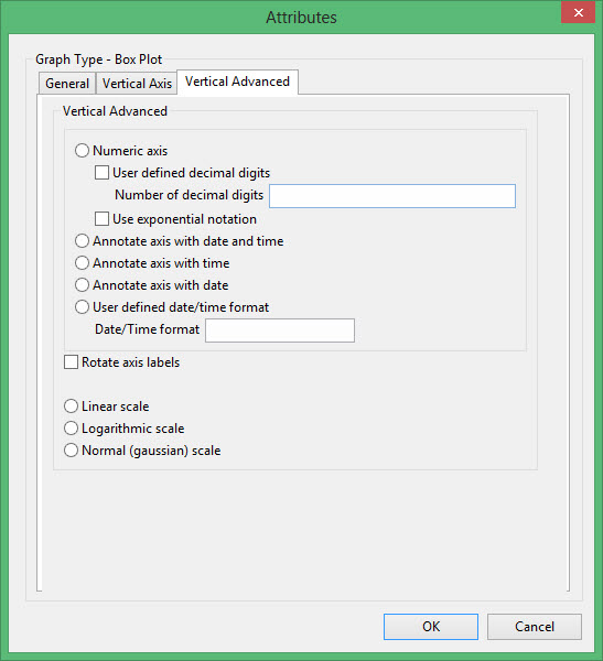
Numeric axis
Select this option if the horizontal axis contains numeric data.
The following options are available when using a numeric axis.
User defined decimal digits
Select this check box if you want to specify the number of decimal places. You will need to enter the number of decimal places.
Use exponential notation
Select this check box if you want to display all axis numbers in exponential notation, for example '1e2' instead of '100'.
Rotate axis labels
Select this check box if you want to rotate the axis annotation 90 °. By default the axis annotation are displayed at an angle of 0° (horizontal).
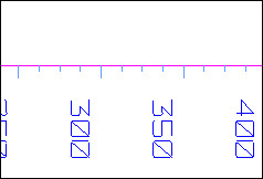
Figure 1: Axis Labels Rotated
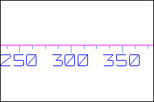
Figure 2: No Rotation
The axis scale can be one of the following:
Linear scale
Select this option to use a linear scale - this is the most common scale. The intervals on a linear scale are a constant amount, for example 5, 10, 15, 20, etc.
Logarithmic scale
Select this option to use a logarithmic scale - most useful when the range spans many orders of magnitude and you don't want to lose information at the smaller scales. Unlike linear scales (which are based on addition), Logarithmic scales are based on multiplication, that is '1, 10, 100, 1000,...'. Zero or negative numbers can never be represented on a logarithmic scale.
Normal (Gaussian) scale
This scale should only be used for the log-normal probability plot. It displays a number between 1 and 1 in units of standard deviation in a Gaussian distribution.

Excel Attributes
Use this panel to configure the font settings, including the font type, size, and colour, for the text elements in the graph.
Click OK to return to the Graph Type section of the Statistics Preferences interface.
This plot type produces a histogram showing the number of character values that match a specified list of character patterns.
The Attributes panel consists of the following tabbed sections;
General tab
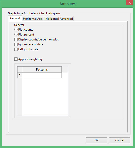
Plot counts
Select this option if you want to calculate the number of items in each bar.
Plot percent
Select this option if you want to calculate the percentage of items in each bar.
Ignore case of data
Select this check box to include both upper and lowercase versions of the character string patterns, that is ab is the same as AB.
Left justify data
Select this check box to left justify the data. This is applicable to drill hole databases with left justified fields.
Apply a weighting
Select this check this box to apply a weighting. The weighting variable is specified once the data has been selected. The weighting variable must have the same length as the data variable to which it is applied, i.e. the same number of data values.
Patterns
The items that are entered under the Patterns heading will control which data from the database or block model will be summed in each bin of the histogram. The name of each bin created will match what is typed on this list. The items that are entered in this list should exactly match any values present in the character-type field of the database or character-type variable in the block model. These character fields or variables were specified in the Attributes column in the Statistics Preferences > Data Elements panel.
Since the characters typed have to exactly match those that exist in the field in the database or the variable in the block model that was selected, typographical and case errors will result in unexpected results.
Wildcards (*) may be used to select the data, but each bin of the histogram contains all data for the character value that is typed in. If wildcards are used in such a way that two different entries on the list calls on the same set of data, the counts presented on the histogram may be inflated as some values may be included in both lists.
Horizontal Axis tab

Text for axis label
Enter the axis title (a maximum size of 40 alphanumeric characters). $x can be used for the horizontal axis variable name, while $y can be used for the vertical axis variable name.
User Defined Range
User defined minimum/maximum
Select these check boxes if you want to manually define the range of the axis. The minimum and maximum values can contain up to 6 decimal places. If these boxes are not selected, the system will find the minimum and maximum from the data.
Check marks can be controlled or generated automatically.
Automatic ticks
Select this option to let the system decide where to place the ticks.
Ticks by count
Select this option to specify the number of ticks. The interval between ticks is the quotient of the horizontal range and this value.
If the horizontal range is 20, and the number of ticks is '5', then ticks will be placed at 4, 8, 12, 16 and 20.
Ticks by interval
Select this option to specify the distance between ticks.
User defined subintervals
Select this check this box if you want to use subintervals, which are smaller check marks placed between the major check marks. You will need to specify the distance between these smaller check marks.
If the interval between major check marks is 10, and the interval between minor check marks is '2', then the minor check marks will be placed at 2, 4, 6 and 8.
Grid lines
Select this check this box if you want to replace check marks with grid lines.
Sub grid lines
Select this check this box if you want to replace subinterval check marks with sub grid lines.
Horizontal Advanced tab
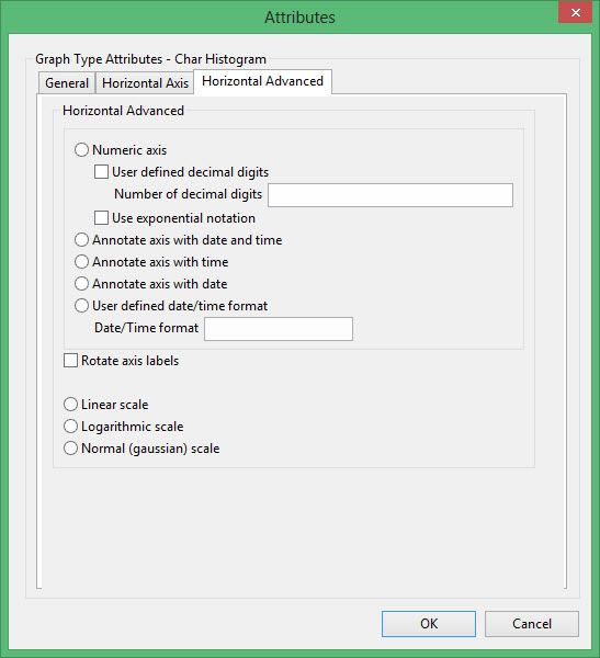
Numeric axis
Select this option if the horizontal axis contains numeric data.
The following options are available when using a numeric axis.
User defined decimal digits
Select this check box if you want to specify the number of decimal places. You will need to enter the number of decimal places.
Use exponential notation
Select this check box if you want to display all axis numbers in exponential notation, for example '1e2' instead of '100'.
Rotate axis labels
Select this check box if you want to rotate the axis annotation 90 °. By default the axis annotation are displayed at an angle of 0° (horizontal).
The axis scale can be one of the following:
Linear scale
Select this option to use a linear scale - this is the most common scale. The intervals on a linear scale are a constant amount, for example 5, 10, 15, 20, etc.
Logarithmic scale
Select this option to use a logarithmic scale - most useful when the range spans many orders of magnitude and you don't want to lose information at the smaller scales. Unlike linear scales (which are based on addition), Logarithmic scales are based on multiplication, that is '1, 10, 100, 1000,...'. Zero or negative numbers can never be represented on a logarithmic scale.
Normal (Gaussian) scale
This scale should only be used for the log-normal probability plot. It displays a number between 1 and 1 in units of standard deviation in a Gaussian distribution.
This plot type produces a graph that displays the probability that a random variable will be less than the independent variable.
General tab
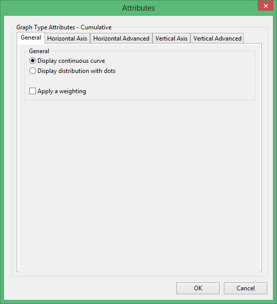
Display a continuous curve
Select this option if you want to display the results as a continuous curve.
Display the distribution with dots
Select this option if you want to display the results as a series of points (dots).
Apply a weighting
Select this check this box to apply a weighting. The weighting variable is specified once the data has been selected. The weighting variable must have the same length as the data variable to which it is applied, i.e. the same number of data values.
Horizontal Axis tab

Text for axis label
Enter the axis title (a maximum size of 40 alphanumeric characters). $x can be used for the horizontal axis variable name, while $y can be used for the vertical axis variable name.
User Defined Range
User defined minimum/maximum
Select these check boxes if you want to manually define the range of the axis. The minimum and maximum values can contain up to 6 decimal places. If these boxes are not selected, the system will find the minimum and maximum from the data.
Check marks can be controlled or generated automatically.
Automatic ticks
Select this option to let the system decide where to place the ticks.
Ticks by count
Select this option to specify the number of ticks. The interval between ticks is the quotient of the horizontal range and this value.
If the horizontal range is 20, and the number of ticks is '5', then ticks will be placed at 4, 8, 12, 16 and 20.
Ticks by interval
Select this option to specify the distance between ticks.
User defined subintervals
Select this check this box if you want to use subintervals, which are smaller check marks placed between the major check marks. You will need to specify the distance between these smaller check marks.
If the interval between major check marks is 10, and the interval between minor check marks is '2', then the minor check marks will be placed at 2, 4, 6 and 8.
Grid lines
Select this check this box if you want to replace check marks with grid lines.
Sub grid lines
Select this check this box if you want to replace subinterval check marks with sub grid lines.
Horizontal Advanced tab

Numeric axis
Select this option if the horizontal axis contains numeric data.
The following options are available when using a numeric axis.
User defined decimal digits
Select this check box if you want to specify the number of decimal places. You will need to enter the number of decimal places.
Use exponential notation
Select this check box if you want to display all axis numbers in exponential notation, for example '1e2' instead of '100'.
Rotate axis labels
Select this check box if you want to rotate the axis annotation 90 °. By default the axis annotation are displayed at an angle of 0° (horizontal).
The axis scale can be one of the following:
Linear scale
Select this option to use a linear scale - this is the most common scale. The intervals on a linear scale are a constant amount, for example 5, 10, 15, 20, etc.
Logarithmic scale
Select this option to use a logarithmic scale - most useful when the range spans many orders of magnitude and you don't want to lose information at the smaller scales. Unlike linear scales (which are based on addition), Logarithmic scales are based on multiplication, that is '1, 10, 100, 1000,...'. Zero or negative numbers can never be represented on a logarithmic scale.
Normal (Gaussian) scale
This scale should only be used for the log-normal probability plot. It displays a number between 1 and 1 in units of standard deviation in a Gaussian distribution.
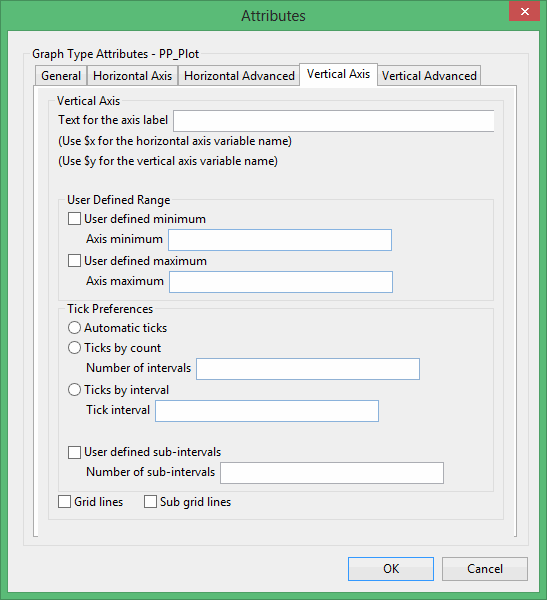
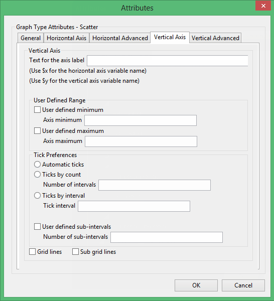
Vertical Axis tab
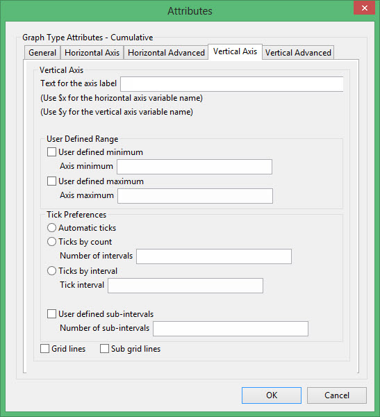
Text for axis label
Enter the axis title (a maximum size of 40 alphanumeric characters). $x can be used for the horizontal axis variable name, while $y can be used for the vertical axis variable name.
User Defined Range
User defined minimum/maximum
Select these check boxes if you want to manually define the range of the axis. The minimum and maximum values can contain up to 6 decimal places. If these boxes are not selected, the system will find the minimum and maximum from the data.
Check marks can be controlled or generated automatically.
Automatic ticks
Select this option to let the system decide where to place the ticks.
Ticks by count
Select this option to specify the number of ticks. The interval between ticks is the quotient of the horizontal range and this value.
If the horizontal range is 20, and the number of ticks is '5', then ticks will be placed at 4, 8, 12, 16 and 20.
Ticks by interval
Select this option to specify the distance between ticks.
User defined subintervals
Select this check this box if you want to use subintervals, which are smaller check marks placed between the major check marks. You will need to specify the distance between these smaller check marks.
If the interval between major check marks is 10, and the interval between minor check marks is '2', then the minor check marks will be placed at 2, 4, 6 and 8.
Grid lines
Select this check this box if you want to replace check marks with grid lines.
Sub grid lines
Select this check this box if you want to replace subinterval check marks with sub grid lines.
Vertical Advanced tab
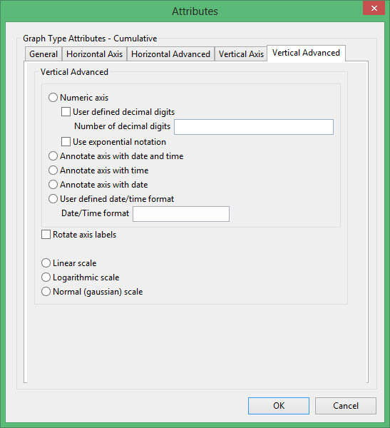
Numeric axis
Select this option if the horizontal axis contains numeric data.
The following options are available when using a numeric axis.
User defined decimal digits
Select this check box if you want to specify the number of decimal places. You will need to enter the number of decimal places.
Use exponential notation
Select this check box if you want to display all axis numbers in exponential notation, for example '1e2' instead of '100'.
Rotate axis labels
Select this check box if you want to rotate the axis annotation 90 °. By default the axis annotation are displayed at an angle of 0° (horizontal).
Figure 3: Axis Labels Rotated
Figure 4: No Rotation
The axis scale can be one of the following:
Linear scale
Select this option to use a linear scale - this is the most common scale. The intervals on a linear scale are a constant amount, for example 5, 10, 15, 20, etc.
Logarithmic scale
Select this option to use a logarithmic scale - most useful when the range spans many orders of magnitude and you don't want to lose information at the smaller scales. Unlike linear scales (which are based on addition), Logarithmic scales are based on multiplication, that is '1, 10, 100, 1000,...'. Zero or negative numbers can never be represented on a logarithmic scale.
Normal (Gaussian) scale
This scale should only be used for the log-normal probability plot. It displays a number between 1 and 1 in units of standard deviation in a Gaussian distribution.
Excel Attributes
Use this panel to configure the font settings, including the font type, size, and colour, for the text elements within the graph.
Click OK to return to the Graph Type section of the Statistics Preferences interface.
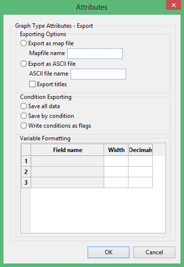
Exporting Options
Export as mapfile
Select this option to export the data to a nominated mapfile (<proj><name>.map).
Export as ASCII file
Select this option to export the data to a nominated ASCII file. Check the Export titles check box to export a title line to the nominated output file.
Condition Exporting
Save all data
Select this option to export all data.
Save by condition
Select this option if you only want to export the data that meets the specified conditions.
Write conditions as flag
Select this option to export all data and place a field at the end of each record. The field at the end of the record will identify whether or not the data passed any conditions (1 = data passed condition; 0 = data did not pass the condition).
Variable Formatting
For each variable, specify the export name (field name), the width and the number of decimal places to include.
This plot type generates a histogram of the data selected. Options exist for linear, log and normal Gaussian scales on both the X and Y axis.
Use the Histogram option to create a histogram of the data selected.
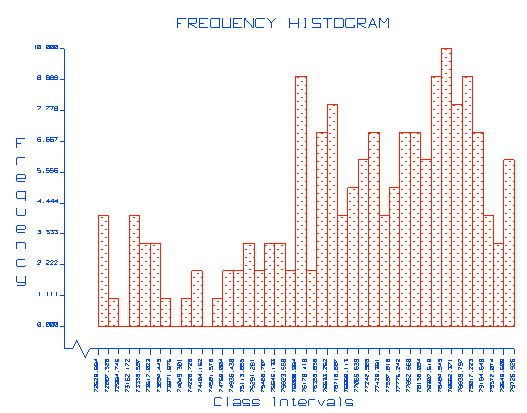
Figure 5: Histogram (bar format)
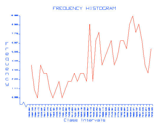
Figure 6: Histogram (line format)
For a histogram you define intervals. The program displays a bar for each interval. The height of the bar depends on how many samples are in its interval. You can let the program choose intervals or you can define your own intervals by controlling the width of the intervals, the number of intervals, or by directly defining each interval.
You can select any number of variables. Graphs are produced for every variable.
The Attributes panel consists of the following tabbed sections;
- General
- Horizontal Axis
- Horizontal Advanced
- Vertical Axis
- Vertical Advanced
General tab

There are four methods to select the intervals:
-
Automatic intervals
Select this option if you want to divide the X range into 40 equal intervals. -
Intervals by interval width
Select this option if you want to specify the interval width (step or increment). The X range will be divided by the specified interval width. -
Intervals by number of intervals
Select this option if you want to specify the number of intervals. The X range will then be divided by the specified number of intervals. -
User defined intervals
Select this option if you want to manually specify each interval. A panel in which to enter the maximum and minimum values for each interval will be displayed after pressing the Define Intervals button.
Plot counts
Select this option if you want to calculate the number of items in each bar.
Plot percent
Select this option if you want to calculate the percentage of items in each bar.
Display general statistics on the graph
Check this box if you want to display the general statistics with the graph.
Apply a weighting
Select this check this box to apply a weighting. The weighting variable is specified once the data has been selected. The weighting variable must have the same length as the data variable to which it is applied, i.e. the same number of data values.
Horizontal Axis tab
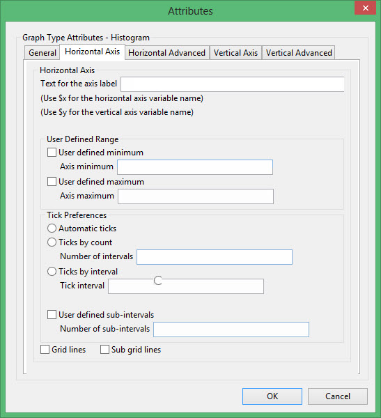
Text for axis label
Enter the axis title (a maximum size of 40 alphanumeric characters). $x can be used for the horizontal axis variable name, while $y can be used for the vertical axis variable name.
User Defined Range
User defined minimum/maximum
Select these check boxes if you want to manually define the range of the axis. The minimum and maximum values can contain up to 6 decimal places. If these boxes are not selected, the system will find the minimum and maximum from the data.
Check marks can be controlled or generated automatically.
Automatic ticks
Select this option to let the system decide where to place the ticks.
Ticks by count
Select this option to specify the number of ticks. The interval between ticks is the quotient of the horizontal range and this value.
If the horizontal range is 20, and the number of ticks is '5', then ticks will be placed at 4, 8, 12, 16 and 20.
Ticks by interval
Select this option to specify the distance between ticks.
User defined subintervals
Select this check this box if you want to use subintervals, which are smaller check marks placed between the major check marks. You will need to specify the distance between these smaller check marks.
If the interval between major check marks is 10, and the interval between minor check marks is '2', then the minor check marks will be placed at 2, 4, 6 and 8.
Grid lines
Select this check this box if you want to replace check marks with grid lines.
Sub grid lines
Select this check this box if you want to replace subinterval check marks with sub grid lines.
Horizontal Advanced tab
Numeric axis
Select this option if the horizontal axis contains numeric data.
The following options are available when using a numeric axis.
User defined decimal digits
Select this check box if you want to specify the number of decimal places. You will need to enter the number of decimal places.
Use exponential notation
Select this check box if you want to display all axis numbers in exponential notation, for example '1e2' instead of '100'.
Rotate axis labels
Select this check box if you want to rotate the axis annotation 90 °. By default the axis annotation are displayed at an angle of 0° (horizontal).
The axis scale can be one of the following:
Linear scale
Select this option to use a linear scale - this is the most common scale. The intervals on a linear scale are a constant amount, for example 5, 10, 15, 20, etc.
Logarithmic scale
Select this option to use a logarithmic scale - most useful when the range spans many orders of magnitude and you don't want to lose information at the smaller scales. Unlike linear scales (which are based on addition), Logarithmic scales are based on multiplication, that is '1, 10, 100, 1000,...'. Zero or negative numbers can never be represented on a logarithmic scale.
Normal (Gaussian) scale
This scale should only be used for the log-normal probability plot. It displays a number between 1 and 1 in units of standard deviation in a Gaussian distribution.
Vertical Axis tab
Text for axis label
Enter the axis title (a maximum size of 40 alphanumeric characters). $x can be used for the horizontal axis variable name, while $y can be used for the vertical axis variable name.
User Defined Range
User defined minimum/maximum
Select these check boxes if you want to manually define the range of the axis. The minimum and maximum values can contain up to 6 decimal places. If these boxes are not selected, the system will find the minimum and maximum from the data.
Check marks can be controlled or generated automatically.
Automatic ticks
Select this option to let the system decide where to place the ticks.
Ticks by count
Select this option to specify the number of ticks. The interval between ticks is the quotient of the horizontal range and this value.
If the horizontal range is 20, and the number of ticks is '5', then ticks will be placed at 4, 8, 12, 16 and 20.
Ticks by interval
Select this option to specify the distance between ticks.
User defined subintervals
Select this check this box if you want to use subintervals, which are smaller check marks placed between the major check marks. You will need to specify the distance between these smaller check marks.
If the interval between major check marks is 10, and the interval between minor check marks is '2', then the minor check marks will be placed at 2, 4, 6 and 8.
Grid lines
Select this check this box if you want to replace check marks with grid lines.
Sub grid lines
Select this check this box if you want to replace subinterval check marks with sub grid lines.
Vertical Advanced tab

Numeric axis
Select this option if the horizontal axis contains numeric data.
The following options are available when using a numeric axis.
User defined decimal digits
Select this check box if you want to specify the number of decimal places. You will need to enter the number of decimal places.
Use exponential notation
Select this check box if you want to display all axis numbers in exponential notation, for example '1e2' instead of '100'.
Rotate axis labels
Select this check box if you want to rotate the axis annotation 90 °. By default the axis annotation are displayed at an angle of 0° (horizontal).
Figure 7: Axis Labels Rotated
Figure 8: No Rotation
The axis scale can be one of the following:
Linear scale
Select this option to use a linear scale - this is the most common scale. The intervals on a linear scale are a constant amount, for example 5, 10, 15, 20, etc.
Logarithmic scale
Select this option to use a logarithmic scale - most useful when the range spans many orders of magnitude and you don't want to lose information at the smaller scales. Unlike linear scales (which are based on addition), Logarithmic scales are based on multiplication, that is '1, 10, 100, 1000,...'. Zero or negative numbers can never be represented on a logarithmic scale.
Normal (Gaussian) scale
This scale should only be used for the log-normal probability plot. It displays a number between 1 and 1 in units of standard deviation in a Gaussian distribution.
Excel Attributes
Use this panel to configure the font settings, including the font type, size, and colour, for the text elements within the graph.
Click OK to return to the Graph Type section of the Statistics Preferences interface.
This option does not produce a graph, but generates statistics of correlation between any number of variable pairs. The variables must have the same number of elements. Joint statistics include correlation coefficient, rank correlation and linear regression slope and intercept. There are no attributes for Joint type.
This plot type produces a graph similar to the Scatter plot, but points are connected by lines. Each data pair is plotted in sequence, which means that the data needs to be logically organised in the data file, for example time series data.
Horizontal Axis tab
Text for axis label
Enter the axis title (a maximum size of 40 alphanumeric characters). $x can be used for the horizontal axis variable name, while $y can be used for the vertical axis variable name.
User Defined Range
User defined minimum/maximum
Select these check boxes if you want to manually define the range of the axis. The minimum and maximum values can contain up to 6 decimal places. If these boxes are not selected, the system will find the minimum and maximum from the data.
Check marks can be controlled or generated automatically.
Automatic ticks
Select this option to let the system decide where to place the ticks.
Ticks by count
Select this option to specify the number of ticks. The interval between ticks is the quotient of the horizontal range and this value.
If the horizontal range is 20, and the number of ticks is '5', then ticks will be placed at 4, 8, 12, 16 and 20.
Ticks by interval
Select this option to specify the distance between ticks.
User defined subintervals
Select this check this box if you want to use subintervals, which are smaller check marks placed between the major check marks. You will need to specify the distance between these smaller check marks.
If the interval between major check marks is 10, and the interval between minor check marks is '2', then the minor check marks will be placed at 2, 4, 6 and 8.
Grid lines
Select this check this box if you want to replace check marks with grid lines.
Sub grid lines
Select this check this box if you want to replace subinterval check marks with sub grid lines.
Horizontal Advanced tab

Numeric axis
Select this option if the horizontal axis contains numeric data.
The following options are available when using a numeric axis.
User defined decimal digits
Select this check box if you want to specify the number of decimal places. You will need to enter the number of decimal places.
Use exponential notation
Select this check box if you want to display all axis numbers in exponential notation, for example '1e2' instead of '100'.
Rotate axis labels
Select this check box if you want to rotate the axis annotation 90 °. By default the axis annotation are displayed at an angle of 0° (horizontal).
The axis scale can be one of the following:
Linear scale
Select this option to use a linear scale - this is the most common scale. The intervals on a linear scale are a constant amount, for example 5, 10, 15, 20, etc.
Logarithmic scale
Select this option to use a logarithmic scale - most useful when the range spans many orders of magnitude and you don't want to lose information at the smaller scales. Unlike linear scales (which are based on addition), Logarithmic scales are based on multiplication, that is '1, 10, 100, 1000,...'. Zero or negative numbers can never be represented on a logarithmic scale.
Normal (Gaussian) scale
This scale should only be used for the log-normal probability plot. It displays a number between 1 and 1 in units of standard deviation in a Gaussian distribution.
Vertical Axis tab

Text for axis label
Enter the axis title (a maximum size of 40 alphanumeric characters). $x can be used for the horizontal axis variable name, while $y can be used for the vertical axis variable name.
User Defined Range
User defined minimum/maximum
Select these check boxes if you want to manually define the range of the axis. The minimum and maximum values can contain up to 6 decimal places. If these boxes are not selected, the system will find the minimum and maximum from the data.
Check marks can be controlled or generated automatically.
Automatic ticks
Select this option to let the system decide where to place the ticks.
Ticks by count
Select this option to specify the number of ticks. The interval between ticks is the quotient of the horizontal range and this value.
If the horizontal range is 20, and the number of ticks is '5', then ticks will be placed at 4, 8, 12, 16 and 20.
Ticks by interval
Select this option to specify the distance between ticks.
User defined subintervals
Select this check this box if you want to use subintervals, which are smaller check marks placed between the major check marks. You will need to specify the distance between these smaller check marks.
If the interval between major check marks is 10, and the interval between minor check marks is '2', then the minor check marks will be placed at 2, 4, 6 and 8.
Grid lines
Select this check this box if you want to replace check marks with grid lines.
Sub grid lines
Select this check this box if you want to replace subinterval check marks with sub grid lines.
Vertical Advanced tab

Numeric axis
Select this option if the horizontal axis contains numeric data.
The following options are available when using a numeric axis.
User defined decimal digits
Select this check box if you want to specify the number of decimal places. You will need to enter the number of decimal places.
Use exponential notation
Select this check box if you want to display all axis numbers in exponential notation, for example '1e2' instead of '100'.
Rotate axis labels
Select this check box if you want to rotate the axis annotation 90 °. By default the axis annotation are displayed at an angle of 0° (horizontal).
The axis scale can be one of the following:
Linear scale
Select this option to use a linear scale - this is the most common scale. The intervals on a linear scale are a constant amount, for example 5, 10, 15, 20, etc.
Logarithmic scale
Select this option to use a logarithmic scale - most useful when the range spans many orders of magnitude and you don't want to lose information at the smaller scales. Unlike linear scales (which are based on addition), Logarithmic scales are based on multiplication, that is '1, 10, 100, 1000,...'. Zero or negative numbers can never be represented on a logarithmic scale.
Normal (Gaussian) scale
This scale should only be used for the log-normal probability plot. It displays a number between 1 and 1 in units of standard deviation in a Gaussian distribution.
This plot type produces several line graphs of selected variable pairs. The data points are connected by lines.
Horizontal Axis tab
Text for axis label
Enter the axis title (a maximum size of 40 alphanumeric characters). $x can be used for the horizontal axis variable name, while $y can be used for the vertical axis variable name.
User Defined Range
User defined minimum/maximum
Select these check boxes if you want to manually define the range of the axis. The minimum and maximum values can contain up to 6 decimal places. If these boxes are not selected, the system will find the minimum and maximum from the data.
Check marks can be controlled or generated automatically.
Automatic ticks
Select this option to let the system decide where to place the ticks.
Ticks by count
Select this option to specify the number of ticks. The interval between ticks is the quotient of the horizontal range and this value.
If the horizontal range is 20, and the number of ticks is '5', then ticks will be placed at 4, 8, 12, 16 and 20.
Ticks by interval
Select this option to specify the distance between ticks.
User defined subintervals
Select this check this box if you want to use subintervals, which are smaller check marks placed between the major check marks. You will need to specify the distance between these smaller check marks.
If the interval between major check marks is 10, and the interval between minor check marks is '2', then the minor check marks will be placed at 2, 4, 6 and 8.
Grid lines
Select this check this box if you want to replace check marks with grid lines.
Sub grid lines
Select this check this box if you want to replace subinterval check marks with sub grid lines.
Horizontal Advanced tab

Numeric axis
Select this option if the horizontal axis contains numeric data.
The following options are available when using a numeric axis.
User defined decimal digits
Select this check box if you want to specify the number of decimal places. You will need to enter the number of decimal places.
Use exponential notation
Select this check box if you want to display all axis numbers in exponential notation, for example '1e2' instead of '100'.
Rotate axis labels
Select this check box if you want to rotate the axis annotation 90 °. By default the axis annotation are displayed at an angle of 0° (horizontal).
The axis scale can be one of the following:
Linear scale
Select this option to use a linear scale - this is the most common scale. The intervals on a linear scale are a constant amount, for example 5, 10, 15, 20, etc.
Logarithmic scale
Select this option to use a logarithmic scale - most useful when the range spans many orders of magnitude and you don't want to lose information at the smaller scales. Unlike linear scales (which are based on addition), Logarithmic scales are based on multiplication, that is '1, 10, 100, 1000,...'. Zero or negative numbers can never be represented on a logarithmic scale.
Normal (Gaussian) scale
This scale should only be used for the log-normal probability plot. It displays a number between 1 and 1 in units of standard deviation in a Gaussian distribution.
Vertical Axis tab

Text for axis label
Enter the axis title (a maximum size of 40 alphanumeric characters). $x can be used for the horizontal axis variable name, while $y can be used for the vertical axis variable name.
User Defined Range
User defined minimum/maximum
Select these check boxes if you want to manually define the range of the axis. The minimum and maximum values can contain up to 6 decimal places. If these boxes are not selected, the system will find the minimum and maximum from the data.
Check marks can be controlled or generated automatically.
Automatic ticks
Select this option to let the system decide where to place the ticks.
Ticks by count
Select this option to specify the number of ticks. The interval between ticks is the quotient of the horizontal range and this value.
If the horizontal range is 20, and the number of ticks is '5', then ticks will be placed at 4, 8, 12, 16 and 20.
Ticks by interval
Select this option to specify the distance between ticks.
User defined subintervals
Select this check this box if you want to use subintervals, which are smaller check marks placed between the major check marks. You will need to specify the distance between these smaller check marks.
If the interval between major check marks is 10, and the interval between minor check marks is '2', then the minor check marks will be placed at 2, 4, 6 and 8.
Grid lines
Select this check this box if you want to replace check marks with grid lines.
Sub grid lines
Select this check this box if you want to replace subinterval check marks with sub grid lines.
Vertical Advanced tab

Numeric axis
Select this option if the horizontal axis contains numeric data.
The following options are available when using a numeric axis.
User defined decimal digits
Select this check box if you want to specify the number of decimal places. You will need to enter the number of decimal places.
Use exponential notation
Select this check box if you want to display all axis numbers in exponential notation, for example '1e2' instead of '100'.
Rotate axis labels
Select this check box if you want to rotate the axis annotation 90 °. By default the axis annotation are displayed at an angle of 0° (horizontal).
The axis scale can be one of the following:
Linear scale
Select this option to use a linear scale - this is the most common scale. The intervals on a linear scale are a constant amount, for example 5, 10, 15, 20, etc.
Logarithmic scale
Select this option to use a logarithmic scale - most useful when the range spans many orders of magnitude and you don't want to lose information at the smaller scales. Unlike linear scales (which are based on addition), Logarithmic scales are based on multiplication, that is '1, 10, 100, 1000,...'. Zero or negative numbers can never be represented on a logarithmic scale.
Normal (Gaussian) scale
This scale should only be used for the log-normal probability plot. It displays a number between 1 and 1 in units of standard deviation in a Gaussian distribution.
This option does not produce a graph, but generates statistics in which the linear regression (best linear fit) coefficients (slope and intercept) are calculated between one dependent and several independent variables. There are no attributes for Multivariate type.
This plot type produces a graph comparing a distribution with a log normal distribution. It is similar to Cumulative except that the X axis is LOG scale and the Y Axis is Gaussian (log-normal) scale. If the graph is a straight line, then the distribution is said to be log-normal. The probability axis is displayed in units of standard deviation and labelled in units from 0 to 1.
General tab

Probability on the vertical axis
Select this option to display the probability on the vertical axis and the variables on the horizontal axis.
Probability on the horizontal axis
Select this option to display the probability on the horizontal axis and the variables on the vertical axis.
Display a continuous curve
Select this option if you want to display the results as a continuous curve.
Display the distribution with dots
Select this option if you want to display the results as a series of points (dots).
Apply a weighting
Select this check this box to apply a weighting. The weighting variable is specified once the data has been selected. The weighting variable must have the same length as the data variable to which it is applied, i.e. the same number of data values.
Horizontal Axis tab
Text for axis label
Enter the axis title (a maximum size of 40 alphanumeric characters). $x can be used for the horizontal axis variable name, while $y can be used for the vertical axis variable name.
User Defined Range
User defined minimum/maximum
Select these check boxes if you want to manually define the range of the axis. The minimum and maximum values can contain up to 6 decimal places. If these boxes are not selected, the system will find the minimum and maximum from the data.
Check marks can be controlled or generated automatically.
Automatic ticks
Select this option to let the system decide where to place the ticks.
Ticks by count
Select this option to specify the number of ticks. The interval between ticks is the quotient of the horizontal range and this value.
If the horizontal range is 20, and the number of ticks is '5', then ticks will be placed at 4, 8, 12, 16 and 20.
Ticks by interval
Select this option to specify the distance between ticks.
User defined subintervals
Select this check this box if you want to use subintervals, which are smaller check marks placed between the major check marks. You will need to specify the distance between these smaller check marks.
If the interval between major check marks is 10, and the interval between minor check marks is '2', then the minor check marks will be placed at 2, 4, 6 and 8.
Grid lines
Select this check this box if you want to replace check marks with grid lines.
Sub grid lines
Select this check this box if you want to replace subinterval check marks with sub grid lines.
Horizontal Advanced tab

Numeric axis
Select this option if the horizontal axis contains numeric data.
The following options are available when using a numeric axis.
User defined decimal digits
Select this check box if you want to specify the number of decimal places. You will need to enter the number of decimal places.
Use exponential notation
Select this check box if you want to display all axis numbers in exponential notation, for example '1e2' instead of '100'.
Rotate axis labels
Select this check box if you want to rotate the axis annotation 90 °. By default the axis annotation are displayed at an angle of 0° (horizontal).
The axis scale can be one of the following:
Linear scale
Select this option to use a linear scale - this is the most common scale. The intervals on a linear scale are a constant amount, for example 5, 10, 15, 20, etc.
Logarithmic scale
Select this option to use a logarithmic scale - most useful when the range spans many orders of magnitude and you don't want to lose information at the smaller scales. Unlike linear scales (which are based on addition), Logarithmic scales are based on multiplication, that is '1, 10, 100, 1000,...'. Zero or negative numbers can never be represented on a logarithmic scale.
Normal (Gaussian) scale
This scale should only be used for the log-normal probability plot. It displays a number between 1 and 1 in units of standard deviation in a Gaussian distribution.
Vertical Axis tab
Text for axis label
Enter the axis title (a maximum size of 40 alphanumeric characters). $x can be used for the horizontal axis variable name, while $y can be used for the vertical axis variable name.
User Defined Range
User defined minimum/maximum
Select these check boxes if you want to manually define the range of the axis. The minimum and maximum values can contain up to 6 decimal places. If these boxes are not selected, the system will find the minimum and maximum from the data.
Check marks can be controlled or generated automatically.
Automatic ticks
Select this option to let the system decide where to place the ticks.
Ticks by count
Select this option to specify the number of ticks. The interval between ticks is the quotient of the horizontal range and this value.
If the horizontal range is 20, and the number of ticks is '5', then ticks will be placed at 4, 8, 12, 16 and 20.
Ticks by interval
Select this option to specify the distance between ticks.
User defined subintervals
Select this check this box if you want to use subintervals, which are smaller check marks placed between the major check marks. You will need to specify the distance between these smaller check marks.
If the interval between major check marks is 10, and the interval between minor check marks is '2', then the minor check marks will be placed at 2, 4, 6 and 8.
Grid lines
Select this check this box if you want to replace check marks with grid lines.
Sub grid lines
Select this check this box if you want to replace subinterval check marks with sub grid lines.
Vertical Advanced tab

Numeric axis
Select this option if the horizontal axis contains numeric data.
The following options are available when using a numeric axis.
User defined decimal digits
Select this check box if you want to specify the number of decimal places. You will need to enter the number of decimal places.
Use exponential notation
Select this check box if you want to display all axis numbers in exponential notation, for example '1e2' instead of '100'.
Rotate axis labels
Select this check box if you want to rotate the axis annotation 90 °. By default the axis annotation are displayed at an angle of 0° (horizontal).
The axis scale can be one of the following:
Linear scale
Select this option to use a linear scale - this is the most common scale. The intervals on a linear scale are a constant amount, for example 5, 10, 15, 20, etc.
Logarithmic scale
Select this option to use a logarithmic scale - most useful when the range spans many orders of magnitude and you don't want to lose information at the smaller scales. Unlike linear scales (which are based on addition), Logarithmic scales are based on multiplication, that is '1, 10, 100, 1000,...'. Zero or negative numbers can never be represented on a logarithmic scale.
Normal (Gaussian) scale
This scale should only be used for the log-normal probability plot. It displays a number between 1 and 1 in units of standard deviation in a Gaussian distribution.
Similar to the Histogram except that the number of samples in an interval controls the size of a wedge in a circular graph.
General tab

Plot counts
Select this option if you want to calculate the number of items in each bar.
Plot percent
Select this option if you want to calculate the percentage of items in each bar.
Display general statistics on the graph
Check this box if you want to display the general statistics with the graph.
Apply a weighting
Select this check this box to apply a weighting. The weighting variable is specified once the data has been selected. The weighting variable must have the same length as the data variable to which it is applied, i.e. the same number of data values.
Axis Label Text tab
Text for axis label
Enter the axis title (a maximum size of 40 alphanumeric characters). $x can be used for the horizontal axis variable name, while $y can be used for the vertical axis variable name.
User Defined Range
User defined minimum/maximum
Select these check boxes if you want to manually define the range of the axis. The minimum and maximum values can contain up to 6 decimal places. If these boxes are not selected, the system will find the minimum and maximum from the data.
Check marks can be controlled or generated automatically.
Automatic ticks
Select this option to let the system decide where to place the ticks.
Checks by count
Select this option to specify the number of ticks. The interval between ticks is the quotient of the horizontal range and this value.
If the horizontal range is 20, and the number of ticks is '5', then ticks will be placed at 4, 8, 12, 16 and 20.
Checks by interval
Select this option to specify the distance between ticks.
User defined subintervals
Select this check this box if you want to use subintervals, which are smaller check marks placed between the major check marks. You will need to specify the distance between these smaller check marks.
If the interval between major check marks is 10, and the interval between minor check marks is '2', then the minor check marks will be placed at 2, 4, 6 and 8.
Grid lines
Select this check this box if you want to replace check marks with grid lines.
Sub grid lines
Select this check this box if you want to replace subinterval check marks with sub grid lines.
User defined minimum/maximum
Select these check boxes if you want to manually define the range of the axis. The minimum and maximum values can contain up to 6 decimal places. If these check boxes are not selected, the system will find the minimum and maximum from the data.
User defined subintervals
Select this check box if you want to use subintervals, which are smaller check marks placed between the major check marks. You will need to specify the distance between these smaller check marks.
If the interval between major check marks is 10, and the interval between minor check marks is '2', then the minor check marks will be placed at 2, 4, 6 and 8.
Grid lines
Select this check box if you want to replace check marks with grid lines.
Sub grid lines
Select this check box if you want to replace subinterval check marks with sub grid lines.
Advanced tab

Numeric axis
Select this option if the horizontal axis contains numeric data.
The following options are available when using a numeric axis.
User defined decimal digits
Select this check box if you want to specify the number of decimal places. You will need to enter the number of decimal places.
Use exponential notation
Select this check box if you want to display all axis numbers in exponential notation, for example '1e2' instead of '100'.
Rotate axis labels
Select this check box if you want to rotate the axis annotation 90 °. By default the axis annotation are displayed at an angle of 0° (horizontal).
Figure 9: Axis Labels Rotated
Figure 10: No Rotation
The axis scale can be one of the following:
Linear scale
Select this option to use a linear scale - this is the most common scale. The intervals on a linear scale are a constant amount, for example 5, 10, 15, 20, etc.
Logarithmic scale
Select this option to use a logarithmic scale - most useful when the range spans many orders of magnitude and you don't want to lose information at the smaller scales. Unlike linear scales (which are based on addition), Logarithmic scales are based on multiplication, that is '1, 10, 100, 1000,...'. Zero or negative numbers can never be represented on a logarithmic scale.
Normal (Gaussian) scale
This scale should only be used for the log-normal probability plot. It displays a number between 1 and 1 in units of standard deviation in a Gaussian distribution.
Excel Attributes
Use this panel to configure the font settings, including the font type, size, and colour, for the text elements within the graph.
Click OK to return to the Graph Type section of the Statistics Preferences interface.
This plot type produces a graph for each variable pair. The graph compares two distributions by plotting corresponding percentages on each axis. The variable pair does not need to have the same number of elements and may come from different datasets.
A point on the graph is plotted by taking a sample value which is common to both datasets and finding the percentile in each distribution. This pair of values is plotted as a point on the graph.
General tab

Plot an equality line
Select this check box if you want to get an equality line.
Display a continuous curve
Select this option if you want to display the results as a continuous curve.
Display the distribution with dots
Select this option if you want to display the results as a series of points (dots).
Display a continuous curve
Select this option if you want to display the results as a continuous curve.
Display the distribution with dots
Select this option if you want to display the results as a series of points (dots).
Apply a weighting
Select this check box if you want to apply a weighting. The weighting variable is specified once the data has been selected. The weighting variable must have the same length as the data variable to which it is applied, i.e. the same number of data values.
Horizontal Axis tab
Text for axis label
Enter the axis title (a maximum size of 40 alphanumeric characters). $x can be used for the horizontal axis variable name, while $y can be used for the vertical axis variable name.
User Defined Range
User defined minimum/maximum
Select these check boxes if you want to manually define the range of the axis. The minimum and maximum values can contain up to 6 decimal places. If these boxes are not selected, the system will find the minimum and maximum from the data.
Check marks can be controlled or generated automatically.
Automatic ticks
Select this option to let the system decide where to place the ticks.
Ticks by count
Select this option to specify the number of ticks. The interval between ticks is the quotient of the horizontal range and this value.
If the horizontal range is 20, and the number of ticks is '5', then ticks will be placed at 4, 8, 12, 16 and 20.
Ticks by interval
Select this option to specify the distance between ticks.
User defined subintervals
Select this check this box if you want to use subintervals, which are smaller check marks placed between the major check marks. You will need to specify the distance between these smaller check marks.
If the interval between major check marks is 10, and the interval between minor check marks is '2', then the minor check marks will be placed at 2, 4, 6 and 8.
Grid lines
Select this check this box if you want to replace check marks with grid lines.
Sub grid lines
Select this check this box if you want to replace subinterval check marks with sub grid lines.
Horizontal Advanced tab

Numeric axis
Select this option if the horizontal axis contains numeric data.
The following options are available when using a numeric axis.
User defined decimal digits
Select this check box if you want to specify the number of decimal places. You will need to enter the number of decimal places.
Use exponential notation
Select this check box if you want to display all axis numbers in exponential notation, for example '1e2' instead of '100'.
Rotate axis labels
Select this check box if you want to rotate the axis annotation 90 °. By default the axis annotation are displayed at an angle of 0° (horizontal).
The axis scale can be one of the following:
Linear scale
Select this option to use a linear scale - this is the most common scale. The intervals on a linear scale are a constant amount, for example 5, 10, 15, 20, etc.
Logarithmic scale
Select this option to use a logarithmic scale - most useful when the range spans many orders of magnitude and you don't want to lose information at the smaller scales. Unlike linear scales (which are based on addition), Logarithmic scales are based on multiplication, that is '1, 10, 100, 1000,...'. Zero or negative numbers can never be represented on a logarithmic scale.
Normal (Gaussian) scale
This scale should only be used for the log-normal probability plot. It displays a number between 1 and 1 in units of standard deviation in a Gaussian distribution.
Vertical Axis tab
Text for axis label
Enter the axis title (a maximum size of 40 alphanumeric characters). $x can be used for the horizontal axis variable name, while $y can be used for the vertical axis variable name.
User Defined Range
User defined minimum/maximum
Select these check boxes if you want to manually define the range of the axis. The minimum and maximum values can contain up to 6 decimal places. If these boxes are not selected, the system will find the minimum and maximum from the data.
Check marks can be controlled or generated automatically.
Automatic ticks
Select this option to let the system decide where to place the ticks.
Ticks by count
Select this option to specify the number of ticks. The interval between ticks is the quotient of the horizontal range and this value.
If the horizontal range is 20, and the number of ticks is '5', then ticks will be placed at 4, 8, 12, 16 and 20.
Ticks by interval
Select this option to specify the distance between ticks.
User defined subintervals
Select this check this box if you want to use subintervals, which are smaller check marks placed between the major check marks. You will need to specify the distance between these smaller check marks.
If the interval between major check marks is 10, and the interval between minor check marks is '2', then the minor check marks will be placed at 2, 4, 6 and 8.
Grid lines
Select this check this box if you want to replace check marks with grid lines.
Sub grid lines
Select this check this box if you want to replace subinterval check marks with sub grid lines.
Vertical Advanced tab

Numeric axis
Select this option if the horizontal axis contains numeric data.
The following options are available when using a numeric axis.
User defined decimal digits
Select this check box if you want to specify the number of decimal places. You will need to enter the number of decimal places.
Use exponential notation
Select this check box if you want to display all axis numbers in exponential notation, for example '1e2' instead of '100'.
Rotate axis labels
Select this check box if you want to rotate the axis annotation 90 °. By default the axis annotation are displayed at an angle of 0° (horizontal).
The axis scale can be one of the following:
Linear scale
Select this option to use a linear scale - this is the most common scale. The intervals on a linear scale are a constant amount, for example 5, 10, 15, 20, etc.
Logarithmic scale
Select this option to use a logarithmic scale - most useful when the range spans many orders of magnitude and you don't want to lose information at the smaller scales. Unlike linear scales (which are based on addition), Logarithmic scales are based on multiplication, that is '1, 10, 100, 1000,...'. Zero or negative numbers can never be represented on a logarithmic scale.
Normal (Gaussian) scale
This scale should only be used for the log-normal probability plot. It displays a number between 1 and 1 in units of standard deviation in a Gaussian distribution.
This plot type produces a graph similar to PP Plot. A point on a QQ graph is plotted by taking a percentile and finding which value corresponds to that percentile in each distribution. This pair of values is plotted as a point on the graph.
The Attributes panel consists of the following tabbed sections:
General tab
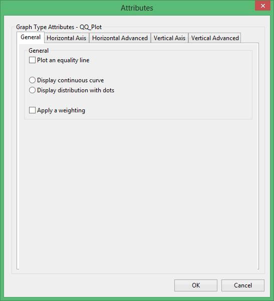
Plot an equality line
Select this check box if you want to get an equality line.
Display a continuous curve
Select this option if you want to display the results as a continuous curve.
Display the distribution with dots
Select this option if you want to display the results as a series of points (dots).
Display a continuous curve
Select this option if you want to display the results as a continuous curve.
Display the distribution with dots
Select this option if you want to display the results as a series of points (dots).
Apply a weighting
Select this check box if you want to apply a weighting. The weighting variable is specified once the data has been selected. The weighting variable must have the same length as the data variable to which it is applied, i.e. the same number of data values.
Horizontal Axis tab
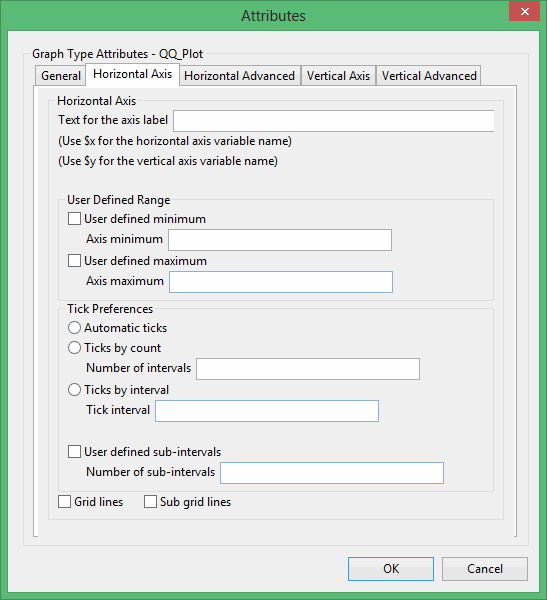
Text for axis label
Enter the axis title (a maximum size of 40 alphanumeric characters). $x can be used for the horizontal axis variable name, while $y can be used for the vertical axis variable name.
User Defined Range
User defined minimum/maximum
Select these check boxes if you want to manually define the range of the axis. The minimum and maximum values can contain up to 6 decimal places. If these boxes are not selected, the system will find the minimum and maximum from the data.
Check marks can be controlled or generated automatically.
Automatic ticks
Select this option to let the system decide where to place the ticks.
Ticks by count
Select this option to specify the number of ticks. The interval between ticks is the quotient of the horizontal range and this value.
If the horizontal range is 20, and the number of ticks is '5', then ticks will be placed at 4, 8, 12, 16 and 20.
Ticks by interval
Select this option to specify the distance between ticks.
User defined subintervals
Select this check this box if you want to use subintervals, which are smaller check marks placed between the major check marks. You will need to specify the distance between these smaller check marks.
If the interval between major check marks is 10, and the interval between minor check marks is '2', then the minor check marks will be placed at 2, 4, 6 and 8.
Grid lines
Select this check this box if you want to replace check marks with grid lines.
Sub grid lines
Select this check this box if you want to replace subinterval check marks with sub grid lines.
Horizontal Advanced tab
Numeric axis
Select this option if the horizontal axis contains numeric data.
The following options are available when using a numeric axis.
User defined decimal digits
Select this check box if you want to specify the number of decimal places. You will need to enter the number of decimal places.
Use exponential notation
Select this check box if you want to display all axis numbers in exponential notation, for example '1e2' instead of '100'.
Rotate axis labels
Select this check box if you want to rotate the axis annotation 90 °. By default the axis annotation are displayed at an angle of 0° (horizontal).
The axis scale can be one of the following:
Linear scale
Select this option to use a linear scale - this is the most common scale. The intervals on a linear scale are a constant amount, for example 5, 10, 15, 20, etc.
Logarithmic scale
Select this option to use a logarithmic scale - most useful when the range spans many orders of magnitude and you don't want to lose information at the smaller scales. Unlike linear scales (which are based on addition), Logarithmic scales are based on multiplication, that is '1, 10, 100, 1000,...'. Zero or negative numbers can never be represented on a logarithmic scale.
Normal (Gaussian) scale
This scale should only be used for the log-normal probability plot. It displays a number between 1 and 1 in units of standard deviation in a Gaussian distribution.
Vertical Axis tab
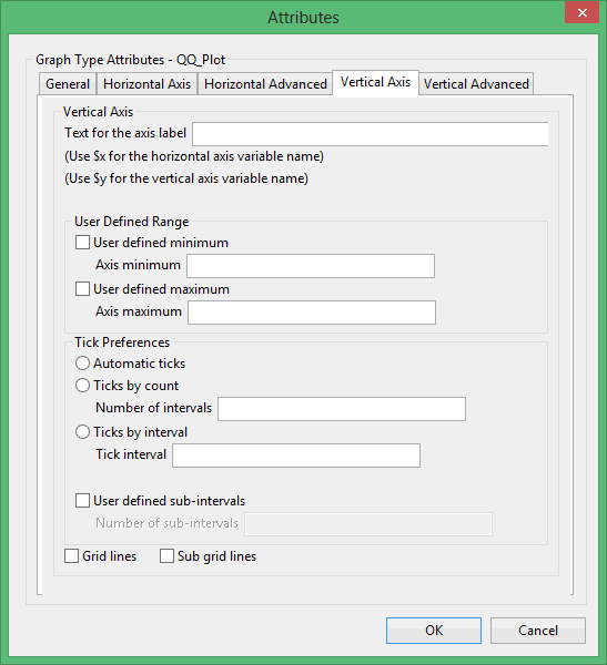
Text for axis label
Enter the axis title (a maximum size of 40 alphanumeric characters). $x can be used for the horizontal axis variable name, while $y can be used for the vertical axis variable name.
User Defined Range
User defined minimum/maximum
Select these check boxes if you want to manually define the range of the axis. The minimum and maximum values can contain up to 6 decimal places. If these boxes are not selected, the system will find the minimum and maximum from the data.
Check marks can be controlled or generated automatically.
Automatic ticks
Select this option to let the system decide where to place the ticks.
Ticks by count
Select this option to specify the number of ticks. The interval between ticks is the quotient of the horizontal range and this value.
If the horizontal range is 20, and the number of ticks is '5', then ticks will be placed at 4, 8, 12, 16 and 20.
Ticks by interval
Select this option to specify the distance between ticks.
User defined subintervals
Select this check this box if you want to use subintervals, which are smaller check marks placed between the major check marks. You will need to specify the distance between these smaller check marks.
If the interval between major check marks is 10, and the interval between minor check marks is '2', then the minor check marks will be placed at 2, 4, 6 and 8.
Grid lines
Select this check this box if you want to replace check marks with grid lines.
Sub grid lines
Select this check this box if you want to replace subinterval check marks with sub grid lines.
Vertical Advanced tab
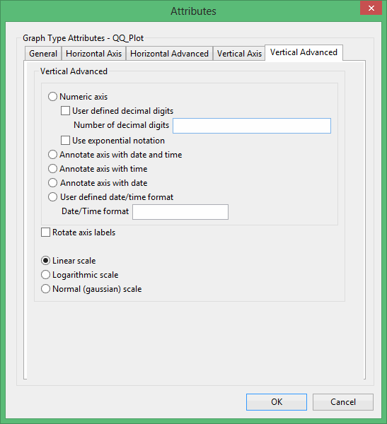
Numeric axis
Select this option if the horizontal axis contains numeric data.
The following options are available when using a numeric axis.
User defined decimal digits
Select this check box if you want to specify the number of decimal places. You will need to enter the number of decimal places.
Use exponential notation
Select this check box if you want to display all axis numbers in exponential notation, for example '1e2' instead of '100'.
Rotate axis labels
Select this check box if you want to rotate the axis annotation 90 °. By default the axis annotation are displayed at an angle of 0° (horizontal).
The axis scale can be one of the following:
Linear scale
Select this option to use a linear scale - this is the most common scale. The intervals on a linear scale are a constant amount, for example 5, 10, 15, 20, etc.
Logarithmic scale
Select this option to use a logarithmic scale - most useful when the range spans many orders of magnitude and you don't want to lose information at the smaller scales. Unlike linear scales (which are based on addition), Logarithmic scales are based on multiplication, that is '1, 10, 100, 1000,...'. Zero or negative numbers can never be represented on a logarithmic scale.
Normal (Gaussian) scale
This scale should only be used for the log-normal probability plot. It displays a number between 1 and 1 in units of standard deviation in a Gaussian distribution.
This plot type produces a triangle graph of three variables. Each variable is represented as being a proportion of the sum of the triplet data. All three variables must have the same number of values. Points near one corner of the triangle indicate that one variable is predominant in the three variables. Points near the centre of the triangle indicate samples in which the three components are in roughly the same proportion.
Excel Attributes
Use this panel to configure the font settings, including the font type, size, and colour, for the text elements within the graph.
Click OK to return to the Graph Type section of the Statistics Preferences interface.
This plot type produces a graph showing a series of point markers for each selected variable pair. Plots are produced for every combination.
General tab
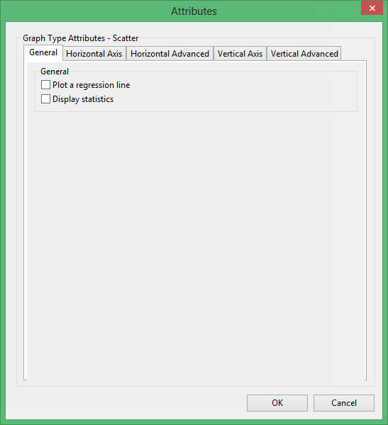
Plot a regression line
Select this check box to place the least squares regression linear regression line on the graph.
Display statistics
Select this check box to display general statistics on the plot.
Horizontal Axis tab
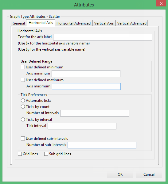
Text for axis label
Enter the axis title (a maximum size of 40 alphanumeric characters). $x can be used for the horizontal axis variable name, while $y can be used for the vertical axis variable name.
User Defined Range
User defined minimum/maximum
Select these check boxes if you want to manually define the range of the axis. The minimum and maximum values can contain up to 6 decimal places. If these boxes are not selected, the system will find the minimum and maximum from the data.
Check marks can be controlled or generated automatically.
Automatic ticks
Select this option to let the system decide where to place the ticks.
Ticks by count
Select this option to specify the number of ticks. The interval between ticks is the quotient of the horizontal range and this value.
If the horizontal range is 20, and the number of ticks is '5', then ticks will be placed at 4, 8, 12, 16 and 20.
Ticks by interval
Select this option to specify the distance between ticks.
User defined subintervals
Select this check this box if you want to use subintervals, which are smaller check marks placed between the major check marks. You will need to specify the distance between these smaller check marks.
If the interval between major check marks is 10, and the interval between minor check marks is '2', then the minor check marks will be placed at 2, 4, 6 and 8.
Grid lines
Select this check this box if you want to replace check marks with grid lines.
Sub grid lines
Select this check this box if you want to replace subinterval check marks with sub grid lines.
Horizontal Advanced tab
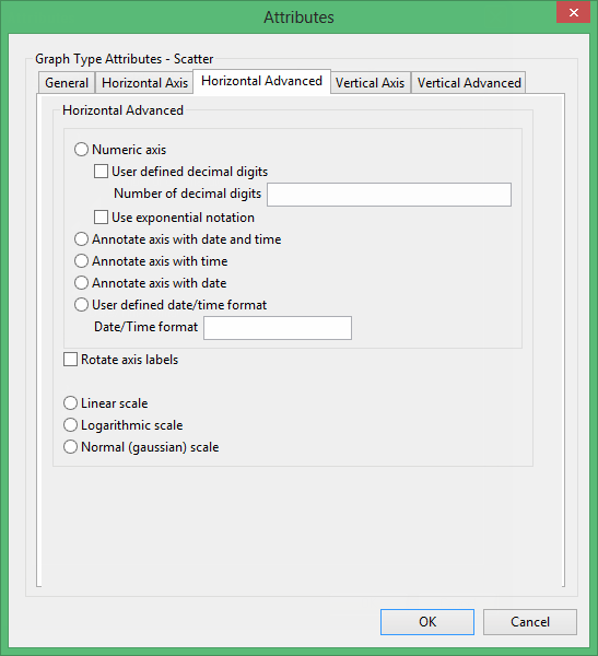
Numeric axis
Select this option if the horizontal axis contains numeric data.
The following options are available when using a numeric axis.
User defined decimal digits
Select this check box if you want to specify the number of decimal places. You will need to enter the number of decimal places.
Use exponential notation
Select this check box if you want to display all axis numbers in exponential notation, for example '1e2' instead of '100'.
Rotate axis labels
Select this check box if you want to rotate the axis annotation 90 °. By default the axis annotation are displayed at an angle of 0° (horizontal).
The axis scale can be one of the following:
Linear scale
Select this option to use a linear scale - this is the most common scale. The intervals on a linear scale are a constant amount, for example 5, 10, 15, 20, etc.
Logarithmic scale
Select this option to use a logarithmic scale - most useful when the range spans many orders of magnitude and you don't want to lose information at the smaller scales. Unlike linear scales (which are based on addition), Logarithmic scales are based on multiplication, that is '1, 10, 100, 1000,...'. Zero or negative numbers can never be represented on a logarithmic scale.
Normal (Gaussian) scale
This scale should only be used for the log-normal probability plot. It displays a number between 1 and 1 in units of standard deviation in a Gaussian distribution.
Vertical Axis tab
Text for axis label
Enter the axis title (a maximum size of 40 alphanumeric characters). $x can be used for the horizontal axis variable name, while $y can be used for the vertical axis variable name.
User Defined Range
User defined minimum/maximum
Select these check boxes if you want to manually define the range of the axis. The minimum and maximum values can contain up to 6 decimal places. If these boxes are not selected, the system will find the minimum and maximum from the data.
Check marks can be controlled or generated automatically.
Automatic ticks
Select this option to let the system decide where to place the ticks.
Ticks by count
Select this option to specify the number of ticks. The interval between ticks is the quotient of the horizontal range and this value.
If the horizontal range is 20, and the number of ticks is '5', then ticks will be placed at 4, 8, 12, 16 and 20.
Ticks by interval
Select this option to specify the distance between ticks.
User defined subintervals
Select this check this box if you want to use subintervals, which are smaller check marks placed between the major check marks. You will need to specify the distance between these smaller check marks.
If the interval between major check marks is 10, and the interval between minor check marks is '2', then the minor check marks will be placed at 2, 4, 6 and 8.
Grid lines
Select this check this box if you want to replace check marks with grid lines.
Sub grid lines
Select this check this box if you want to replace subinterval check marks with sub grid lines.
Vertical Advanced tab
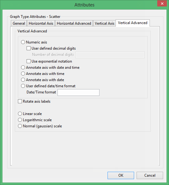
Numeric axis
Select this option if the horizontal axis contains numeric data.
The following options are available when using a numeric axis.
User defined decimal digits
Select this check box if you want to specify the number of decimal places. You will need to enter the number of decimal places.
Use exponential notation
Select this check box if you want to display all axis numbers in exponential notation, for example '1e2' instead of '100'.
Rotate axis labels
Select this check box if you want to rotate the axis annotation 90 °. By default the axis annotation are displayed at an angle of 0° (horizontal).
The axis scale can be one of the following:
Linear scale
Select this option to use a linear scale - this is the most common scale. The intervals on a linear scale are a constant amount, for example 5, 10, 15, 20, etc.
Logarithmic scale
Select this option to use a logarithmic scale - most useful when the range spans many orders of magnitude and you don't want to lose information at the smaller scales. Unlike linear scales (which are based on addition), Logarithmic scales are based on multiplication, that is '1, 10, 100, 1000,...'. Zero or negative numbers can never be represented on a logarithmic scale.
Normal (Gaussian) scale
This scale should only be used for the log-normal probability plot. It displays a number between 1 and 1 in units of standard deviation in a Gaussian distribution.
Excel Attributes
Use this column to configure the Excel attributes for the resulting graph. Click ![]() to configure the attributes for the associated graph. Once selected, the appropriate Excel Attributes panel for the graph displays.
to configure the attributes for the associated graph. Once selected, the appropriate Excel Attributes panel for the graph displays.
The options contained in the displayed Excel Attributes panel depend on the graph type chosen. Click on the listings below to display information on the displayed panels.
The Excel Attributes column is not applicable to the Anova, Export, Joint, and Multivariate listings.
