Database Drift Analyser - Vulcan Options
This panel is separated into the following tabbed sections:
- General
- Colours
- X axis
- Y axis
- Box plot
General
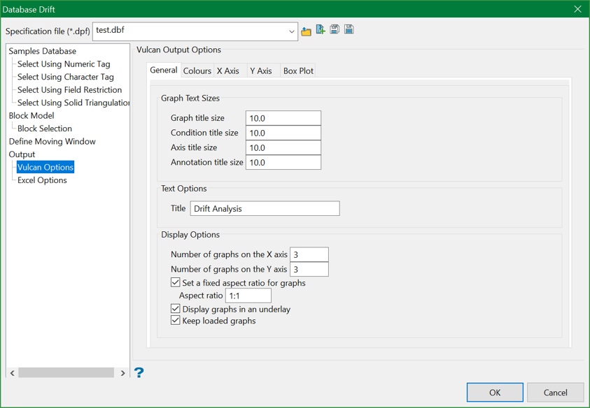
Graph text sizes
Enter the size for the graph text, i.e. the graph title, condition title, axes titles and annotation titles. The default text size is " 10 ".
Text Options
Title
Enter the title for the resulting graph (a maximum size of 40 alphanumeric characters).
Display Options
Number of windows on X/Y axis
Enter the number of graphs (in the X and Y direction) that you want displayed in the Graphs Window. Each graph displays in its own window in the main Graph window.
For example: If you enter " 4 " as the number of sub-windows for the X axis, and " 3 " as the number of sub-windows for the Y axis, then you will get 12 sub-windows. If there are more graphs/statistics than the specified number of sub-windows, then you will be able to scroll by page.
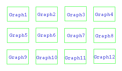
Figure 1: Sub-windows
Use the  Zoom and
  Pan icons on the Graphics toolbar to zoom in on the graphs.
Display graphs in an underlay
Select this check box to display the graphs as underlays. If this check box is not enabled, then the resulting graphs will be displayed as layers. These layers are named " VSTGR<n> " where <n> = the number of the display layer.
For example: Graph1 would be displayed as layer " VSTGR1 ", Graph2 as layer " VSTGR2 " etc.
Set a fixed aspect ratio for graphs
Select this check box to control the aspect ratio of graphs by entering in either a ratio (such as 4:3), or a value (such as 1.333). This allows pie charts to display as round (1:1 ratio) and helps reduce text crowding.
Retain current graph
Select this check box to keep the display of the current graphs.
Colours
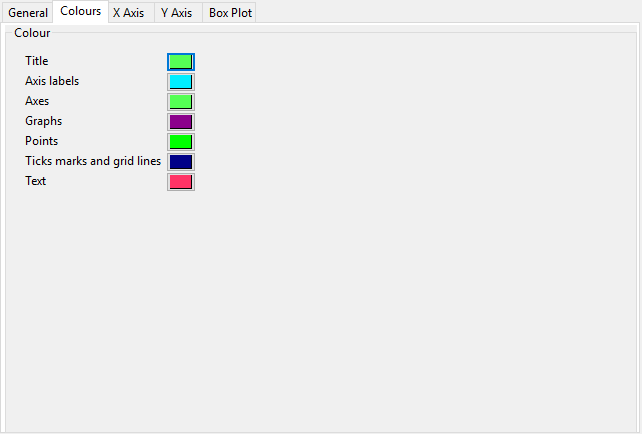
Colour
Select the colours for the graph elements (graph title, axes labels, graph points, grid lines etc). The colours are selected from the current colour table.
X axis
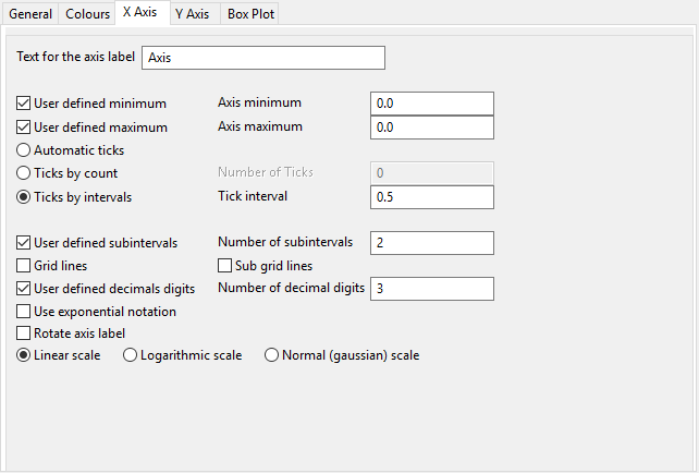
Text for the axis label
Enter the axis title (a maximum size of 40 alphanumeric characters).
User defined minimum/maximum
Check these check boxes to manually define the range of the axis. The minimum and maximum values can contain up to 6 decimal places. If these check boxes are not ticked, then the system will find the minimum and maximum from the data.
Check marks can be controlled or generated automatically.
- Automatic ticks
Select this option to let the system decide where to place the ticks. - Ticks by count
Select this option to specify the number of ticks. The interval between ticks is the quotient of the horizontal range and this value.
For example: If the horizontal range is 20, and the number of ticks is "5", then ticks will be placed at 4, 8, 12, 16 and 20. - Ticks by interval
Select this option to specify the distance between ticks.
For example: If the horizontal range is 20, and the check interval is "5", then the ticks will be placed at 5, 10, 15 and 20.
User defined subintervals
Select this check box to use subintervals, which are smaller check marks placed between the major check marks. You will need to specify the distance between these smaller check marks.
For example: If the interval between major check marks is 10, and the interval between minor check marks is " 2 ", then the minor check marks will be placed at 2, 4, 6 and 8.
Grid lines
Select this check box to replace check marks with grid lines.
Sub grid lines
Select this check box to replace subinterval check marks with sub grid lines.
User defined decimal digits
Select this check box to specify the number of decimal places. You will need to enter the number of decimal places.
Use exponential notation
Select this check box to display all axis numbers in exponential notation, for example " 1e2 " instead of " 100 ".
Rotate axis labels
Select this check box to rotate the axis annotation 90°. By default the axis annotations are displayed at an angle of 0°, i.e. horizontal.
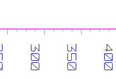
Figure 2: Axis Labels Rotated
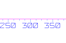
Figure 3: No Rotation
The axis scale can be one of the following:
Linear scale
Select this option to use a linear scale - this is the most common scale. The intervals on a linear scale are a constant amount, for example 5, 10, 15, 20 etc.
Logarithmic scale
Select this option to use a logarithmic scale - most useful when the range spans many orders of magnitude and you don't want to lose information at the smaller scales. Unlike linear scales (which are based on addition), Logarithmic scales are based on multiplication, that is"1, 10, 100, 1000,...". Zero or negative numbers can never be represented on a logarithmic scale.
Normal (Gaussian) scale
This scale should only be used for the log-normal probability plot. It displays a number between 0 and 1 in units of standard deviation in a Gaussian distribution.
Y axis
The options displayed under this tab are similar to the ones displayed through the X axis tab.
Box plot
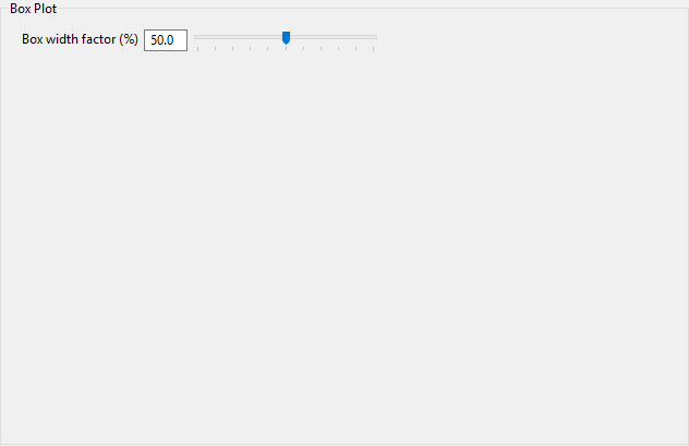
Box width factor
Specify the width of each box in the resulting graph. The width value can either be entered as a percentage or it can be specified through using the available slider bar.
