Contact Profile
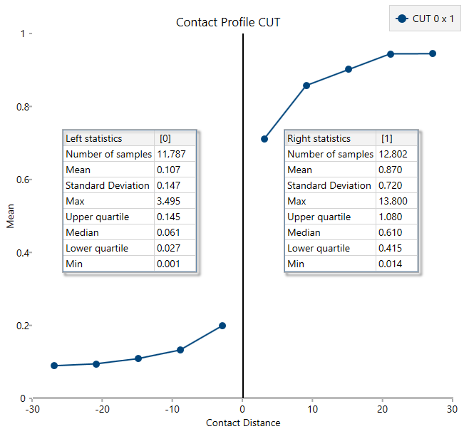
Use this option to create a contact matrix to determine hard verses soft boundaries. This is similar to the correlation matrix, but is graded by colour to show how hard or soft the boundaries are based on the differences between their average grades.
Instructions
Follow these steps:
-
On the Data ribbon, click Source Data to import your data into VDA. Any data source can be used as long as it contains the domain information, an assay value, and the X, Y, and Z coordinates.
-
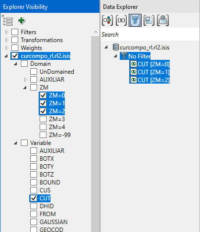
In the Explorer Visibility pane, select the domain(s) and variable(s) to use.
-
In the Data Explorer pane, select the data.
-
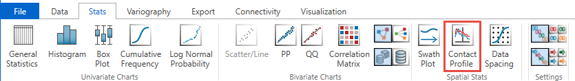
On the Stats ribbon, select Contact Profile.
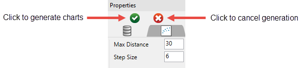
Note: The icon will be disabled if the data selected is invalid for some reason.
-
In the Properties pane, set the Max Distance and Step Size, then click the green arrow to generate the charts.
-
You can make adjustments to the way the statistics are displayed in your chart.
-
Move the location of the statistics panels by clicking and dragging them to the desired location.
-
Dock the statistics panel below the chart by clicking Dock Statistics in the Chart Settings tab of the Properties panel.

-
Adjust the font style and size by clicking the Visualisation tab at the top of the Vulcan Data Analyser panel, then clicking Font Styles.

-
