Capping Strategy
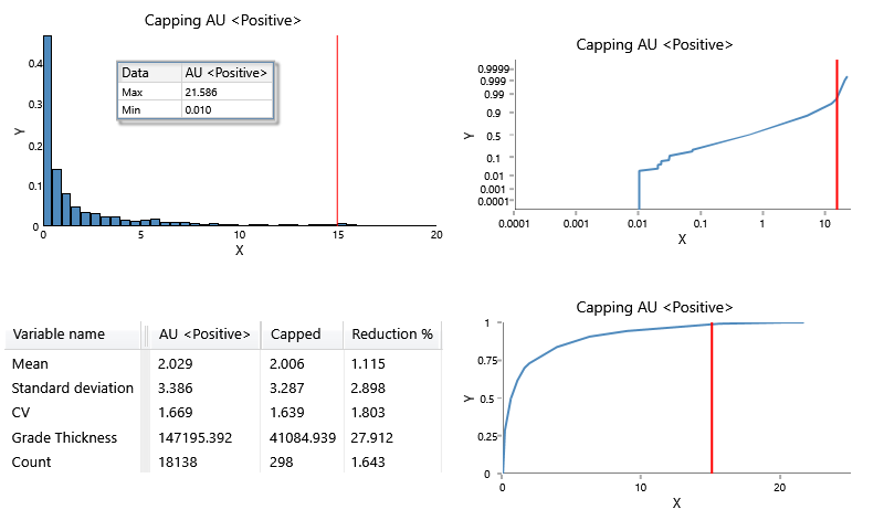
Use this option to generate histogram, log probability, cumulative frequency, and general statistic charts that can help identify the impact capping your data at a certain threshold will have.
Follow these steps:
-
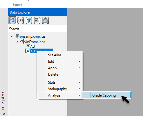
On the ribbon, go to the Data tab, then click Open Data Source, then select the block model or database you want to analyse to load it into the Explorer Visibility column.
-
Select the variable you want to use from the Data Explorer column, then right-click to select Grade Capping.
-
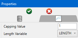
Enter an initial Capping Value, or leave the default value of 1. You will also need to select the database field that represents the Length Variable if it is not automatically selected.
-
Click the green check icon
 at the top of the Properties column to create the charts.
 -
Customise the charts by editing the parameters in the Properties column.
-
Cumulative Frequency
Option Result Title You can replace the default title with a customized title by entering the text here. If you do not want a title on the chart, delete the text from the textbox. Line Type Select the option for either a bar chart of a line chart.
You can set different display options for charts showing more than one dataset, as shown in the example chart above.
Colour Select a colour from the colour chart to change the colour of the histogram bars. Marker Select from various shapes to customise the data points. -
Histogram
Option Result Chart type Select the option for either a bar chart of a line chart.
You can set different display options for charts showing more than one dataset, as shown in the example chart above.
Fill colour To change the colour of the histogram bars, select a colour from the colour chart. Outline colour To change the colour of the bar outlines, select a colour from the colour chart. Units Count - Shows the number of values that fall within a range (bin).
Frequency - Shows the ratio of a number of values between 0 and 1.
Percent - Shows the ratio of a number of values between 0 and 100.
Label values Selecting this option will label each bar with its numeric value. -
Log Normal Axes / Cumulative Frequency Axes / Histogram Axes
Option Result Gridlines Click this option to display major gridlines along either the X axis, the Y axis, or both. Auto fit Select this option for the axes to be automatically set up based on the values found in the data.
Minimum / Maximum
Deselect Auto fit, then enter the minimum and maximum axes values.
Auto Interval
With this option checked, the interval will be automatically determined. Unchecked this option to enter a new interval.
Title
Enter a title for the axis.
Scale
Select the type of scale in which you want to view the data.
-
Bin Customisation
Option Result Auto fit Using Auto fit will distribute the values of the entire dataset over the number of bins. If you want to limit the range of values, clear the Auto fit checkbox and enter a Start and End value to use instead. Start / End value
Enter the values where you want the values to begin and end.
Number of bins
Enter the number of bins.
Use Logarithmic Bins Select this option to change the X axis to display a logarithmic scale. -
Annotations and Legend
Option Result Decimals Set the number of decimals to display in the legend. Note: This will effect the display only. It has no effect on the precision of the numbers used in calculations.
Dock Statistics Enabling this option will position the table below the chart. Show Statistics Select the Show Statistics checkbox if you want to display the general statistics.
-
