Editing a Variogram Created from a Block Model
After an experimental variogram has been made, these parameters can be used to generate the model variogram.
Properties tabs
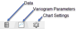
Data tab
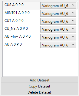
Data Sets
Add Dataset
Select the chart to which you wish to add data. Then select the data group from the Data Explorer that you wish to add. Last, click on the 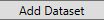 button. The data will be added to the chart using the same parameters as the existing dataset already on the chart.
Copy Dataset
Select a dataset from the list to highlight it, then click the 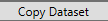 button to create a copy of the dataset on the chart.
Delete Dataset
Select a dataset from the list to highlight it, then click the 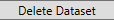 button to delete the dataset from the list and the chart.
Variogram Parameters tab
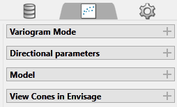
Variogram Mode
Refresh Chart
To refresh the chart, click the ![]() icon in the upper right corner.
icon in the upper right corner.
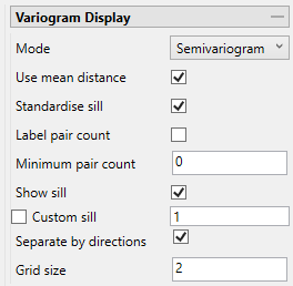
Mode
Note: The list of modes available for use depends on the type of variogram you are modelling. Depending on what type of variogram you are modelling, some of these modes might not be available.
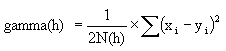
This is the standard semi variogram.
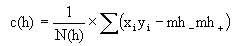
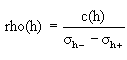
This is like the standard semi variogram, but divided by the mean of the data values.
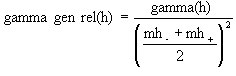
This is like the standard semi variogram, but each difference is divided by the mean of the sample values.
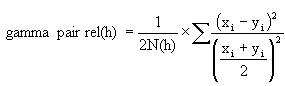
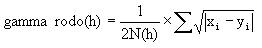
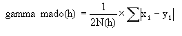
sqrt(Semivariogram) / Madogram
Transform data as 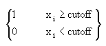 and compute the semivariogram
where:
Use mean distance
Use the mean distance for the x coordinate of the variogram points.
Standardise sill
Select this check box if you want to standardise the variogram sill by dividing the results by the sample variance. This is useful when calculating a semivariogram because instead of reaching the sill at the sample variance it will reach it at 1.
Label pair count
Select this option to display the number of pairs used for each point on the graph.
Rotate pair count
This option displays when Label pair count is selected. Select this option to rotate the number labels of the pairs so that they are oriented 90 degrees upward.
Minimum pair count
Enter the lowest number of pairs that you want to be used to influence the variogram model.
Show sill
Select this option to show the sill.
Custom Sill
Select this option to enter your own value for the sill.
Separate by directions
Block model variograms can be created for multiple directions and separated by direction in the same document by viewing using the grid mode. This option is enabled by default. When disabled, all variograms are displayed in the same chart.
Grid size
This specifies how many charts each row and column will show. If the Grid Size is not enough to include all directions, then a scroll bar will appear to the right.
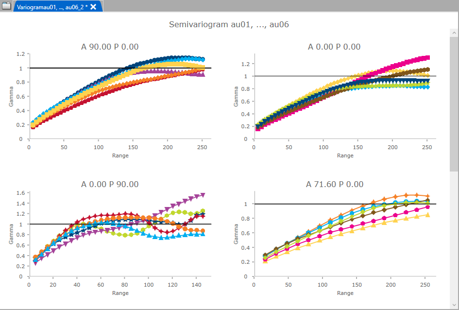
Figure 1: In this image for instance there are 7 directions but grid size is set to 2, therefore only 4 variograms are visible at once. The other directions are visible too, but you will need to scroll down to view them.
Directional parameters
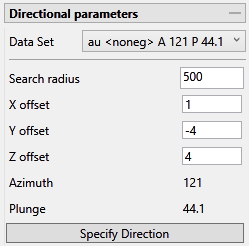
Tip: A red border will warn you when an entry is not a number or has an incorrect format.
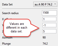
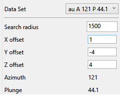
Data Set
The current data set that is being display on the chart is listed, showing the azimuth and plunge angle.
|
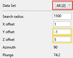
Note: If more than one data set exists and you have the selection set to All, any fields that do not match will be highlighted, as shown here:
Data set 1
Data set 2
Both data sets |
Model
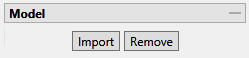
Import or remove variogram models (.vrg) by clicking the buttons.
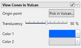
View Cones in Vulcan
You can visualise the search ellipses by enabling the option to View Cones in Vulcan, or by clicking Display Cones from the Connectivity tab in the ribbon. The cones are interactive, therefore, any changes made in the variogram parameters will be automatically reflected in the cones seen in Vulcan.
Steps
-
Begin by clicking the button labelled Pick in Vulcan.
-
In the Envisage workspace, click where you want the origin of the cones to be displayed.
-
Use the slider to adjust the Translucency of the cones.
-
Set the colours for the cone by clicking on Colour 1 and Colour 2, then selecting a colour from the palette.
-
To remove a the cone from the screen, disable the View Cones in Vulcan checkbox.
After you have set the parameters for a cone, it can be displayed using the icons found on the Connectivity tab on the ribbon.
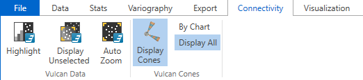
Click Display Cones, then select either By Chart or Display All.
By Chart - Only the charts that have the View Cones in Vulcan option enabled will be displayed.
Display All - All cones will be displayed regardless of whether or not the View Cones in Vulcan option has been enabled.
Chart Settings tab
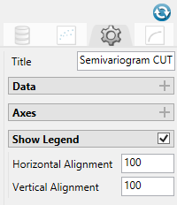
Title (optional)
By default, the title is filled in with the <mode> + <dataset name>. The mode can be selected by using the drop-down list found under the Variogram Parameters tab. However, you may enter your own title by replacing the default entry, or remove the title by deleting the text.
Data
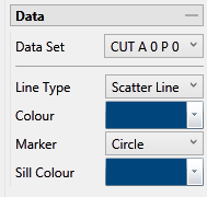
Data Set
The current data set that is being display on the chart is listed, showing the azimuth and plunge angle.
Line Type, Colours and Markers
Use the drop-down menus to select the line type, colours, and markers to customise the charts.
Axes
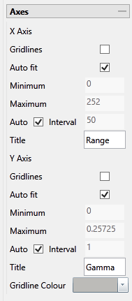
Gridlines
Select this option to display the gridlines at major intervals on the chart. You can elect to display gridlines for both axes or just one, depending on your needs.
Auto fit
By default, Vulcan Data Analyser will auto fit the axes based on the values calculated from the dataset. However, you can customise the axes to highlight your particular study and needs. This can be done in two ways:
Method One
-
Deselect Auto fit.
-
Set a Minimum and Maximum range.
-
Let Vulcan Data Analyser adjust the intervals automatically by leaving the Auto Interval option selected.
Method Two
-
Deselect Auto fit.
-
Set a Minimum and Maximum range.
-
Deselect Auto Interval, then enter an interval of your choice.
Axes Titles
By default, the axes are provided with the traditional titles of Gamma and Range. However, if you wish to change these you may do so by replacing the text in each of the textboxes.
Gridline Colour
Click the arrow to display the colour palette, then select a colour for the gridlines.
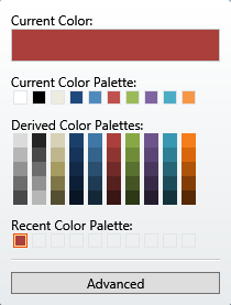
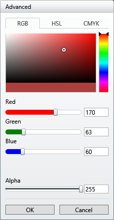
Clicking the Advanced button will bring up a dialog which will allow you to customise the colour to you exact specifications.
Show Legend
By default, the legend is automatically displayed. If you do not want to see the legend simply uncheck the checkbox in the upper right corner.
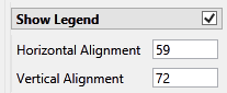
Horizontal and Vertical Alignment
Position the chart legend by left-clicking on it with your mouse and dragging it to the desired location. It is also possible to position the legends by typing in a number between 0 and 100 into the textbox. If you do not want to see the legend simply uncheck the checkbox in the upper right corner.
