Display
Display a Variogram
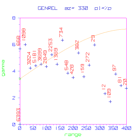
Use the Display option to display experimental and model variograms on the screen. These variograms are stored in a variogram results file (<proj><name>.vrs or <proj><name>.vrg).
Several display parameters can be specified, stored (in the <proj><name>.srf) and re-used at a later stage. An example is given in Appendix A.
Instructions
On the Block menu, point to Variography, and then click Display to display the Variography Parameter Identifier panel.
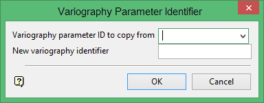
Variography parameter ID to copy from
This is an optional field for the name of an existing variography parameter file. It to copy an existing file and modify the copy to reflect specific requirements for the new parameters.
New variography identifier
Enter the name of the new parameter file. The maximum size is 10 alphanumeric characters.
Click OK.
The following panel is then displayed.
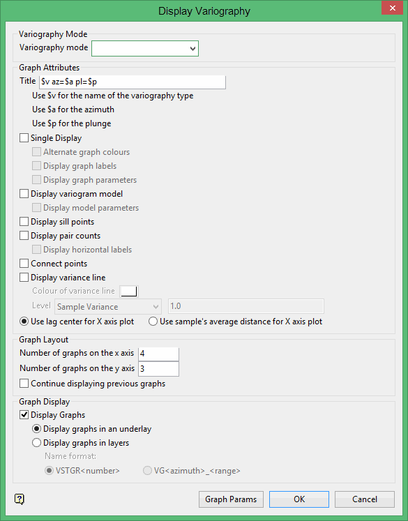
Title
Enter the text string which appears at the top of each graph. You can use $v in the title which is replaced by the variography type (for example, GENERAL); $p which is replaced by the plunge angle of the particular direction or $a which is replaced by the azimuth angle of the particular direction.
Enter the text string which appears at the top of each graph. You can use $p in the title which is replaced by the plunge angle of the particular direction or $a which is replaced by the azimuth angle of the particular direction.
Variography mode
Select, from the drop-down list, the type of variography to display.
Display graphs
Select this check box to display the variograms. They are stored in the .vrs file created through the Create option.
Select the Display graphs in an underlay option if you want to display the graphs as an underlay. Select the Display graphs in layers option to display the graphs as layers. You will need to specify the naming format for the resulting layers. This can be VSTGR<number> where the number increases with each graph, that is, VSTGR1, VSTGR2, etc or VG<azimuth>_<plunge>.
Display variogram model
Select this check box to display the variogram model function on the graph. The model function is stored in a.vrg file (created through the Auto Fit or Edit options). Check the Display model parameters check box if you want to display the parameters for the variogram model.
Display sill points
Select this check box to display small circles for each sill structure. The circles are placed at the sill ranges for the value of the model function. These circles can be used in the Edit option to move sill points. You can move these sill points to change the range or the sill differential for a structure.
Display pair counts
Select this check box to display the number of pairs next to each point on the graph. Check the Display horizontal labels check box to print the pair counts horizontally instead of the vertically.
Connect points
Select this check box to connect the points in the experimental variogram.
Display variance line
Select this check box to display a horizontal line that represents the variance of the samples used to calculate the variogram. Usually, the sill of the variogram should peak at the variance. You will need to select a colour for the variance line. The colour is chosen from the current colour table.
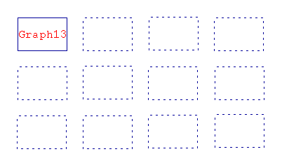
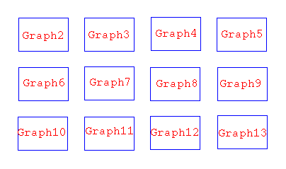
Number of graphs on the X/Y axis
Specify the number of graphs to display in the X and Y directions.
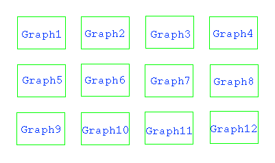
For example: If you enter '4' as the number in the X direction, and '3' as the number in the Y direction, then 12 graphs will fit on the screen.
Use the Zoom button ![]() on the Graphics toolbar to zoom in on a particular graph. You can switch between the Primary Window and the Graph Window by using the key combination Alt + Tab or by using the Window > Window option or by selecting View > Windows > Select option.
on the Graphics toolbar to zoom in on a particular graph. You can switch between the Primary Window and the Graph Window by using the key combination Alt + Tab or by using the Window > Window option or by selecting View > Windows > Select option.
Continue displaying previous graphs
Select this check box to keep the display of the current graphs.
Select the Graph Params option to change the default graph parameters, for example, the colour of the graph components and size of the text; the axis parameters, such as checks, grid lines and axis label; and advanced axis parameters, such as axis annotations.
Once selected, the General Parameters panel displays.
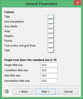
Select colours for the graph elements, such as title text, axis annotations, axes labels, graphs (for example, bars of a histogram), graph points, grid lines and text. Colour for text refers to the display of textual information other than title, annotation and labels. The colours are selected from the current colour table.
Enter the size for the graph text (graph title, condition title, axes titles and annotation titles). The font type used is SCALED. The font size of textual information other than titles is 10 point. This can only be changed through using the options under the Design > Text Edit submenu.
Click Next to display the Axis parameters panel.
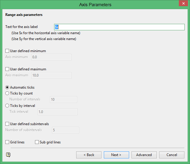
This panel displays twice—once for the horizontal axis and once for the vertical axis.
Text for axis label
Enter the axis title (a maximum size of 40 alphanumeric characters). $x can be used for the horizontal axis variable name, while $y can be used for the vertical axis variable name.
User defined minimum/maximum
Check these check boxes to manually define the range of the axis. The minimum and maximum values can contain up to 6 decimal places. If these check boxes are not checked, then the system will find the minimum and maximum from the data.
Check marks can be controlled or generated automatically.
- Automatic checks
Select this option to let the system decide where to place the checks. - Checks by count
Select this option to specify the number of checks. The interval between checks is the quotient of the horizontal range and this value.
For example: If the horizontal range is 20, and the number of checks is5, then checks will be placed at 4, 8, 12, 16 and 20. - Checks by interval
Select this option to specify the distance between checks.
For example, if the horizontal range is 20, and the check interval is5, then the checks will be placed at 5, 10, 15 and 20.
User defined subintervals
Select this check box to use subintervals, which are smaller check marks placed between the major check marks. You will need to specify the distance between these smaller check marks.
For example, if the interval between major check marks is 10, and the interval between minor check marks is '2', then the minor check marks will be placed at 2, 4, 6 and 8.
Grid lines
Select this check box to replace check marks with grid lines.
Sub grid lines
Select this check box to replace subinterval check marks with sub grid lines.
The Advanced option activates the following panel.
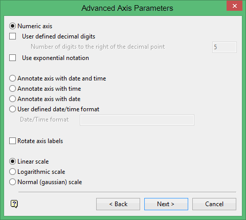
Numeric axis
Select this option if the horizontal axis contains numeric data.
The following options are available when using a numeric axis.
User defined decimal digits
Select this check box to specify the number of decimal places. You will need to enter the number of decimal places.
Use exponential notation
Select this check box to display all axis numbers in exponential notation, for example, '1e2' instead of '100'.
Annotate axis with date and time
Select this option to annotate the axis with the date and time.
Annotate axis with time
Select this option to annotate the axis with the time.
Annotate axis with date
Select this option to annotate the axis with the date.
User defined date/time format
Select this option to annotate the axis with a defined date and time. You will need to enter the text that will be used to annotate the axis.
Rotate axis labels
Select this check box to rotate the axis annotation 90°. By default the axis annotations are displayed at an angle of 0°, that is, horizontal.
The axis scale can be one of the following:
Linear scale
Select this option to use a linear scale - this is the most common scale. The intervals on a linear scale are a constant amount, for example, 5, 10, 15, 20 etc.
Logarithmic scale
Select this option to use a logarithmic scale - most useful when the range spans many orders of magnitude and you don't want to lose information at the smaller scales. Unlike linear scales (which are based on addition), Logarithmic scales are based on multiplication, that is, '1, 10, 100, 1000,...'. Zero or negative numbers can never be represented on a logarithmic scale.
Normal (Gaussian) scale
This scale should only be used for the log-normal probability plot. It displays a number between 0 and 1 in units of standard deviation in a Gaussian distribution.
Click Next to return to the Axis parameters panel. The Axis parameters panel is then redisplayed, allowing you to specify the parameters for the vertical axis. After completing this panel, select the Next option to return to the Display variography panel.
Click OK to display the graphs.
A selection box displays if there are more graphs than the specified number. From this box, select the method of scrolling.
By Page
Selecting Page Forward displays the next graph starting in the first position. For example, if you have 13 graphs, but specified 12, graph 13 displays in the first position of the next screen.
By Graph
Selecting Forward Graph display the next graph in the last position. For example, if you have 13 graphs, but specified 12, graph 13 is displayed in the 12thposition, graph 12 in 11thposition and so on.
The following methods can be used to remove the graphs that were displayed as underlays:
- Selecting the Remove Underlay
 or Remove All Underlays
  icons from the Standard toolbar.
 - Selecting the Remove option from either the main Block menu or the File > Underlays submenu.
Note: Removing layers or underlays does not affect the display entries in the display parameter file (.srf).
