Data Spacing
Use this option to calculate data spacing for drillholes or samples.
Instructions
Begin by importing your data source into the Data Analyser. Any data source can be used as long as it contains an assay value and the X, Y, and Z coordinates.
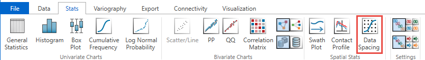
Next, select two or more variables to analyse, then click the Data Spacing icon in the Stats ribbon.
Note: The icon will be disabled if the data selected is invalid for some reason.
After you have selected the variables, set the Search radius in the Properties panel.
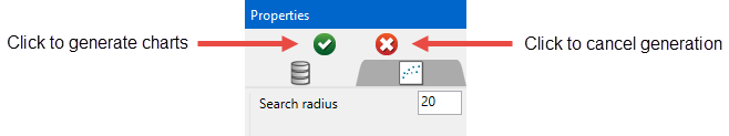
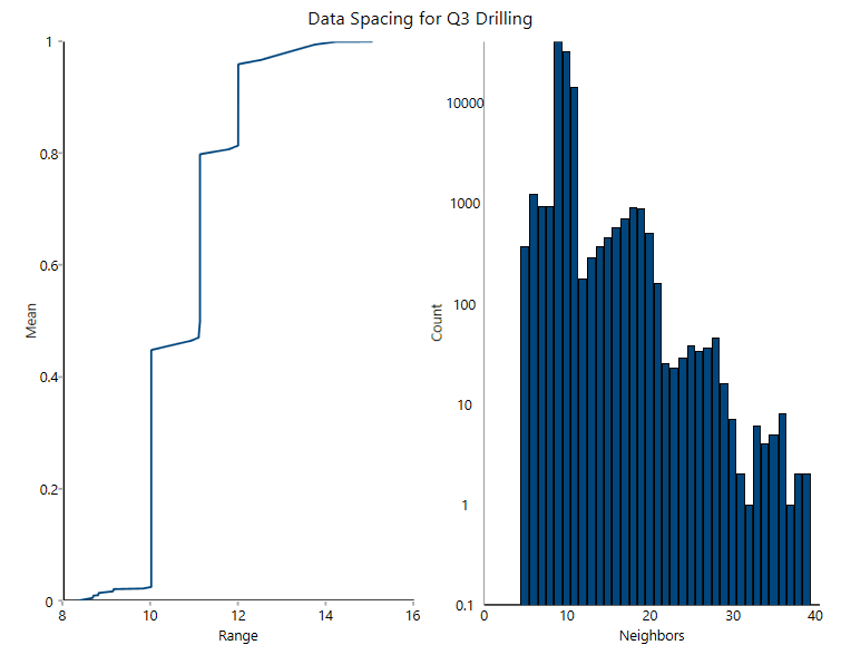
Click the green icon with the check mark to begin the analysis and generate the chart. The results will be shown as below.
Customising the chart
Refresh Chart
To refresh the chart, click the ![]() icon in the upper right corner.
icon in the upper right corner.
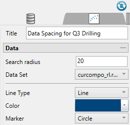
Title (optional)
By default, the title is filled in with the <mode> + <dataset name>. The mode can be selected by using the drop-down list found under the Variogram Parameters tab. However, you may enter your own title by replacing the default entry, or remove the title by deleting the text.
Search radius
This set the distance that will be used to search for nearby samples.
Data Set
Displays the datasets that are currently active and can be edited by adjustments made in the Properties pane.
Tip: More than one pair of datasets can be displayed on the same chart. Begin by highlighting all the pairs you want to display in the Data Explorer. Then on the Stats tab, the Settings group, select the icon labelled All variables on the same chart. When you click the button to generate the chart, all of the results will be shown on the same chart.
Line Type
Select between a scatter (points) or a line plot.
Colour
Use the colour chart to select the colour of the data points on the chart. Multiple groups of datasets will automatically be assigned different colours.
Marker
Select from various shapes to customise the data points.
Axes and Neighbor Axes
option to show a histogram containing the number of neighbors at the specified search radius
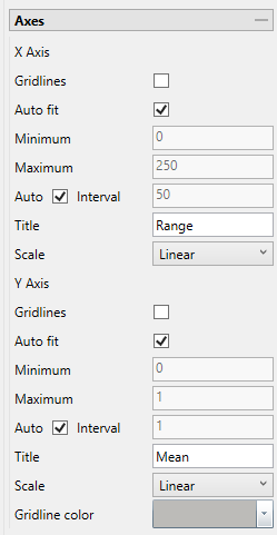
Auto fit
Select this option for the axes to be automatically set up based on the values found in the data.
Minimum / Maximum
Deselect Auto fit, then enter the minimum and maximum axes values.
Auto Interval
With this option checked, the interval will be automatically determined. Unchecked this option to enter a new interval.
Title
Enter a title for the axis.
Scale
Select the type of scale in which you want to view the data.
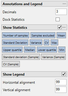
Decimals
Set the number of decimals to display in the legend.
Note: This will effect the display only. It has no effect on the precision of the numbers used in calculations.
Show statistics
Enable this checkbox to display the statistics in the chart. You can select the specific statistics you want displayed by clicking on the various options.
Show Legend
Toggle on and off the legend display.
