General Statistics
Provides a list of summary statistics.
Instructions
Follow these steps:
-
On the ribbon, go to the Data tab, then click Open Data Source, then select the block model or database you want to analyse to load it into the Explorer Visibility column.
-
Select the variable you want to use from the Data Explorer column.
Note: You can select more than one variable if you want to see multiple histograms on the same chart.
-
On the ribbon, go to the Stats tab, then click General Statistics. After the chart has been created, the Properties column will display the options available to customise your chart.
To refresh the chart, click the
 icon in the upper right corner.
Tip: To add additional data to the chart, you can drag and drop one or more variables from the Data Explorer column. The chart will be updated automatically.
-
The Properties column lets you edit the title, colours, and type of information that is displayed.
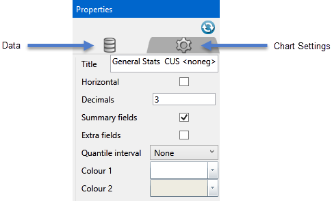
Refresh Chart
To refresh the chart, click the
icon in the upper right corner.Title
If the default name automatically given to the chart is not desired, enter a name here. It will be displayed at the top of the chart.
Horizontal
Select this option to show the statistical headings as columns. While unchecked, they will be displayed as rows.
Decimals
Enter the decimal precision here.
Summary fields
By default, this option is automatically selected. It contains fields for general statistical operations.
Extra fields
Select this option to display more statistic fields.
Quantile interval
Use the drop-down list to select the interval of percentiles to be displayed. For example, if 1 is selected, all percentiles will be displayed. If 20 is selected, every percentile that is divisible by 20 will be displayed.
These interval selections are also applied to the Export functions Analyse_for.png and CSV files.
Colour1 / Colour 2
You can customise the colour of the columns of data by opening the colour chart and selecting a colour. The colours will alternate by column, so Colour 1 refers to columns 1, 3, 5, etc. Colour 2 refers to columns 2, 4, 6, etc.
Sort by
Use the drop-down list to sort the data.
Exporting results as CSV
You can export the results as a CSV on the Export tab, then clicking CSV. Regardless of which fields have been select for viewing in the chart area, all fields will be exported to the CSV.
